Introduction
This documentation consists of several parts and shows you the entire process of setting up and administering a WordPress Website from scratch.
What is WordPress CMS?
WordPress is a free and open source blogging tool and a content management system (CMS) based on PHP and MySQL. It enables you to build Websites and powerful on-line applications and requires almost no technical skills or knowledge to manage. Many aspects, including its ease of use and extensibility, have made WordPress the most popular Web site software available. Learn More
Getting Started
Template installation has never been easier. The installation process includes only three simple steps: Cherry framework installation, child theme installation and sample data installation.
All installation steps can be done within WordPress interface. It makes process comfortable and fast.
You can verify this by clicking on the link below:

CherryFramework installation
- Log in to your WordPress admin panel (add /wp-admin to your domain name in the browser address bar).
- Go to the menu Appearance > Themes and click the Add New Theme button.
- Click the Upload link.
- Click the Browse button and navigate to the unzipped template package on your computer.
- Look for a file called CherryFramework.zip. Click on it to select, then click OK.
- Click the Install Now button and wait until the installation is complete.
- Click the Activate theme link.
For more information, feel free to check the detailed video tutorial on How to install Cherry framework template.
Congratulations, you have just installed the framework.
Theme Plugins:
Cherry Plugin
Attention: Installation and activation of Cherry Plugin is required for the correct work of shortcodes and widgets. Cherry Plugin is installed and activated by default on installing Cherry Framework.
Download: https://github.com/CherryFramework/CherryFramework/raw/master/includes/plugins/cherry-plugin.zip
Description: The Cherry team has already created a Cherry framework that can be reasonably called perfect, but we are always looking for more improvements. Meet the Cherry Plugin. This is an extension for our Cherry framework where we've included all the shortcodes and widgets you will ever need. The plugin is fully compatible with any WordPress theme powered by Cherry Framework. So far, the plugin is a beta release, but we're going to keep on improving it to deliver even more cool features.
Contact Form 7
Download: http://wordpress.org/extend/plugins/contact-form-7/
Description: Contact form for contact page.
Compatible Plugins:
WPML
Download: http://wpml.org/
Description: WPML makes it easy to build multilingual sites and run them.
JigoShop
Download: http://wordpress.org/plugins/jigoshop/
Description: A feature-packed eCommerce plugin built upon WordPress core functionality ensuring excellent performance and customizability.
WooCommerce
Download: http://wordpress.org/plugins/woocommerce/
Description: WooCommerce is a powerful, extendable eCommerce plugin that helps you sell anything. Beautifully.
BuddyPress
Download: http://wordpress.org/plugins/buddypress/
Description: Social networking in a box. Build a social network for your company, school, sports team or niche community.
bbpress
Download: http://wordpress.org/plugins/bbpress/
Description: bbPress is forum software made the WordPress way.
Mingle Forum
Download: http://wordpress.org/plugins/mingle-forum/
Description: Mingle Forum allows you to easily and quickly put a Forum on your WordPress site/blog.
WP Forum Server
Download: http://wordpress.org/plugins/forum-server/
Description: This WordPress plugin is a complete forum system for your wordpress blog.
Loading data from Google servers
Some countries have issues connecting to Google servers. This can cause issues loading Google Fonts. To resolve these issues please do the following:
Can't load Google Fonts:
Open ...\CherryFramework\admin\options-sanitize.php file
Locate the line:
wp_enqueue_style( "options_typography_$f", "//fonts.googleapis.com/css?family=$f$ch", false, null, 'all' );
Replace it with the following:
wp_enqueue_style( "options_typography_$f", "//fonts.useso.com/css?family=$f$ch", false, null, 'all' );
Back up and Update
Backup
You can create a Backup for both CherryFramework and child theme. This can be done in "Cherry Options > Data management" section in WordPress admin panel.
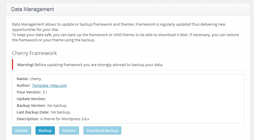
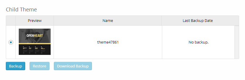
Backup can be easily done clicking "Backup" buttons under Cherry Framework and child theme blocks.
Now you can find the archive with your framework or child theme in the /wp-content/themes_backup/ folder.
You can also download it clicking "Download backup" button. If some difficulties occur, you can re-install the framework via tabs Appearance -> Themes -> Install Themes -> Upload.
Update
To update Cherry Framework, you need to the following:
- In your admin panel, open the tab "Cherry Options > Data management".
- Click Update button under Cherry Framework block
- Wait till the process begins.
- Rest Cherry Framework will do by itself.
Page Templates and Sidebars
Page Templates
- Default Template (the default page template with a sidebar position)
- Full Width Page (a page template with one column without a sidebar)
- Home Page (a page template used for the Home page)
- Filter Folio 2 cols (a page template for the custom gallery/portfolio posts displayed in 2 columns)
- Filter Folio 3 cols (a page template for the custom gallery/portfolio posts displayed in 3 columns)
- Filter Folio 4 cols (a page template for the custom gallery/portfolio posts displayed in 4 columns)
- Testimonials (a page template to display the testimonial custom posts)
- FAQs (the page template to display the FAQ posts)
- Archives (the page template for displaying archives)
Sidebar Position
- Sidebar - areas located on the right/left side of the pages
- Footer Area 1,2,3,4 (optional) - areas located at the bottom of the pages
Posts, Categories and Post Formats
Adding category
Review the following article for more information on adding categories: http://codex.wordpress.org/Manage_Categories_SubPanel
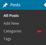
- Log into your WordPress Administration Panel (Dashboard).
- Click the Posts tab.
- With that done, click Categories for blog posts.
- Type in the name of your new category.
- After that, click the Add New Category button.
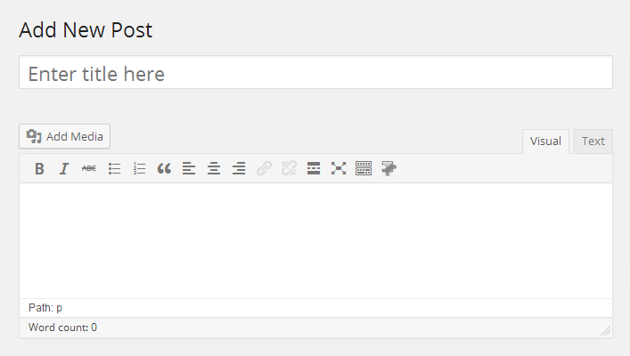
Creating a Blog post
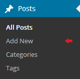
- Log into your WordPress Administration Panel (Dashboard).
- Click the Posts tab.
- Click the Add New tab.
- Type in your post content. For more information on adding posts, please check the following link http://codex.wordpress.org/Posts_Add_New_SubPanel.
Choosing a Post Format
Please review the following link for more information on different post formats: http://codex.wordpress.org/Post_Formats.
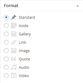
- Log into your WordPress Administration Panel (Dashboard).
- Click the Posts tab.
- To choose the post format, check the ones listed in the Format box.
Below is the list of available post formats with their descriptions and settings.
Standard Post Format
A regular, standard post has the following fields:
- Post title - post title
- Post content - post content
- Categories - post category(-ies)
- Tags - post tags
- Featured Image - post image
- and other fields which can be enabled under the Screen Options section located at the top right corner.
Standard Post Format
Aside Post Format
This is a simplified regular post version. In other words, it comes with a post content field only and you don't need to fill in the post title and other fields. This is a so called post-note.
Aside Post Format
Gallery Post Format
The main feature of this post format is the ability to maintain unlimited number of attached images.
Adding a Gallery Post Format:
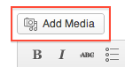
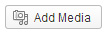
- Click the Add Media button.
- To add images from your hard drive, drag and drop your files into the box that appears or click Select Files to choose a picture from your computer to upload.
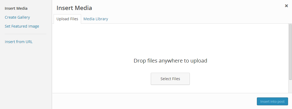
- After the images have finished uploading, you will be shown all the images in your Media Library. Select Uploaded to this post to see attached images.
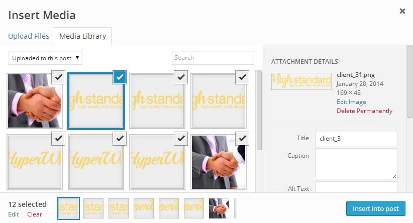
- When you’ve finished editing, you may close Media Library. The uploaded images will be attached automatically.
The gallery post format has all the standard fields (like title, content, categories, etc.) just like the regular post format.
Link Post Format
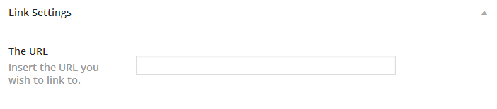
Link Post Format
After selecting the Link post format, you will get an additional URL field where you need to specify the link (URL) for the target page/resource. The Post title will be used as your link text.
If you fill in the post content field, it will be used as the target page/source description.
Image Post Format
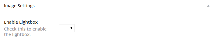
Image Post Format
An Image post format is a post format based on a single image uploaded via the Featured Image option.
Upon selecting the Image Post Format, you will be able to disable the lightbox image feature by selecting the corresponding setting in the Enable Lightbox image option.
Quote Post Format
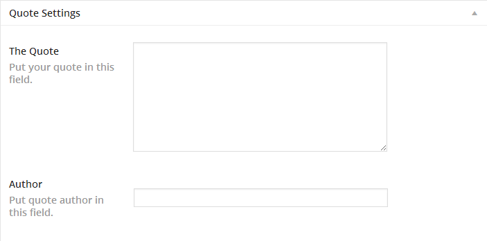
Quote Post Format
A Quote Post Format serves as a so-called post-citation. It's used to publish quotes.
Upon selecting this post format, you will get an additional The Quote field - basically the body of the quotation and an Author field - the quotation author name.
Audio Post Format
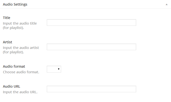
Audio Post Format
Audio Post Format is used for publishing audio content.
Upon selecting this post format, you will get the following additional options:
- Title - a track title
- Artist - an audio track performer
- Audio Format - an audio track format
- Audio URL - a direct link to the audio track
Video Post Format
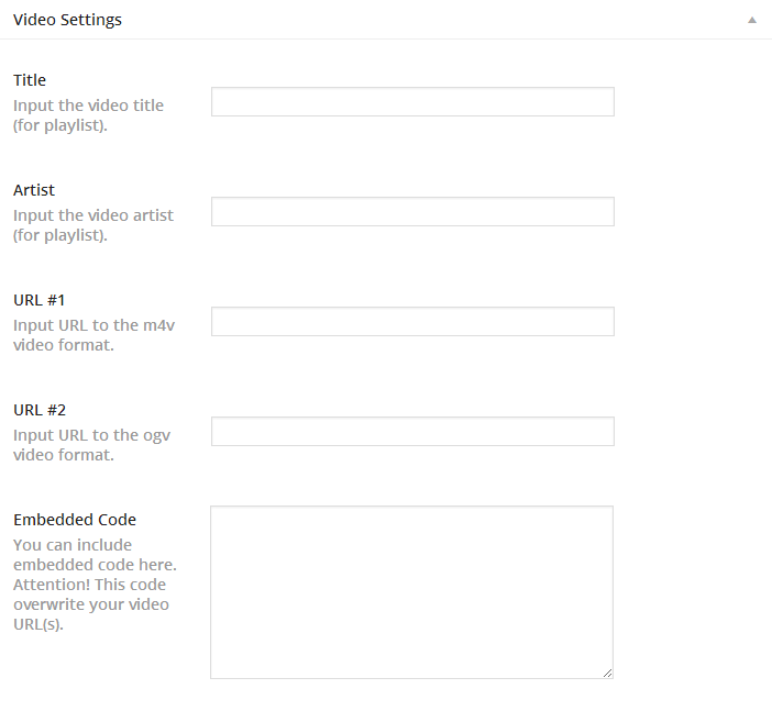
Video Post Format
A Video Post Format is used for publishing video content.
Upon selecting this post format, you will get the following additional options:
- Title - a video clip title
- Artist - a video clip performer
- URL #1 - a direct link to a video clip in m4v format
- URL #2 - a direct link to a video clip in ogv format
- Embedded Code - used for off-site video embedding, e.g. via youtube, vimeo, etc.
Creating a slider post
Slides are essentially a custom post type which means that they are different from common posts, such as blog posts. That allows us to manage the content of the site really easily.
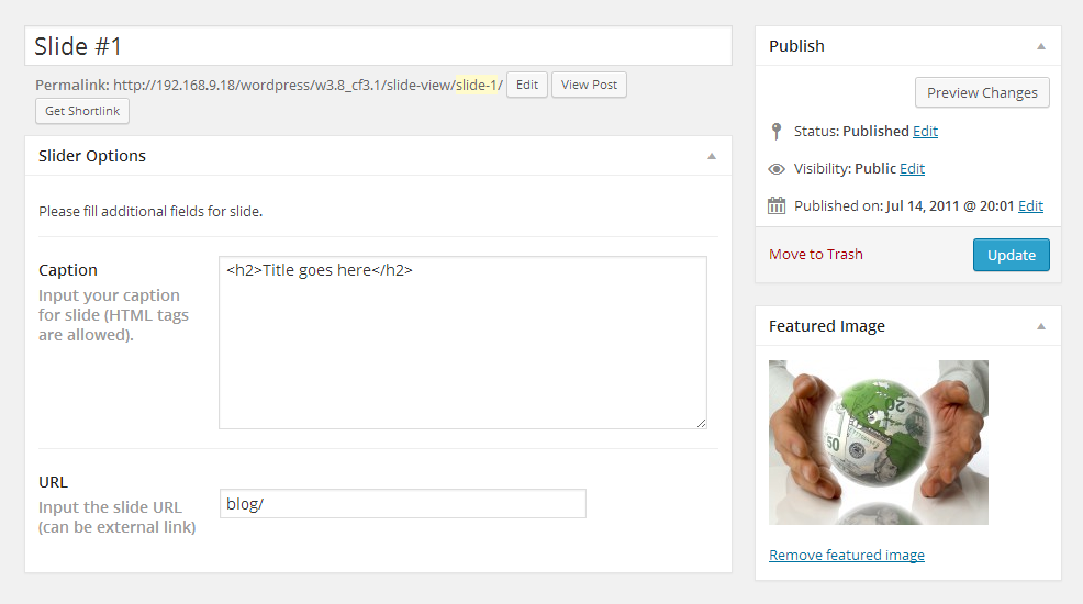
Creating a slider post
- Log into your WordPress Administration Panel (Dashboard).
- Click the Slider tab.
- And now click the Add New tab.
- Insert your slider title.
- Upload your image through the Featured Image option (click the Set featured image link).
- You can use the following fields for your slider:
- Caption - the field for the slide caption.
- URL - the field for the slide URL (you can put an external link here).
- When you are done, click the Publish button.
Adding a Portfolio post
Portfolio items are essentially a custom post type http://codex.wordpress.org/Post_Types#Custom_Types which means that they are different from common posts. That allows us to manage the content of the site really easily.
Adding a portfolio post
- Log into your WordPress Administration Panel (Dashboard).
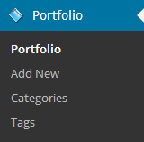
- Click the Portfolio tab.
- And now the Add New one.
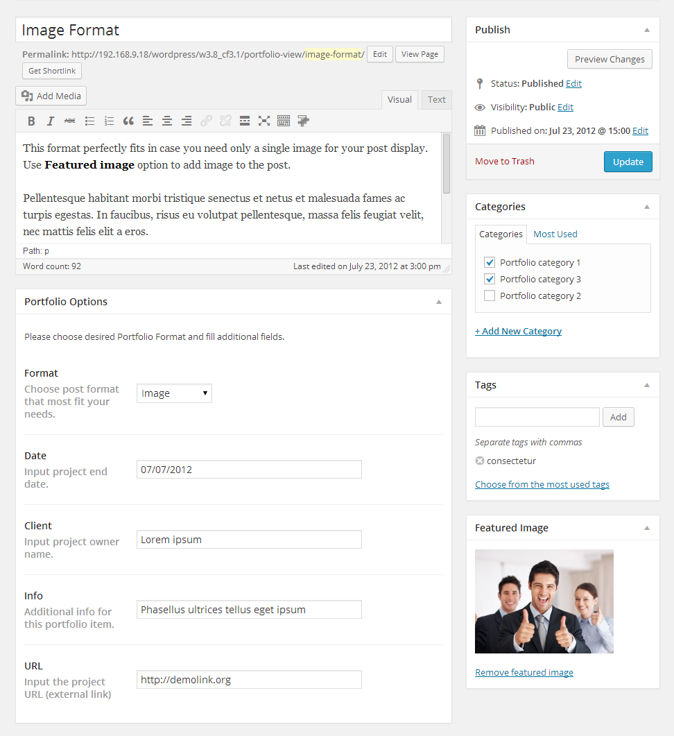
- Fill in all the required fields (title, content).
- Upload your image through the Featured Image option (click the Set featured image link).
- And click the Publish button.
Choosing Portfolio post format
Creating a portfolio post in this theme allows you to select one of the available post types.
- Image - a default gallery post format. Displays only the featured image.
- Slideshow - the project gallery is displayed as a slideshow. It can contain an unlimited number of images uploaded and attached to the post.
- Grid Gallery - post images are displayed as a gallery. Can contain an unlimited number of images uploaded and attached to the post.
- Video - in this post type you can embed a video from any video hosting (YouTube, Vimeo, etc.).
- Audio - selecting this post type, you can embed your audio link.
Adding a Testimonials post
Adding a Testimonials post
- Log into your WordPress Administration Panel (Dashboard).
- Click the Testimonials tab.
- Then click the Add New tab.
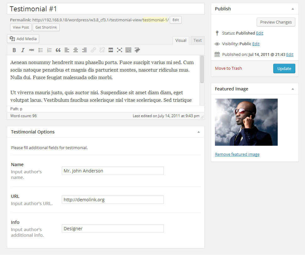
- Fill in all the required fields (title, content).
- Upload your image with the help of the Featured Image option (click the Set featured image link).
- You can use the following fields for this sort of posts:
- Name - author's name
- URL - author's link
- Info - author's additional info.
- Hit the Publish button.
Adding a FAQs post
Adding a FAQs post
- Log into your WordPress Administration Panel (Dashboard).
- Click the FAQs tab.
- And now the Add New button.
- Since it is a question/answer type of post, the title of the post is the question and the content is the answer.
- Click Publish.
Adding an Our Team post
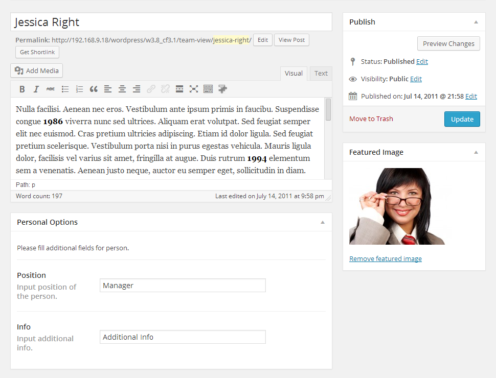
Adding an Our Team post
- Log into your WordPress Administration Panel (Dashboard).
- Click the Our Team tab.
- And now the Add New button.
- Fill in all the required fields (title, content).
- Upload your image using the Featured Image option (click the Set featured image link).
- You can use the following fields for this sort of posts:
- Position - the position of the person
- Info - additional information.
- Click Publish.
Portfolio page
Creating a Portfolio page
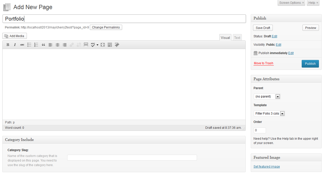
Creating a Portfolio page
Portfolio pages can be created with the help of the page templates.
- Log in to your WordPress Administration Panel (Dashboard).
- Click the Pages tab.
- Click the Add New tab.
- Type in your page name, for example Portfolio page.
- Select your page template ( Filter Folio 2 cols, Filter Folio 3 cols or Filter Folio 4 cols in the Page Attributes drop-down menu).
- With that done, click the Publish button.
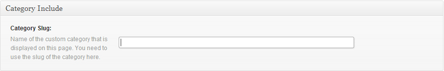
You can create a category portfolio page using the Category Include field. You need to write the slug of the category which you want to be displayed.
Shortcodes
A shortcode is a powerful content building tool http://codex.wordpress.org/Shortcode. Shortcodes are easy to use. First of all, make sure that the editing mode is set to Visual.
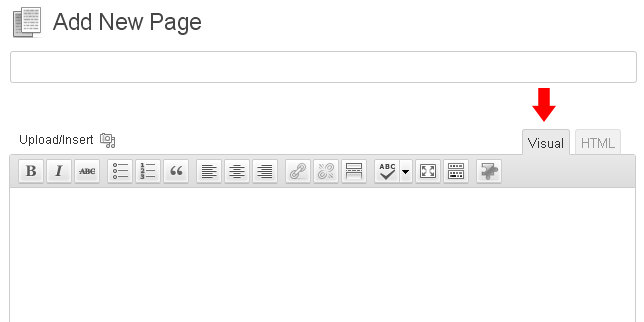
Then please click the button for the shortcodes. After that, select the shortcode you want to insert.
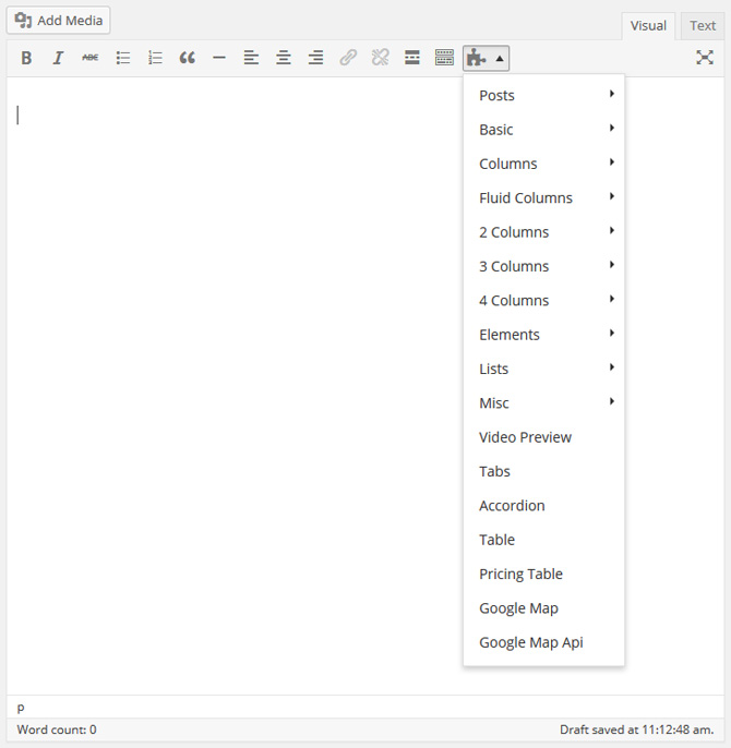
All available shortcodes are conditionally divided into these groups:
- Dynamic - used for content output (posts, custom post types, tags, etc.)
- Grid Columns - various columns for grid forming.
- Elements - additional elements for content forming.
- Other - additional elements for advanced/complex content forming.
Dynamic
Post Grid
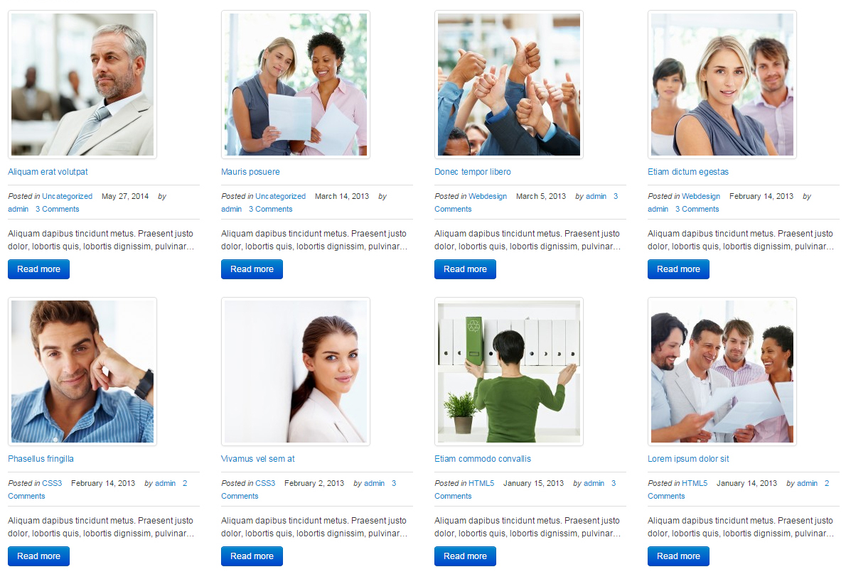
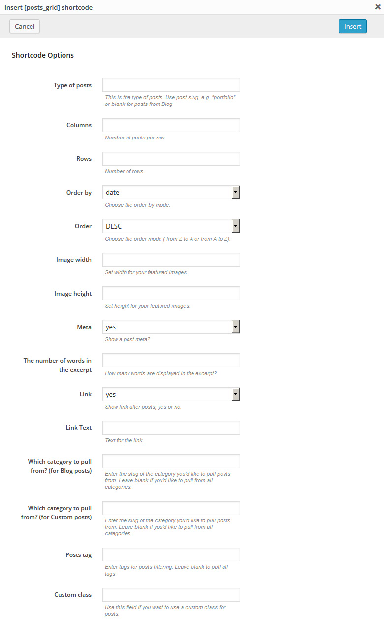
[posts_grid columns="3" rows="3" order_by="date" order="DESC" thumb_width="100" thumb_height="100" meta="yes" excerpt_count="20" link="yes" link_text="more" custom_class="custom_class"]
Description: displays standard and custom posts in table view with a configurable number of columns and rows.
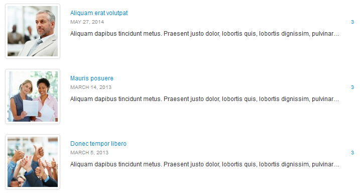
Post List
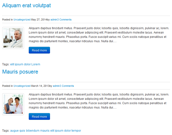
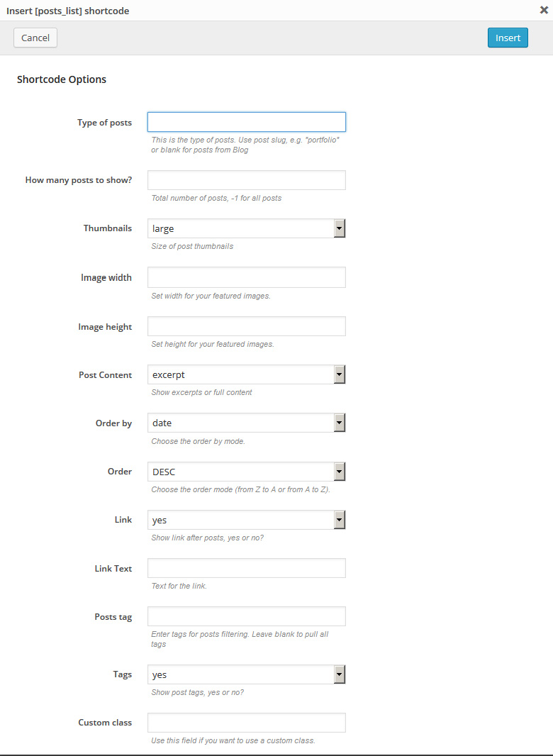
[posts_list numb="3" thumbs="large" thumb_width="100" thumb_height="100" post_content="excerpt" order_by="date" order="DESC" link="yes" link_text="more" tags="yes" custom_class="custom_class"]
Description: displays standard and custom posts as on the blog page.
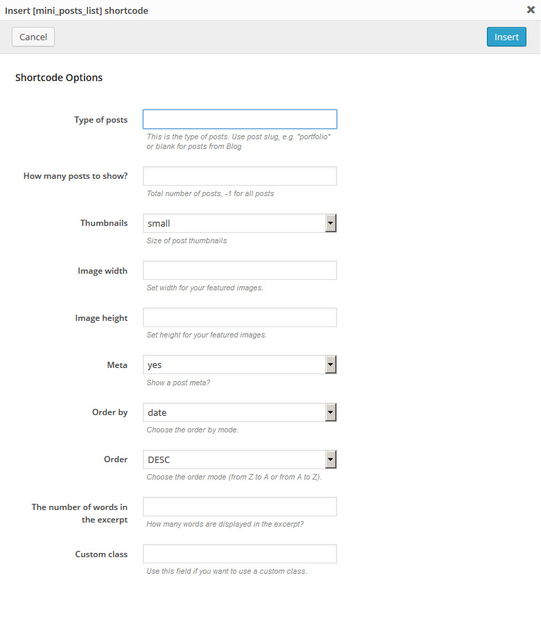
Mini Post Grid
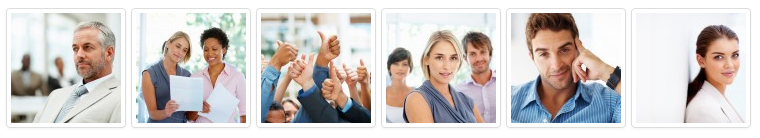
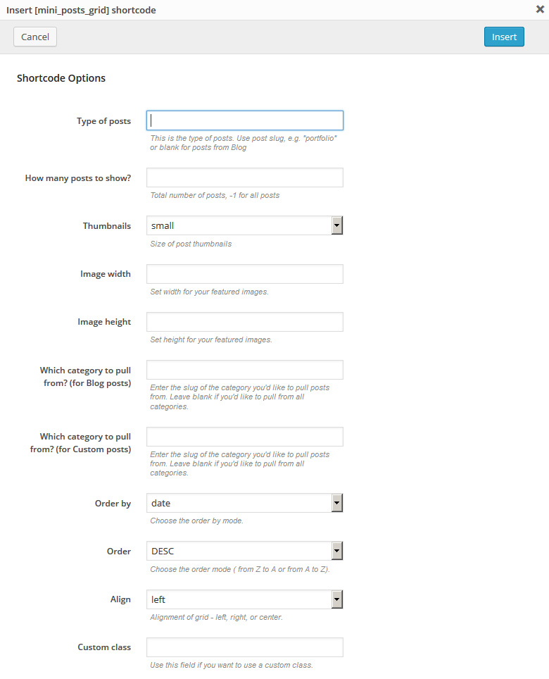
[mini_posts_grid numb="3" thumbs="small" thumb_width="100" thumb_height="100" order_by="date" order="DESC" align="left"]
Description: a more compact version of the [post_grid] shortcode. Displays the images of standard and custom posts with a configurable images size.
Mini Post List
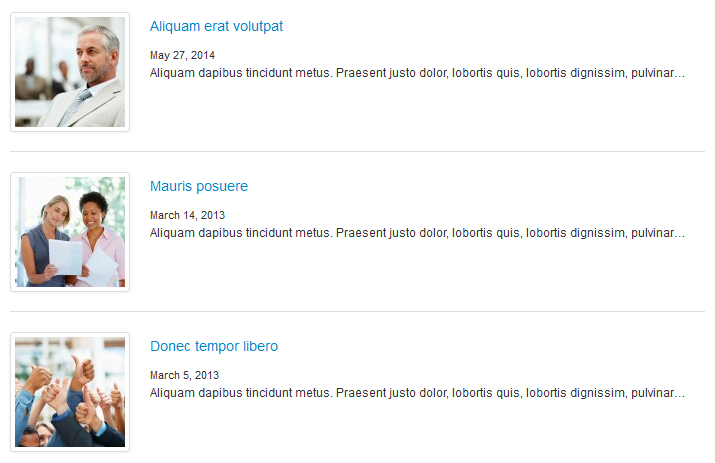
[mini_posts_list numb="3" thumbs="small" thumb_width="100" thumb_height="100" meta="yes" order_by="date" order="DESC" excerpt_count="20"]
Description: a more compact version of the [posts_list] shortcode. Displays standard and custom posts in list view.
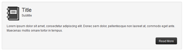
Recent Posts
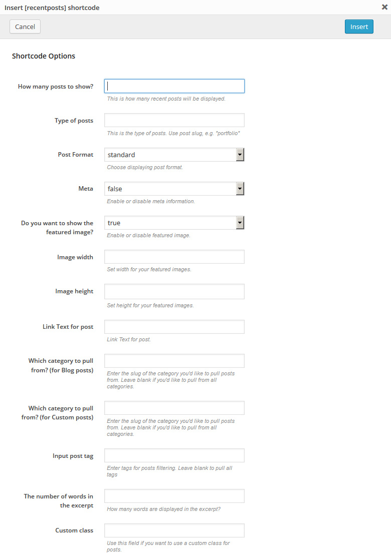
[recent_posts num="3" post_format="standard" meta="false" thumb="true" excerpt_count="20"]
Description: displays the recent posts which can be configured with the following options (post type, number of posts, post format, excerpt length, button title and others).
Recent Testimonials
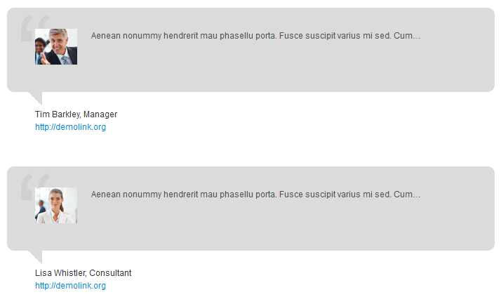
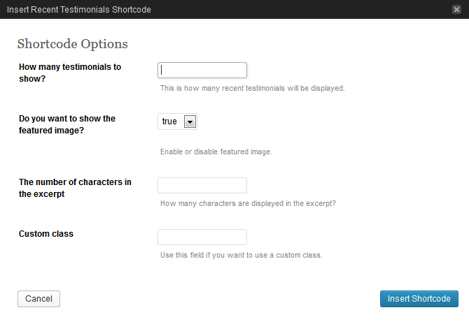
[recenttesti num="2" thumb="true"]
Description: displays the specified number of Testimonials custom post type posts, includes the ability to show/hide posts images and manage word count.
Banner
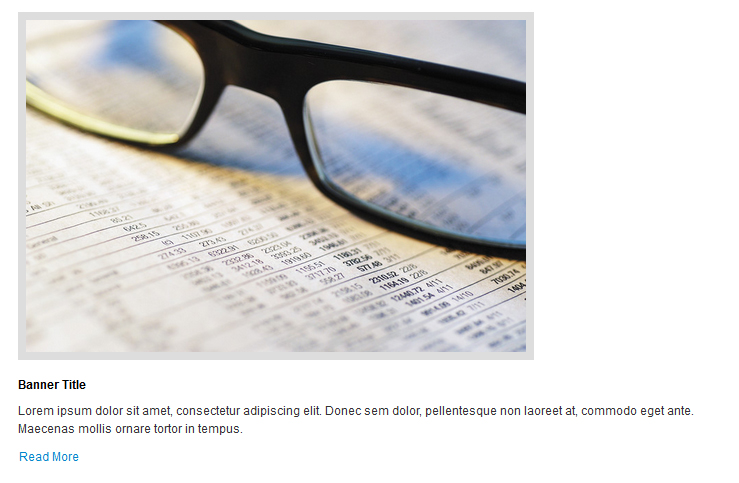
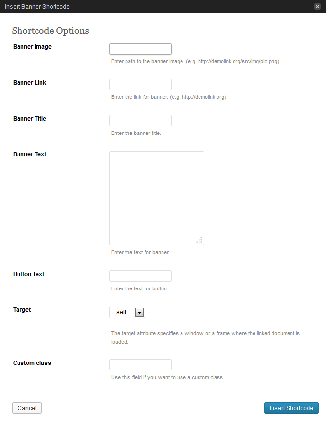
[banner img="#" banner_link="#" title="Title" text="Text" btn_text="Button" target="_self"]
Description: used to display a block with static text and/or image, title, link, etc.
Comments
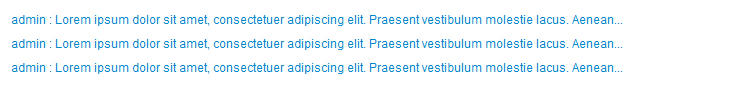
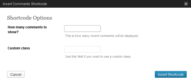
[recent_comments num="5"]
Description: displays the latest comments.
Post Cycle
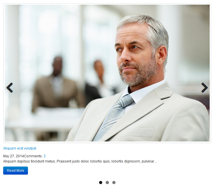
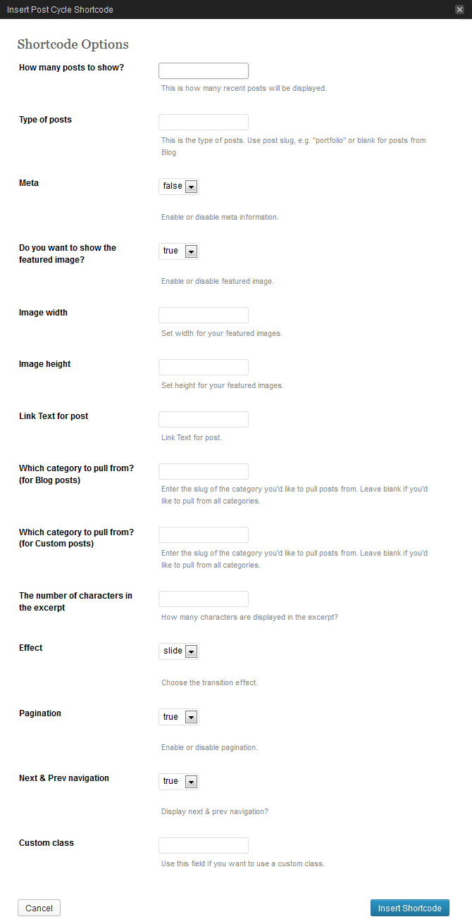
[post_cycle num="5" type="blog" meta="false" thumb="true" thumb_width="50" thumb_height="50" effect="slide"]
Description: compact display of different posts in mini-slider view.
Carousel(Elasti)
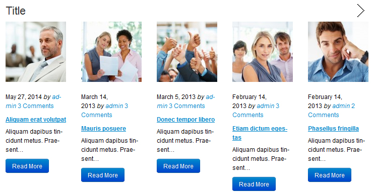
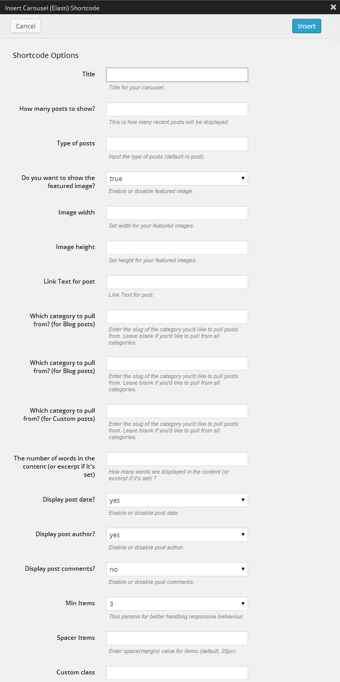
[carousel num="5" type="blog" thumb="true" thumb_width="120" thumb_height="50" date="yes" author="yes" min_items="3"]
Description: displays the posts in carousel view, has various additional options.
Carousel(OWL)
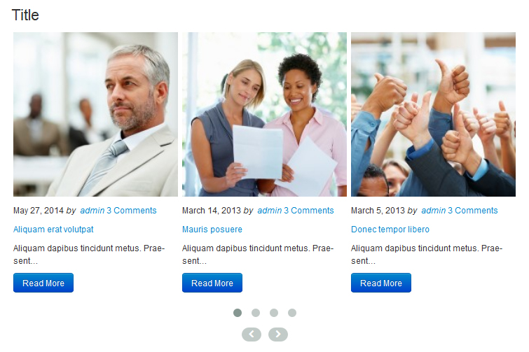
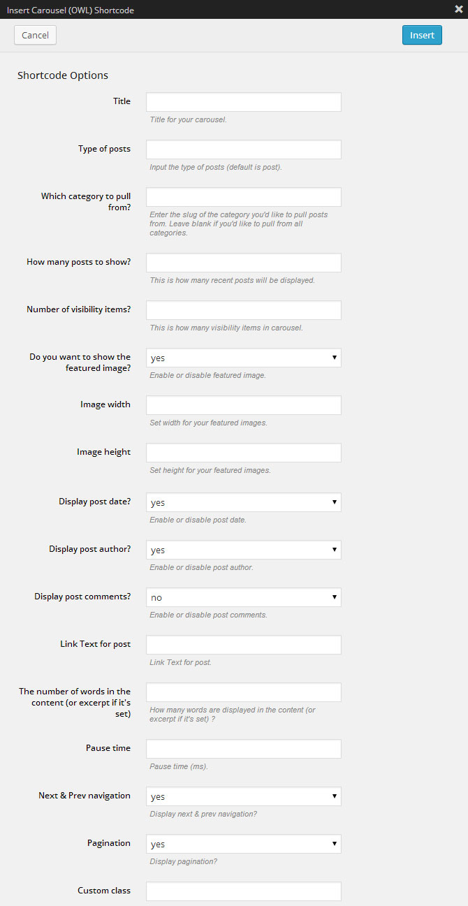
[carousel_owl title="Title" post_type="blog" posts_count="5" visibility_items="3" thumb="yes" thumb_width="200" thumb_height="200" date="yes" author="yes" comments="no" excerpt_count="10" display_navs="yes" display_pagination="yes"]
Description: displays the posts in carousel view, has various additional options.
Roundabout

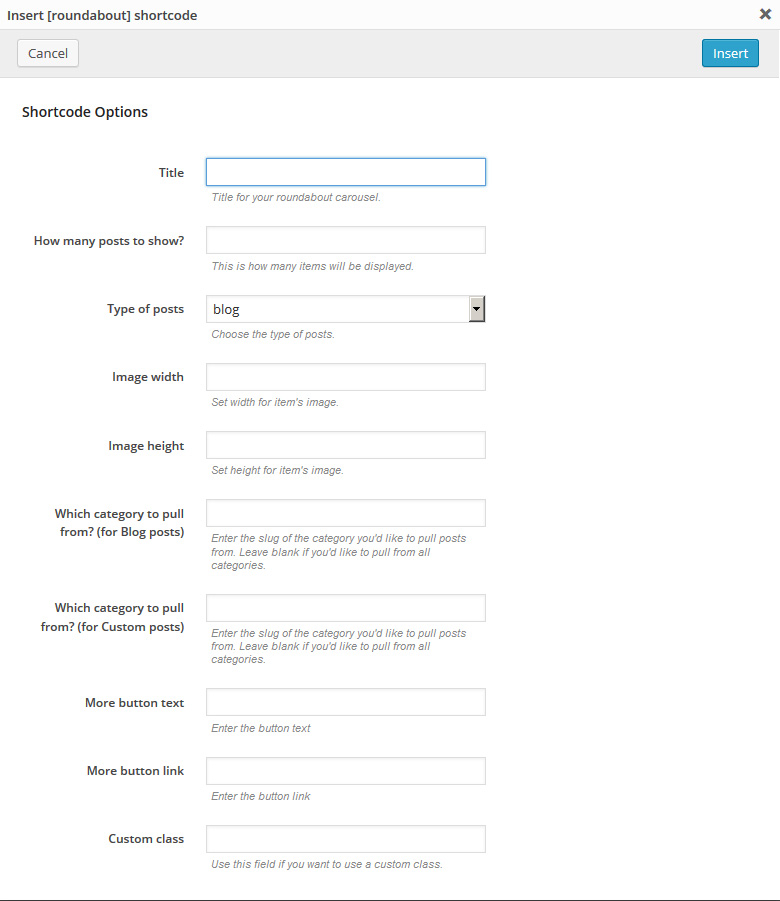
[roundabout title="Title" num="3" type="blog"]
Description: Roundabout is a jQuery plugin that converts a structure of static HTML elements into a highly customizable turntable-like interactive area.
Service Box
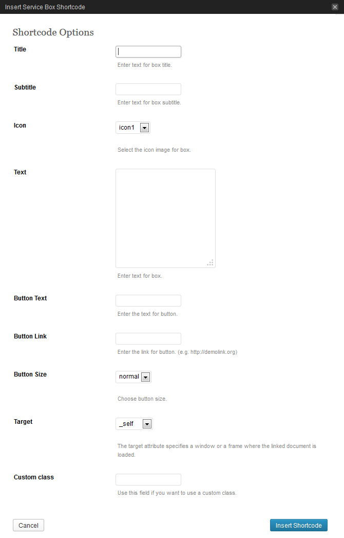
[service_box title="Title" icon="icon1" text="Your text" btn_text="Button" btn_link="#" btn_size="normal" target="_self"]
Description: used to display information blocks that include title, icon, text, button. The main feature of this shortcode is the existence of pre-installed icons.
Hero unit
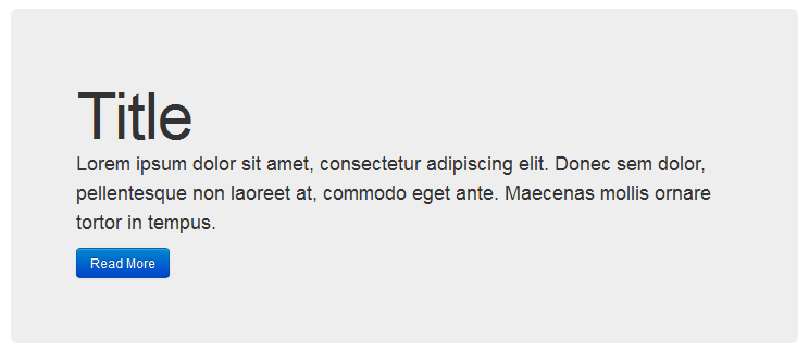
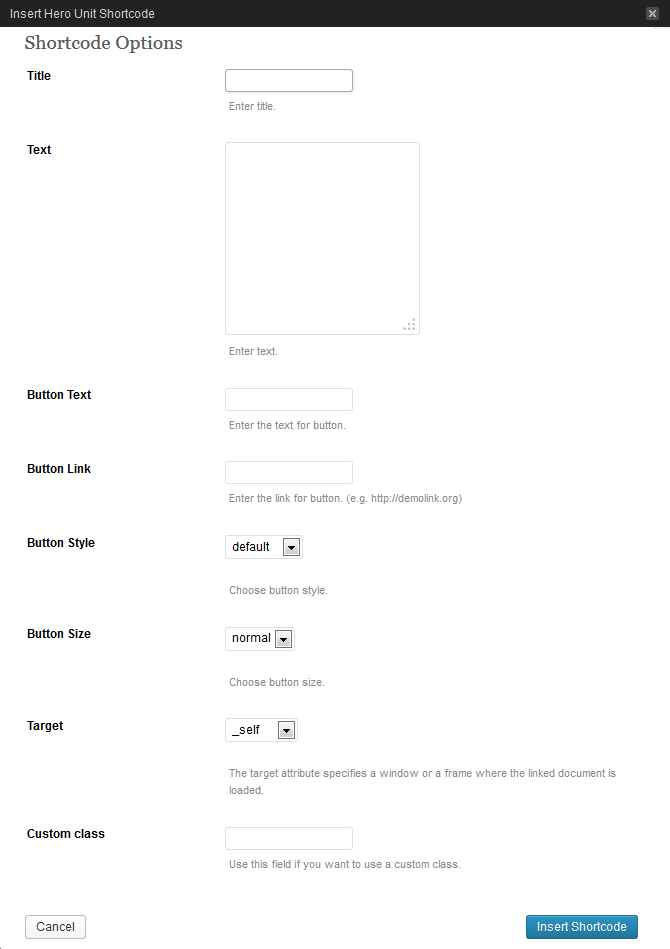
[hero_unit title="Title" text="Text" btn_text="Button" btn_link="#" btn_style="default" btn_size="normal" target="_self"]
Description: used to display major website information, promotions, etc. Usually located on the main website page, right after the header.
Categories
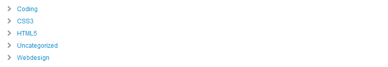
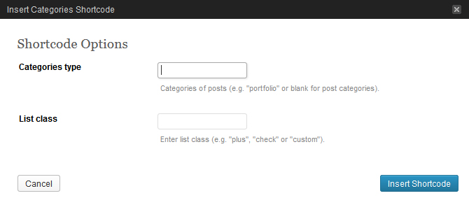
[categories class="plus"]
Description: used to display the categories.
Tags

[tags]
Description: used to display the tags.
Columns
Grid Columns (span1-12)
[span#] [/span#]
Description: used for the formation of structural grid elements, where # is a number from 1 to 12, which defines the element width.
[row]
[span6] Your Content... [/span6]
[span6] t... [/span6]
[/row]
Note, when forming a grid, you should "wrap" grid elements into [row] shortcode:
Fluid Columns (one_half, one_third...)
[one_half] [/one_half]
Description: used to form structural grid elements, where the grid elements width is delineated with %.
[row_fluid]
[five_sixth] Your content... [/five_sixth]
[one_sixntent... [/one_sixth]
[/row_fluid]
Note, when forming a fluid grid you should "wrap" grid elements into the [row_fluid] shortcode:
Multiple Columns (75% / 25%, etc.)
[row]
[span8] t... [/span8]
[span4] Your content... [/span4]
[/row]
Multiple Columns shortcodes are used to simplify content forming by inserting the most common grid variants.
Custom classes
[row custom_class="custom-row"]
[span8 custom_class="custom-span8"] content [/span8]
[span4 custom_class="custom-span4"] content [/span4]
[/row]
You can also add custom classes to Columns category shortcodes. This expands customization options for specific blocks.
Elements
Label

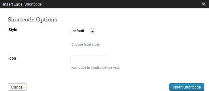
[label style="default"]label[/label]
Description: used to display a label with pre-defined styling.
Highlight

[highlight]Text[/highlight]
Description: used to highlight a chosen text fragment.
Button

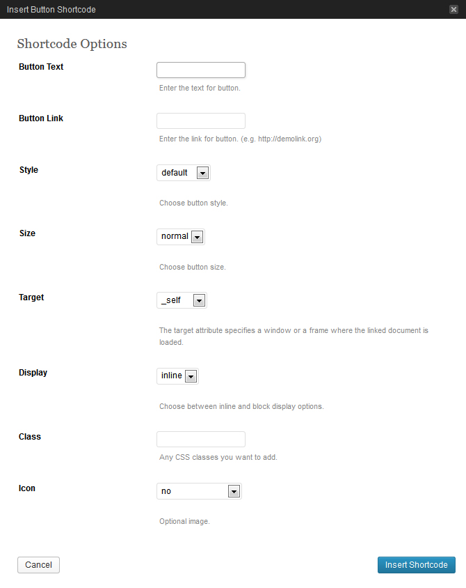
[button text="Text" link="#" style="default" size="normal" target="_self" display="inline" icon="no"]
Description: used to insert a button with various display settings (style, size, icon, etc.).
Dropcap

[dropcap]L[/dropcap]
Description: used to display a dropped capital letter.
Icon
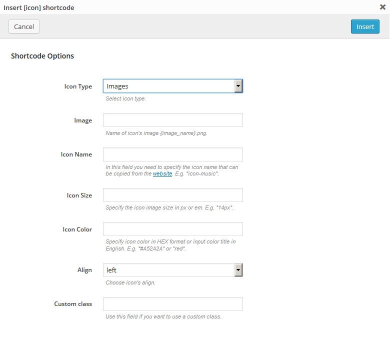
[icon image="#" align="left"]
Description: used to display a simple icon.
Horizontal rule

[hr]
Description: used to display a horizontal line.
Small Horizontal rule

[sm_hr]
Description: used to display an alternative horizontal line with a smaller margin.
Vertical Rule

[vr]
Description: used to display a vertical line.
Spacer
[spacer]
Description: used to set vertical spacing between elements.
Progress bar

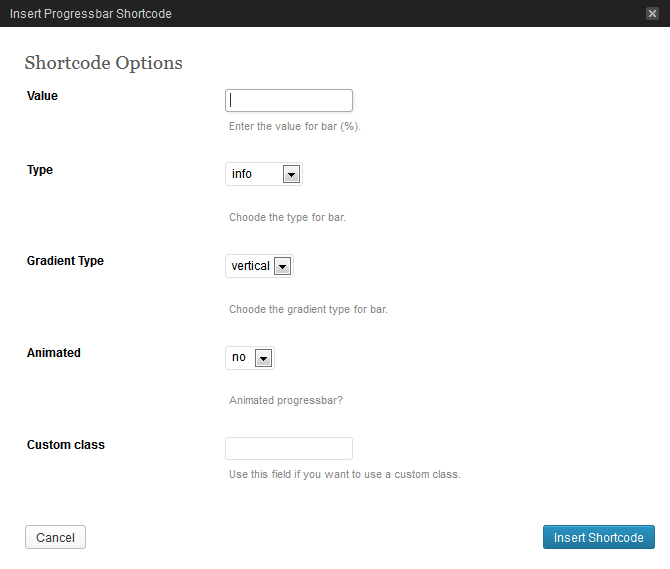
[progressbar value="20" type="info" grad_type="vertical" animated="no"]
Description: used to display an indicator of some process completion.
Address
[address] Your address here [/address]
Description: used as some container for the address.
Clear
[clear]
Description: used for the re-zeroing of element flow around.
Lists shortcodes (unstyled, check, check2, arrow, arrow2, star, plus, minus)
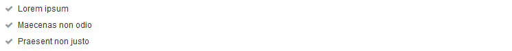
[check_list] List here ... [/check_list]
Description: a set of shortcodes used to display various lists stylizations. Each shortcode implements its own marker for the list items.
Extra Wrap
[extra_wrap][/extra_wrap]
Description: Shortcode for wrapping content with block with overflow:hidden.
Content Box
[content_box custom_class="custom_content_box"][/content_box]
Description: Shortcode for wrapping content with block with pseudo classes :before and :after for displaying full width block.
Other
Video Preview
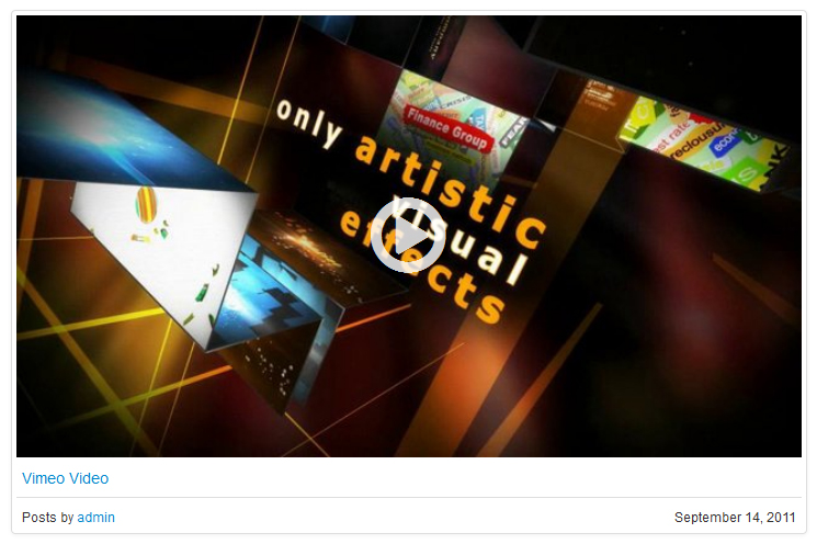
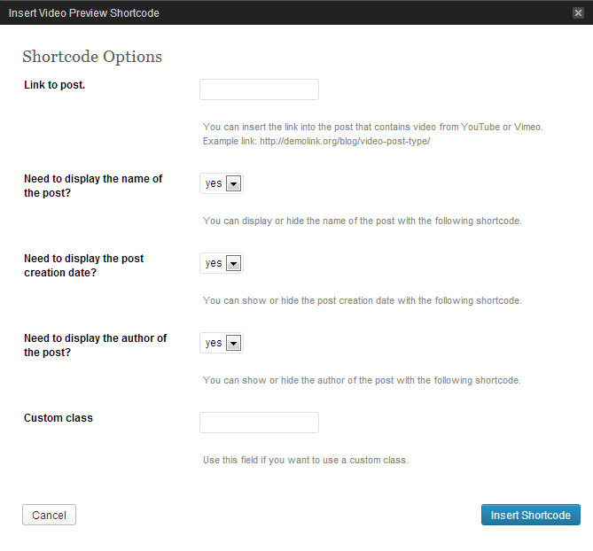
[video_preview post_url="http://demolink.org/blog/video-post-type/" title="yes" date="yes" author="yes"]
Description: used to insert video preview, which can be loaded from the off-site services (youtube, vimeo) or from your website (self hosted).
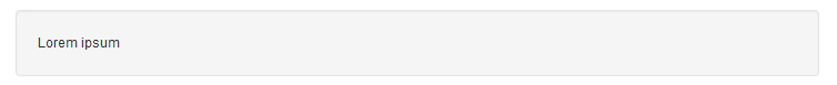
Alert Boxes (message, info, success, danger)

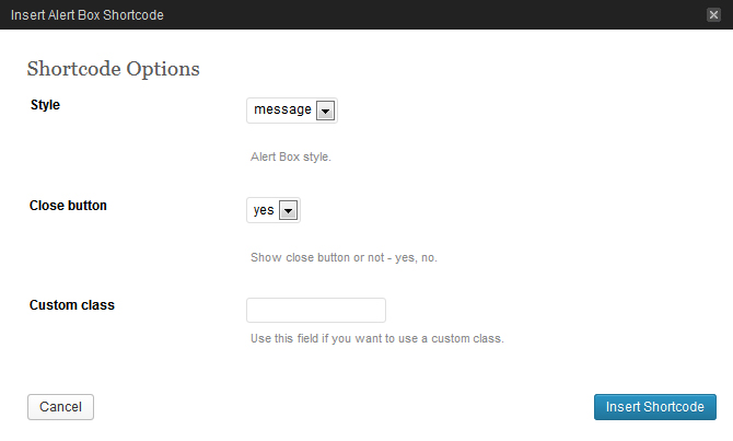
[alert_box style="message" close="yes"]Hello, World![/alert_box]
Description: a shortcodes set used to display service messages.
Well
[well size="well-normal"] Your text here... [/well]
Description: used to insert a stylized container.
Small

[small] Your text here... [/small]
Description: used to insert a text block with a smaller font size.
Title Box

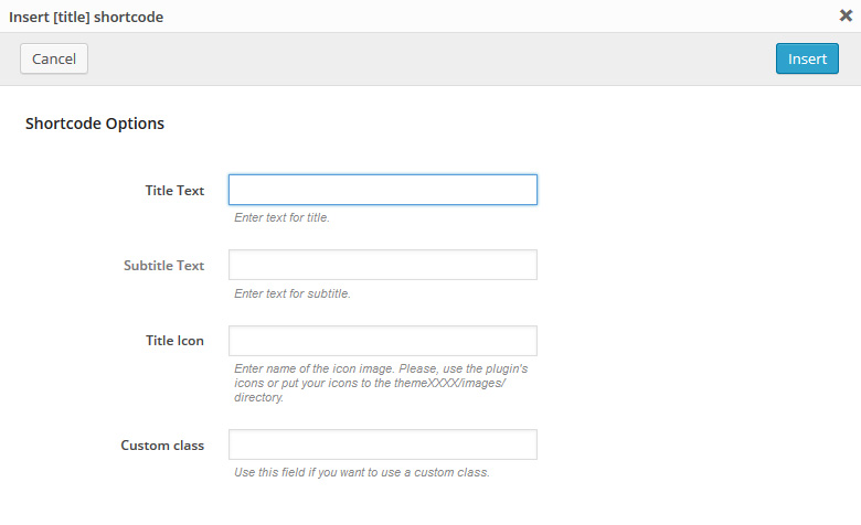
[title_box title="Title" subtitle="subtitle text" icon="#"]
Description: used to display double title: the main title text and an additional one.
Tabs
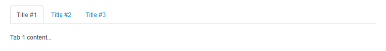
[tabs direction="top" tab1="Title #1" tab2="Title #2" tab3="Title #3"] [tab1] Tab 1 content... [/tab1] [tab2] Tab 2 content... [/tab2] [tab3] Tab 3 content... [/tab3] [/tabs]
Description: used to display content arranged into tabs. Tabs may contain static and dynamic content.
Accordion
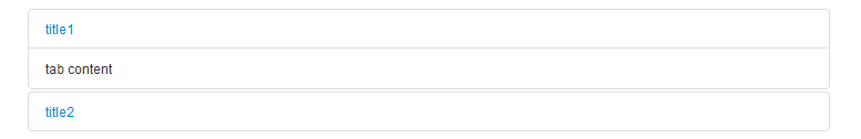
[accordions] [accordion title="title1" visible="yes"] tab content [/accordion] [accordion title="title2"] another content tab [/accordion] [/accordions]
Description: used to display an accordion - fold up panels with titles.
Table
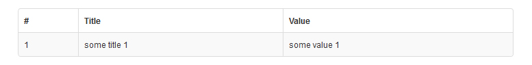
[table td1="#" td2="Title" td3="Value"] [td1] 1 [/td1] [td2] some title 1 [/td2] [td3] some value 1 [/td3] [/table]
Description: used to display a table.
Template URL
[template_url]
Description: shows the link to your website.
Sitemap
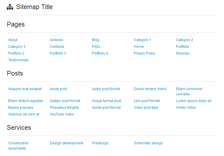
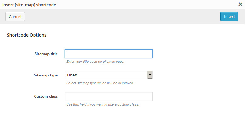
[site_map title="Sitemap" type="Lines" custom_class="custom_class"]
Description: shortcode that shows sitemap.
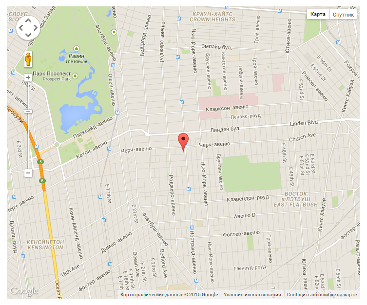
Google Map
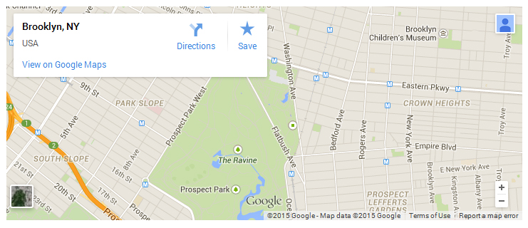
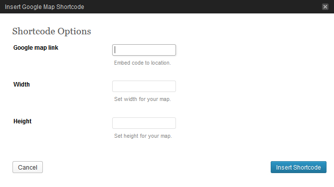
[map src="#" width="300" height="200"]
Description: adds Google Maps to page. In order to make this shortcode work, you should insert the link with required coordinates from Google site.
Google Map Api
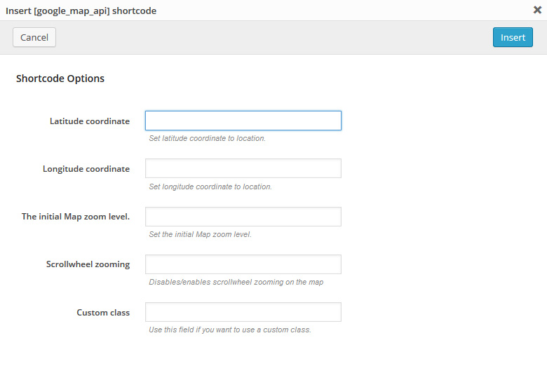
[google_map_api lat_value="45" lng_value="-80" zoom_value="8" zoom_wheel="no" custom_class="custom-class "]
Description: allows to add and customize Google Maps API. Detailed description for Google Maps configuring is available at Google Maps JavaScript API.
Pricing table
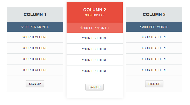
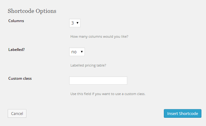
[chp_pricing_table columns="3" labelled="yes"]

[chp_pricing_column_label title="Features"]
[chp_pricing_row_label odd="true"] Label 1 [/chp_pricing_row_label]
[chp_pricing_row_label] Label 2 [/chp_pricing_row_label]
[chp_pricing_row_label odd="true"] Label 3 [/chp_pricing_row_label]
[chp_pricing_row_label] Label 4 [/chp_pricing_row_label]
[/chp_pricing_column_label]

[chp_pricing_column title="Column 1" price="100" currency_symbol="$" interval="Per Month"]
[chp_pricing_row_label] Label 1 [/chp_pricing_row_label]
[chp_pricing_row odd="true"] Your text here [/chp_pricing_row]
[chp_pricing_row_label] Label 2 [/chp_pricing_row_label]
[chp_pricing_row] Your text here [/chp_pricing_row]
[chp_pricing_row_label] Label 3 [/chp_pricing_row_label]
[chp_pricing_row odd="true"] Your text here [/chp_pricing_row]
[chp_pricing_row_label] Label 4 [/chp_pricing_row_label]
[chp_pricing_row] Your text here [/chp_pricing_row]
[button text="Sign Up" link="#" style="default" size="normal" target="_self" display="inline" icon="no"]
[/chp_pricing_column]

[chp_pricing_column title="Column 2" highlight="true" highlight_reason="Most Popular" price="200" currency_symbol="$" interval="Per Month"]
[chp_pricing_row_label] Label 1 [/chp_pricing_row_label]
[chp_pricing_row odd="true"] Your text here [/chp_pricing_row]
[chp_pricing_row_label] Label 2 [/chp_pricing_row_label]
[chp_pricing_row] Your text here [/chp_pricing_row]
[chp_pricing_row_label] Label 3 [/chp_pricing_row_label]
[chp_pricing_row odd="true"] Your text here [/chp_pricing_row]
[chp_pricing_row_label] Label 4 [/chp_pricing_row_label]
[chp_pricing_row] Your text here [/chp_pricing_row]
[button text="Sign Up" link="#" style="default" size="normal" target="_self" display="inline" icon="no"]
[/chp_pricing_column]

[chp_pricing_column title="Column 3" price="300" currency_symbol="$" interval="Per Month"]
[chp_pricing_row_label] Label 1 [/chp_pricing_row_label]
[chp_pricing_row odd="true"] Your text here [/chp_pricing_row]
[chp_pricing_row_label] Label 2 [/chp_pricing_row_label]
[chp_pricing_row] Your text here [/chp_pricing_row]
[chp_pricing_row_label] Label 3 [/chp_pricing_row_label]
[chp_pricing_row odd="true"] Your text here [/chp_pricing_row]
[chp_pricing_row_label] Label 4 [/chp_pricing_row_label]
[chp_pricing_row] Your text here [/chp_pricing_row]
[button text="Sign Up" link="#" style="default" size="normal" target="_self" display="inline" icon="no"]
[/chp_pricing_column]

[/chp_pricing_table]
Description: used to display Pricing tables.
Audio / Video
Description: WordPress 3.6+ has great support for embedding YouTube and Vimeo videos, but if you want to play a video or audio file, like an MP3 or MP4 file, that has been uploaded to a server, you need to implement some kind of player so that the file would appear as media rather than a link on your site. Read More
The process is similar to inserting an image into your post content:- Add or edit a page or post.
-
Click in your content where you want the player to appear, then hit Add Media above the content editor.
- Click Upload Files.
- Upload an audio or video file.
-
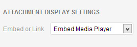
Make sure the file you uploaded is selected, then under Attachment Display Settings, set Embed or Link to "Embed Media Player."
- Click Insert into page.
WordPress will have inserted a shortcode for your audio or video that will be replaced with the player.
Maybe you uploaded an audio or video file to another server, for example Amazon S3 or a file hosting service. Just enter the URL to your media file (unlinked) on a line of its own. For example, you want to embed a YouTube video. Simply paste that into your content on a line of its own and the YouTube player will show in its place when you publish. Be sure that the URL is not linked.
http://www.youtube.com/watch?v=mmRPSoDrrFU
That simple line above becomes this:
Plugins and Custom Widgets
Plugins
Note: your theme may not contain some plugins listed below.
Contact Form 7
Download: http://wordpress.org/extend/plugins/contact-form-7/
Description: Contact form for the contact page.
Newsletter Sign-Up
Download: http://wordpress.org/plugins/newsletter-sign-up/
Description: Adds various ways for your visitors to sign up to your mailing list (checkbox, widget, form).
Widgets
The following widgets are also used in the theme:
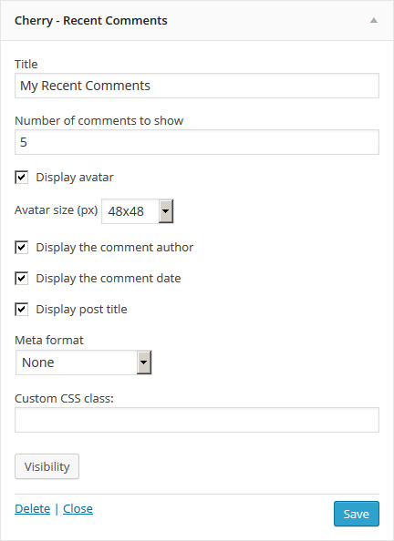
Cherry - Recent Comments
Displays recent comments in a more convenient format. The given widget includes the following options:
- Title: - widget Title
- Number of comments to show: - number of comments to show
- Display avatar: - display avatar
- Avatar size (px): - You can choose avatar size
- Display the comment author: - display the comment author
- Display the comment date: - display the comment date
- Display post title: - display post title
- Meta format: - the output format of meta data
- Custom CSS class: - widget custom class
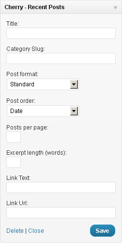
Cherry - Recent Posts
Displays your recent posts. You can also show custom posts of certain categories and add a read more link. The given Widget contains the following options:
- Title: - Widget Title
- Category Slug: - Post Category Slug.
- Post Format: - Choose Post Format for displaying posts.
- Post Order: - You can choose the order for displaying posts.
- Posts per page: - The number of posts to display.
- Excerpt length (words): - excerpt length (the number of words).
- Link Text: - the Link Text that is displayed after the Recent Posts.
- Link Url: - the Link URL that is displayed after the Recent Posts.
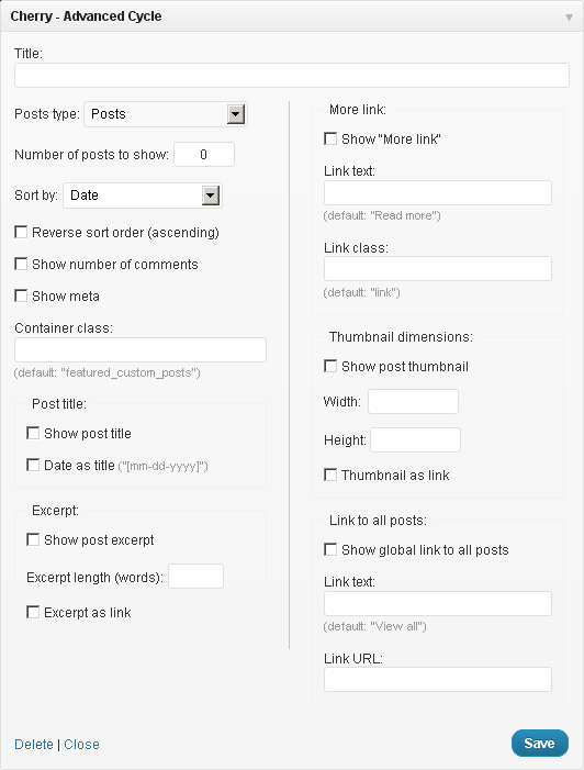
Cherry - Advanced Cycle
This multifunctional widget is used to display different post types including the blog posts. Highly customizable, it has the functionality of changing display settings. This widget contains the following options:
- Title: - Widget Title
- Posts type: - select posts type
- Number of posts to show: - the number of posts
- Sort by: - post selection option
- Reverse sort order (ascending): - reverse sort order
- Show number of comments - show the number of comments
- Show meta - show meta
- Container class: - wrapper class. Set to featured_custom_posts by default.
- Show post title - show post title
- Date as title - for using the date instead of the title
- Before title: - custom HTML-markup before the title
- After title: - custom HTML-markup after the title
- Show post excerpt - show excerpt
- Excerpt length (words) - excerpt length (the number of words)
- Excerpt as link - convert excerpt into a link
- Show "More" link - show link More after the post
- Link text: - link text
- Link class: - CSS-class for the More link
- Show post thumbnail - show thumbnail for a post
- Width: - image width
- Height: - image height
- Thumbnail as link - convert the image into a link
- Show global link to all posts - Show global link to all posts
- Link text: - the text of the given link
- Link URL: - link URL.
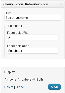
Cherry - Social Networks
This is the widget that allows linking to your social network accounts. The widget contains the following options:
- Title: - Widget Title
- Facebook URL, Twitter URL, Flickr URL, etc. - the links to your Social Network accounts
- Display: the way icons are displayed
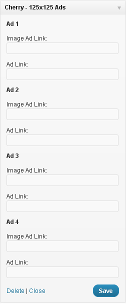
Cherry - 125x125 Ads
This is the Widget that allows you to show a set of banners. The widget contains the following options:
- Title: - Widget Title
- Image Ad link: - path to your banner image
- Add link: - your banner link.
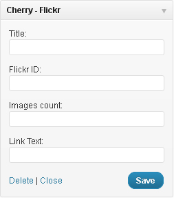
Cherry - Flickr
This widget allows you to display photos from your Flickr gallery. It contains the following options:
- Title: - Widget Title
- Flickr ID: - your flickr ID
- Images count: - the number of photos to show
- Link Text: - the link text under your flickr photos.
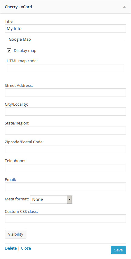
Cherry - vCard
This widget allows you to display information about your company or about you. It contains the following options:
- Title (optional): - Widget Title
- Google Map: - display map
- HTML map code: - field to enter HTML code Google maps
- Street Address: - put your street address here
- City/Locality: - enter your city or location here
- State/Region: - enter your state or region here
- Zipcode/Postal Code: - enter your zipcode or postal code here
- Telephone: - telephone number
- Email: - your email.
- Meta format: - the output format of meta data
- Custom CSS class: - widget custom class
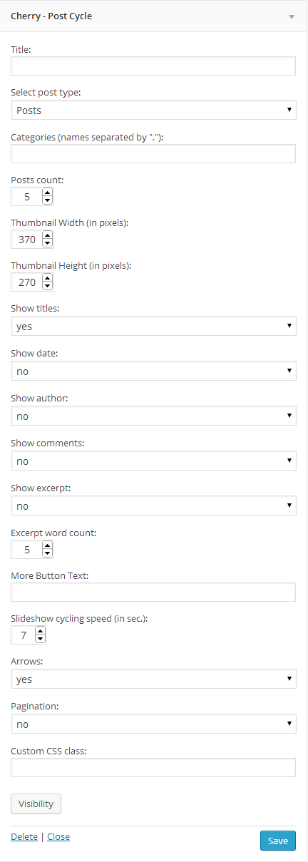
Cherry - Post Cycle
This widget allows you to display information about your company or about you. It contains the following options:
- Title (optional): - Widget Title
- Post type: - Select post format
- Categories: - Select categories to display posts from
- Posts count: - number of displayed post
- Thumbnail Width (in pixels): - width of post thumbnail
- Thumbnail Height (in pixels): - height of post thumbnail
- Show titles: - display post titles
- Show date: - display post date
- Show author: - display author
- Show comments: - display post comments
- Show excerpt: - display post excerpt
- Excerpt word count: - number of words displayed in excerpt
- More Button Text: - text for the more button
- Slideshow cycling speed (in sec.): - slideshow speed in milliseconds
- Arrows: - display slider arrows
- Pagination: - display slider pagination
- Custom CSS class: - widget custom class
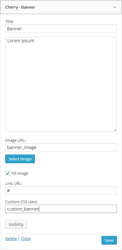
Cherry - Banner
Widget is used to display banner. It contains the following options:
- Title (optional): - Widget Title
- Banner description: - Widget Banner description
- Image URL: - Background source image
- Fill image: - Option for switching between two banner display options: resizing image to make it fit banner dimensions as a background or putting image above banner content
- Link URL: - link URL
- Custom CSS class: - widget custom class
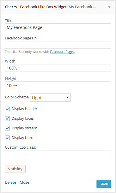
Cherry - Facebook Like Box Widget
This widget is used to display Facebook pages. It contains the following options:
- Title (optional): - Widget Title
- Facebook page url: - url your Facebook Page
- Width: & Height: - Widget size
- Color Scheme: - Color Scheme(Light/Dark)
- Display header: - enable/disable header
- Display faces: - enable/disable faces
- Display stream: - enable/disable stream
- Display border: - enable/disable border
- Custom CSS class: - widget custom class
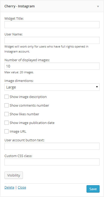
Cherry - Instagram
Widget is used to display recent Instagram posts. It contains the following options:
- Widget Title: (optional): - Widget Title
- User Name: (required field) - Instagram User Name(Widget will work only for users who have full rights opened in Instagram account.)
- Number of displayed images: - Number of displayed images(Max value: 20 images.)
- Image dimensions: - the size of the displayed image(Large/Thumbnail)
- Show image description: - enable/disable image description
- Show comments number: - enable/disable comments number
- Show likes number: - enable/disable likes number
- Show image publication date: - enable/disable image publication date
- Show Image URL: - enable/disable Image URL
- User account button text: - text profile link Instagram
- Custom CSS class: - widget custom class
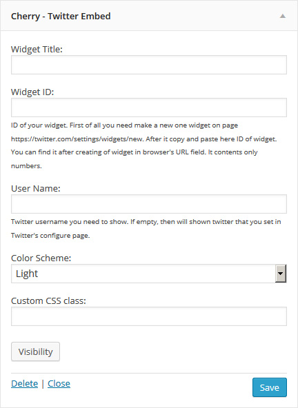
Cherry - Twitter Embed
This widget allows to display recent entries (tweets). It includes the following options:
- Widget Title: - title of the widget
- Widget ID: - type your widget ID here. First of all you need to create a new widget here. Then insert widget ID to the appropriate field.
- User Name: - Twitter username.
- Color Scheme: - color scheme (light/dark)
- Custom CSS class: - custom css class of te widget
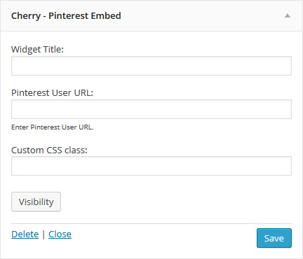
Cherry - Pinterest Embed
This widget allows to display themed collections. It includes the following options:
- Widget Title: - title of the widget
- Pinterest User URL: - type Pinterest account URL here
- Custom CSS class: - custom css class of the widget
Cherry Options
The following theme contains the Settings option. These settings allow you to change the theme’s color palette, order of items, turn items on/off and do lots of other things. In order to use these settings, please go to Appearance → Cherry Options.
General
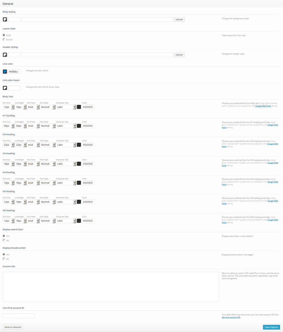
- Body styling - you can select the body color and the background pattern.
- Layout Style: - you can select layout for Your site(wide/boxes style)
- Header styling: - Header background image and fill color.
- Buttons and links color - Buttons and links color.
- Buttons and links hover color - Buttons and links hover color.
- Body Text - You can choose your preferred font for body text. The following options are available for editing the fonts:
Note: Font marked with an asterisk (*) means that it will be loaded from the Google Web Fonts library.
- H1-H6 Headings - You can choose your preferred font for headings and titles. The following options are available for editing the fonts:
Note: Font marked with * means that it will be loaded from the Google Web Fonts library.
- Display search box? - show/hide the search bar in the header.
- Display breadcrumbs? - show/hide the breadcrumbs in the pages.
- Custom CSS - if you need to add some CSS rules, but you don't want to mess with the main CSS file, you can use this field. Just insert your new css rules.
- Live Chat account ID - Your Olark live chat account ID
Logo & Favicon
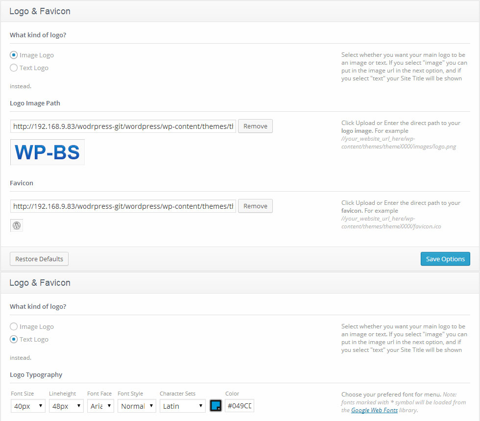
- What kind of logo? - indicates what kind of logo to use, the text one or the image logo.
- Logo URL - with Image logo selected, you can upload the new image with the help of the 'upload' feature or use any picture from the Media Library.
- Logo Typography - You can choose your preferred font for the text logo. The following options are available for editing the fonts:
Note: an asterisk * near the font means that the font will be loaded from the Google Web Fonts library.
- Favicon - you can upload the new favicon with the help of the 'upload' feature or use any picture from the Media Library.
Navigation
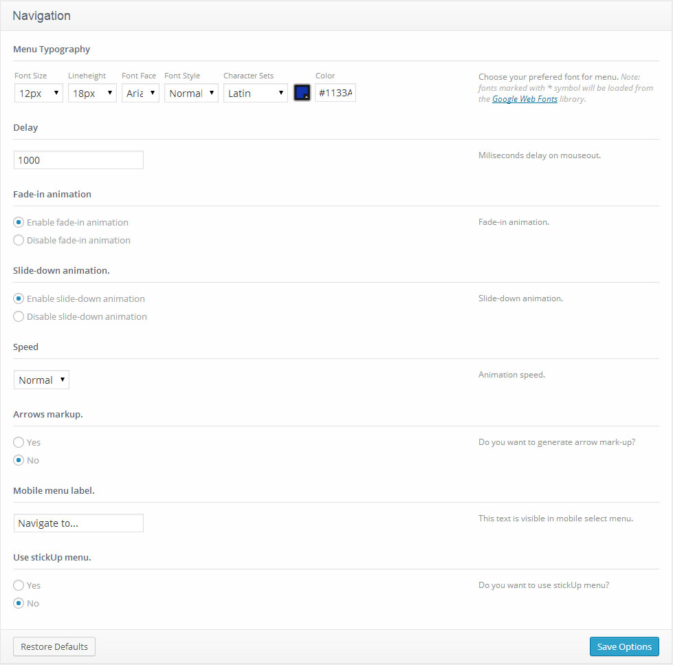
- Menu Typography - You can choose your preferred font for the main menu. The following options are available for editing the fonts:
Note: an asterisk * near the font means that the font will be loaded from the Google Web Fonts library.
- Delay - delay in milliseconds that defines when the menu hides
- Fade-in animation - enable/disable the fade-in animation
- Slide-down animation - enable/disable the slide animation
- Speed - the speed of the sub-menu expanding
- Arrows markup - enable/disable arrows for the menu items that have sub-menus
- Mobile menu label - This text is visible in mobile select menu.
- Use stickUp menu - Enable this option if you want to use stickUp menu.
Slider
Slider height can be defined in "wp-content/themes/theme###/slider.php". Edit "height" value in $slider_default_params array.
Disable Slider
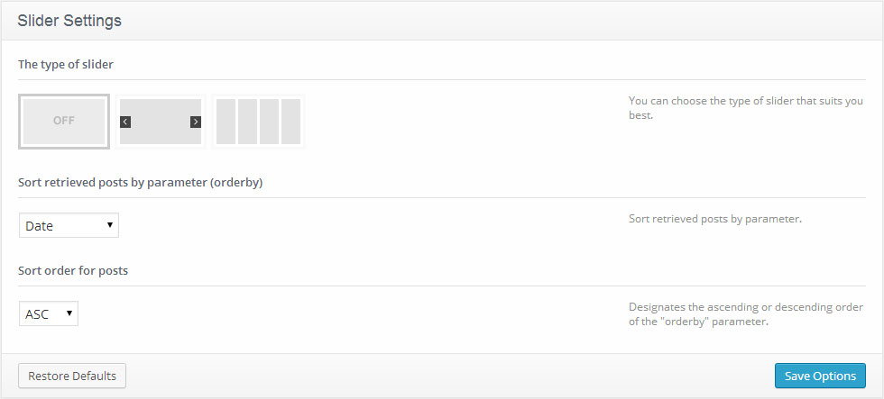
You can switch off the slider.
Slideshow
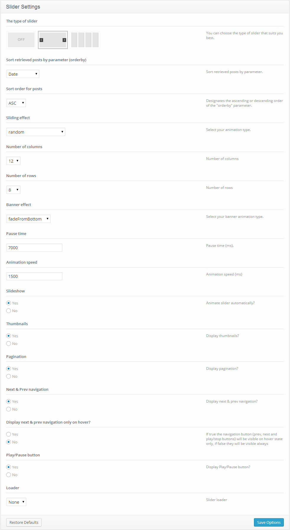
- Sliding effect - slider transition effect
- Sort by parameter - sort retrieved posts by parameter (order by)
- Sort order - sort order for posts
- Number of columns - number of columns
- Number of rows - number of rows
- Banner effect - select your banner animation type
- Pause time - pause time (ms)
- Animation speed - animation speed (ms)
- Slideshow - Animate slider automatically?
- Thumbnails - Display thumbnails?
- Pagination - Display pagination?
- Next & Prev navigation - Display next & prev navigation?
- Display next & prev navigation only on hover? - If 'yes,' the navigation button (prev, next and play/stop buttons) will be visible on hover state only, if 'no,' they will always be visible.
- Play/Pause button - Display Play/Pause button?
- Loader - slider loader.
Accordion
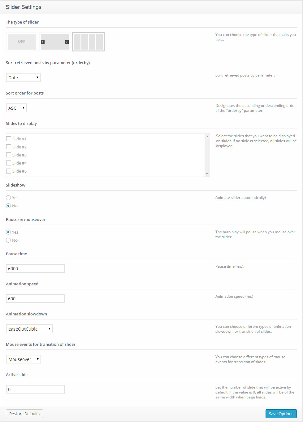
- Slides to display - Select the slides that you want to be displayed on the slider. If no slide is selected, all slides will be displayed.
- Sort by parameter - sort retrieved posts by parameter (order by)
- Sort order - sort order for posts
- Slideshow - Animate slider automatically?
- Pause on mouseover - The auto play will pause when you mouse over the slider.
- Pause time - pause time (ms).
- Animation speed - animation speed (ms).
- Animation slowdown - You can choose different types of animation slowdown for transition of slides.
- Mouse events for transition of slides - You can choose different types of mouse events for transition of slides.
- Active slide - Set the number of slides that will be active by default. If the value is 0, all slides will be of the same width when a page loads.
Blog
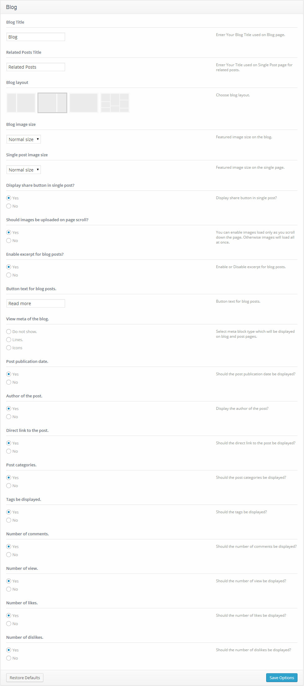
- Blog Title - your Blog Title used on the Blog page
- Related Posts Title - your title used on Single Post page for related posts
- Blog layout - choose blog layout
- Blog image size - the image size (Normal size or Large size) for the Blog page
- Single post image size - the image size (Normal size or Large size) for the single post page
- Display share button in single post? - display share button in single post
- Should images be uploaded on page scroll? - you can enable images load only as you scroll down the page. Otherwise images will load all at once.
- Enable excerpt for blog posts? - display excerpt for posts
- Button text for blog posts. - button text for blog posts
- View meta of the blog - select the meta block type which will be displayed on the blog and post pages
- Post publication date - Should the post publication date be displayed?
- Author of the post - Display the author of the post?
- Direct link to the post - Should the direct link to the post be displayed?
- Post categories - Should the post categories be displayed?
- Tags be displayed - Should the tags be displayed?
- Number of comments - Should the number of comments be displayed?
- Number of views - Should the number of views be displayed?
- Number of likes - Should the number of likes be displayed?
- Number of dislikes - Should the number of dislikes be displayed?
Portfolio
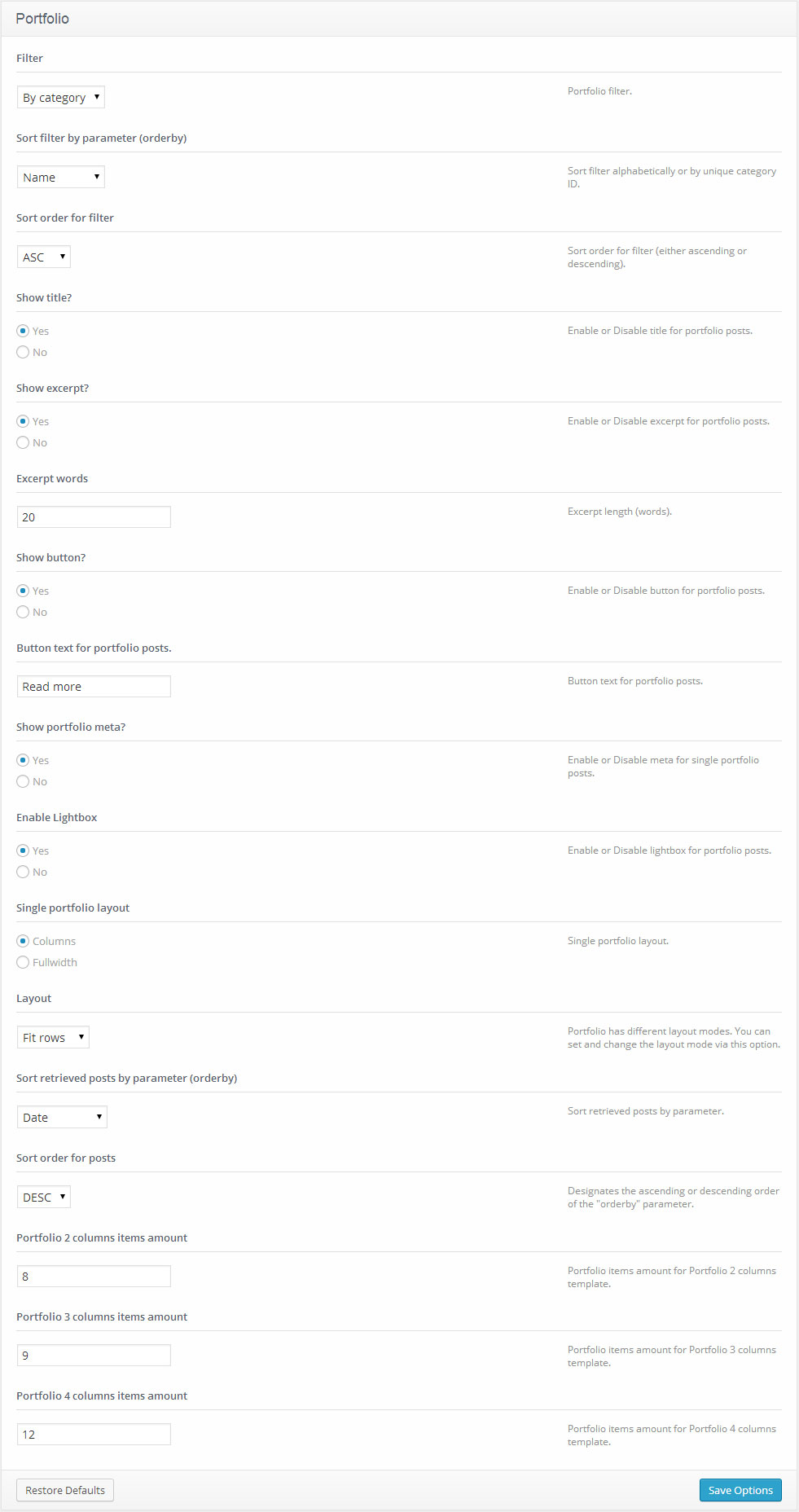
- Filter - Portfolio filter.
- Show title? - Enable or Disable the title for portfolio posts.
- Show excerpt? - Enable or Disable the excerpt for portfolio posts.
- Excerpt words - Excerpt length (words).
- Show button? - Enable or Disable the button for portfolio posts.
- Layout - Portfolio has different layout modes. You can set and change the layout mode with this option.
- Portfolio 2 columns items amount - Portfolio items number for Portfolio 2 columns template.
- Portfolio 3 columns items amount - Portfolio items number for Portfolio 3 columns template.
- Portfolio 4 columns items amount - Portfolio items number for Portfolio 4 columns template.
Footer
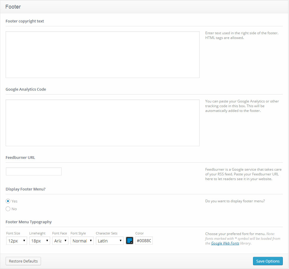
- Footer copyright text - footer text content. If the text field is empty, the default content will be displayed. It is located in the footer.php file.
- Google Analytics Code -you can put a code for gathering your site's SEO statistics. For instance, Google Analytics Code.
- Feedburner URL - Feedburner is a Google service that takes care of your RSS feed. Paste your Feedburner URL here to let the readers see it in your website.
- Display Footer menu - enable or disable the footer menu.
- Footer Menu Typography - You can choose your preferred font for the footer menu. The following options are available for editing the fonts:
Note: an asterisk * near the font means that the font will be loaded from the Google Web Fonts library.
Cookie Policy
Cookies are small text files which websites place on visitors’ computers. They’re typically used to identify that particular visitor and provide them with a better experience. Cookies are a crucial part of many website functions which we take for granted.
For instance, it’s usually cookies which allow online shops to remember what items you have in your shopping trolley. They’re also used to keep you logged in to a website, or to provide valuable usage statistics and information to website owners.
If you run a website, it almost certainly uses cookies. Their most likely function is to monitor visitor numbers and behaviours through tools like Google Analytics. They may also be used to display relevant adverts to visitors, or – if you sell online – to power key parts of your online shopping system.
26th May 2012 - The ICO released a change to the enforcement, "implied consent" is now allowed as long as you make it clear where your privacy/cookie policy is.
For your convenience, we have added a Cookie Banner in Cherry Options.
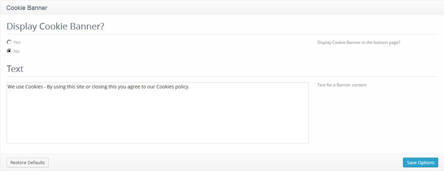
- Display Cookie Banner? - Should the Cookie Banner be displayed?
- Text - Text for a Banner content