Cherry4
Shortcodes
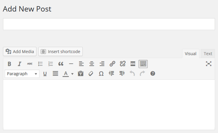
Shortcodes is a powerful tool in content management ( learn more ). They are very simple in usage. First of all you need to switch to visual editor by clicking Visual.
Click Insert shortcode button. Next, choose proper shortcode.
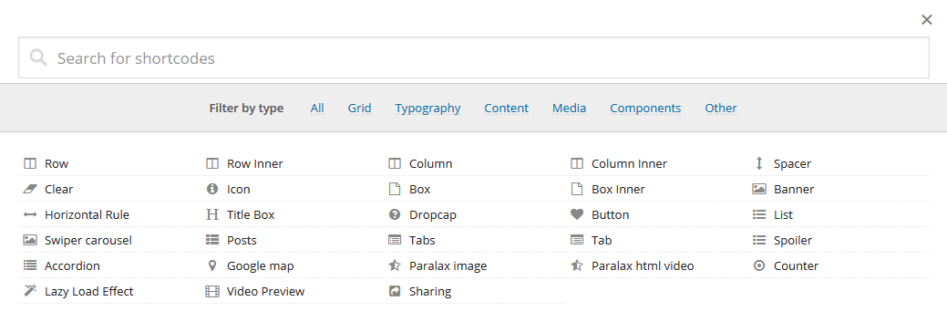
All shotcodes can be divided into the following groups:
- Box - used to display containers and elements of column formatting and to display grid.
- Content - elements of interface formatting.
- Media - additional content elements.
- Gallery - additional content elements.
- Data - additional content elements.
- Other - subsidiary elements of content advanced management.
Grid
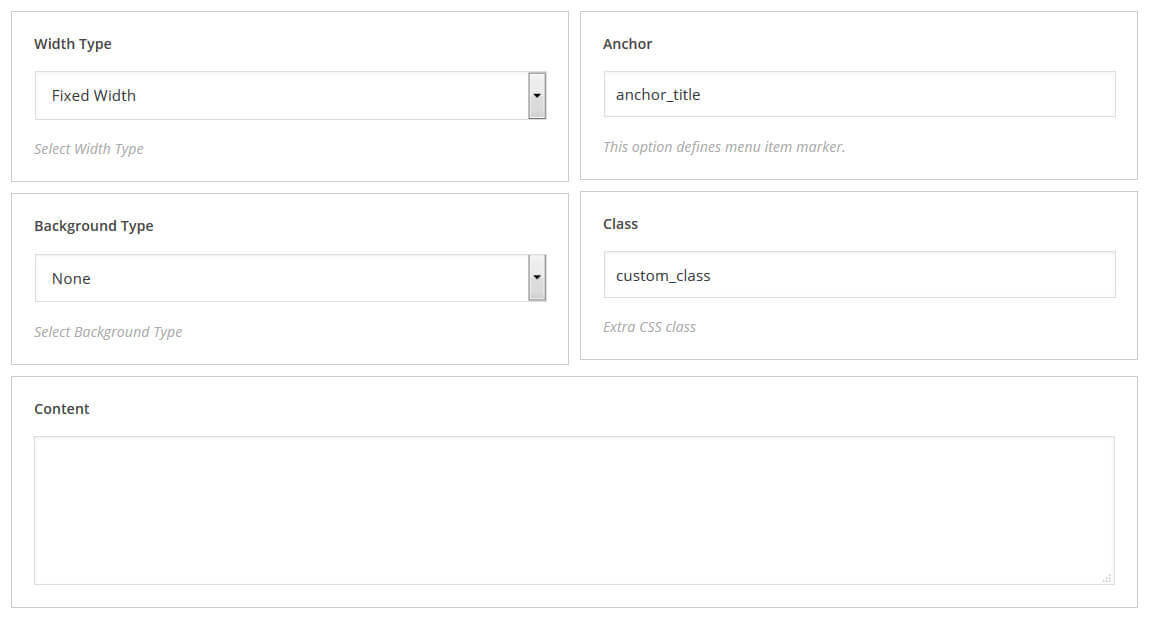
Row (Background Type:None)
When forming a grid, you should "wrap" grid elements into [row] shortcode.
- Width Type - settings for select width type
- Background Type - settings for select background type
- Anchor - this option defines menu item marker
- Class - extra CSS class
[cherry_row type="fixed-width" bg_type="none" anchor="anchor_title" class="custom_class"][/cherry_row]
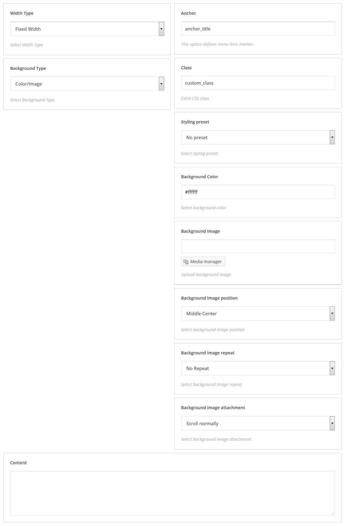
Row (Background Type: Color/Image)
- Width Type - settings for select width type
- Background Type - settings for select background type
- Anchor - this option defines menu item marker
- Class - extra CSS class
- Styling preset - select styling preset
- Background Color - select background color
- Background Image - upload background image
- Background image position - select background image position
- Background image repeat - select background image repeat
- Background image attachment - select background image attachment
[cherry_row type="fixed-width" bg_type="image" anchor="anchor_title1" class="custom_class" preset="primary" bg_color="#ffb6ab" bg_image="http://99.99.99.99/cherry_test/wp-content/uploads/2015/07/257860.jpg" bg_position="top-left" bg_repeat="repeat-x" bg_attachment="fixed"][/cherry_row]
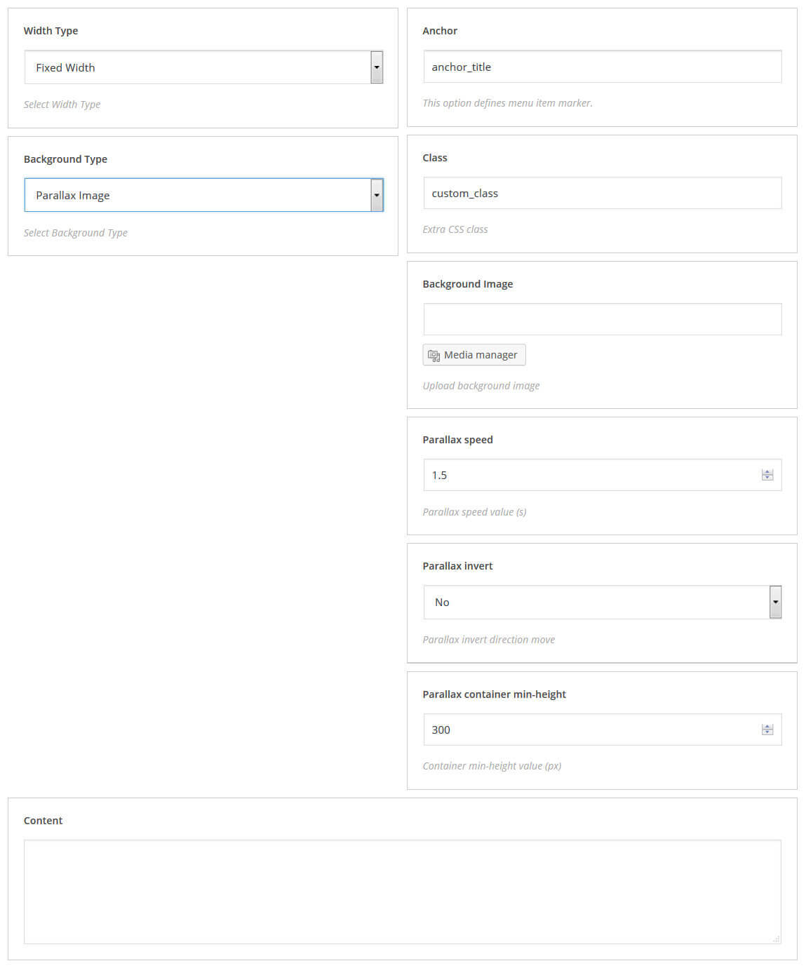
Row (Background Type: Parallax Image)
- Width Type - settings for select width type
- Background Type - settings for select background type
- Anchor - this option defines menu item marker
- Class - extra CSS class
- Background Image - upload background image
- Parallax speed - parallax speed value (s)
- Parallax invert - parallax invert direction move
- Parallax container min-height - container min-height value (px)
[cherry_row bg_type="parallax_image" anchor="anchor_title2" class="custom_class1" image_src="http://99.99.99.99/cherry_test/wp-content/uploads/2015/07/407309.jpg" parallax_speed="2" parallax_invert="yes" min_height="320"][/cherry_row]
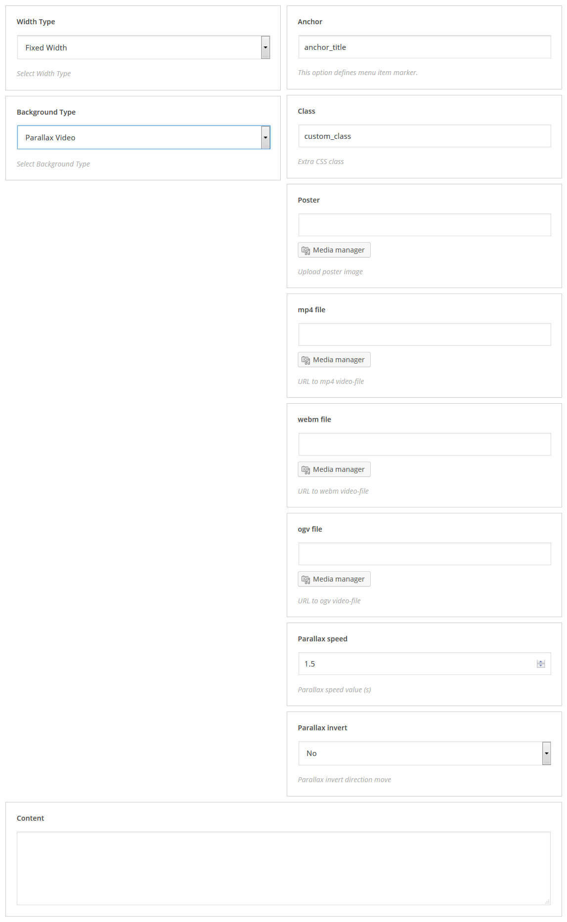
Row (Background Type: Parallax Video)
- Width Type - settings for select width type
- Background Type - settings for select background type
- Anchor - this option defines menu item marker
- Class - extra CSS class
- Poster - upload poster image
- mp4 file - upload poster image
- webm file - URL to webm video-file
- ogv file - URL to ogv video-file
- Parallax speed - parallax speed value (s)
- Parallax invert - parallax invert direction move
[cherry_row bg_type="parallax_video" anchor="anchor_title3" class="custom_class2" poster="http://99.99.99.99/cherry_test/wp-content/uploads/2015/08/background-2-1920x1013.gif" mp4="http://99.99.99.99/cherry_test/wp-content/uploads/2015/07/623403.jpg" webm="http://99.99.99.99/cherry_test/wp-content/uploads/2015/07/623403.jpg" ogv="http://99.99.99.99/cherry_test/wp-content/uploads/2015/07/623403.jpg" speed="2.5" invert="yes"][/cherry_row]
Row Inner
When creating an additional nesting of rows, you should "wrap" its elements into [row_inner] shortcode.
[cherry_row_inner type="fixed-width" bg_type="none" anchor="anchor_title" class="custom_class"][/cherry_row_inner]
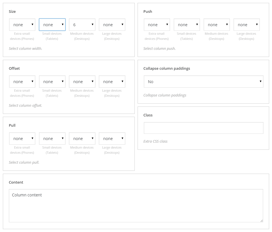
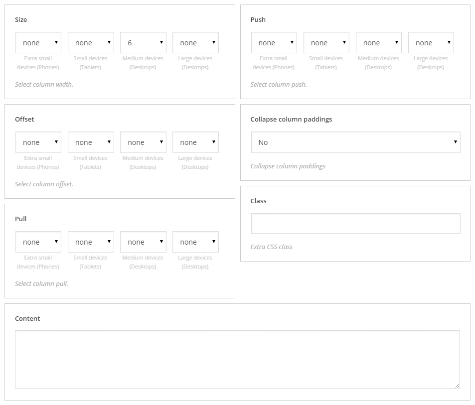
Column
Along with row shortcode, column is used to build multicolumn layouts. Columns should be placed only within rows.
- size: - size of the column with possibility to set size for different resolutions
- offset: - increases the left margin of the column
- pull: - column order modifier
- push: - column order modifier
- collapse column paddings: - resets the settings of columns margin
- class: - shortcode custom class
[cherry_col size_xs="none" size_sm="none" size_md="6" size_lg="none" offset_xs="none" offset_sm="none" offset_md="none" offset_lg="none" pull_xs="none" pull_sm="none" pull_md="none" pull_lg="none" push_xs="none" push_sm="none" push_md="none" push_lg="none" collapse="no"]Column content[/cherry_col]
Column Inner
Used to build multicolumn layouts in nesting rows.
- size: - size of the column with possibility to set size for different resolutions
- offset: - increases the left margin of the column
- pull: - column order modifier
- push: - column order modifier
- collapse column paddings: - resets the settings of columns margin
- class: - shortcode custom class
[cherry_col_inner size_xs="none" size_sm="none" size_md="6" size_lg="none" offset_xs="none" offset_sm="none" offset_md="none" offset_lg="none" pull_xs="none" pull_sm="none" pull_md="none" pull_lg="none" push_xs="none" push_sm="none" push_md="none" push_lg="none" collapse="no"]Column content[/cherry_col_inner]
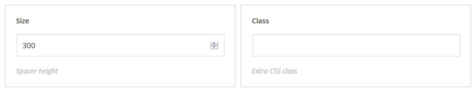
Spacer
Can be used in case you need vertical indent between blocks. Can be added in the visual editor with the help of the [su_spacer] shortcode and has the following settings:
- size: - spacer height
- class: - shortcode custom class
[cherry_spacer size="450" class="spacer-class"]
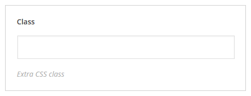
Clear
Used to reset the float. Can be used with a custom class.
[cherry_clear class="clear-class"]
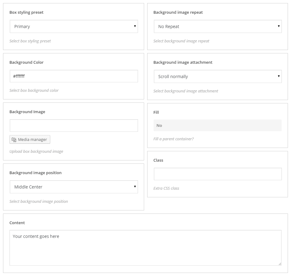
Box
Box shortcode is used to build content wrapping boxes.
- box styling preset: - option of box styling
- background color: - box background color
- background image: - box background image
- background image position: - background image position setting
- background image repeat: - background image repeat setting
- background image attachment: - defines whether image will be scrolled with the content or not
- fill: - used to set up sizes according to the parent container
- class: - shortcode custom class
[cherry_box preset="primary" bg_color="#ffffff" bg_position="center" bg_repeat="no-repeat" bg_attachment="scroll" fill="no"]Your content goes here[/cherry_box]
Box inner
Box shortcode is used to build nesting content wrapping boxes..
- box styling preset: - container styling
- background color: - box background color
- background image: - box background image
- background image position: - box background image position
- background image repeat: - box background image repeat
- background image attachment: - defines if background image will have fixed position or will scroll with the whole page
- fill: - make box have the same size as parent container
- class: - define user custom class
[cherry_box_inner bg_color="#ffffff" bg_position="center" bg_repeat="no-repeat" bg_attachment="scroll" fill="no"]Your content goes here[/cherry_box_inner]

Typography
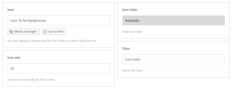
Icon
Used to add text icons to your post content.
- icon: – filed to add an icon, icon can be added through media manager and icon picker
- icon size: – icon size (can be used with text icons only)
- icon color: – icon color
- class: – shortcode custom class
[cherry_icon icon="icon: fa fa-headphones" color="#dadada" class="icon-class"]
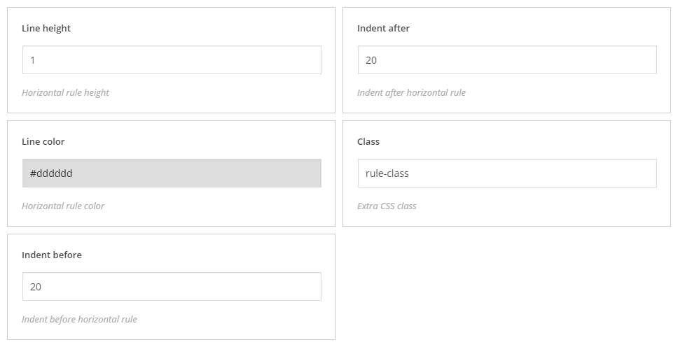
Horizontal Rule
Used to add thematic breaks to the post content.
- line height: – separator height
- line color: – color
- indent before: – top indent
- indent after: – bottom indent
- class: – shortcode custom class
[cherry_hr height="1" color="#dddddd" indent_top="20" indent_bottom="20" class="rule-class"]
Title Box
Displays double title: main and secondary titles of the text.
- title: – title content
- subtitle: – subtitle content
- icon: – filled to add an icon, icon can be added through media manager and icon picker
- icon size: – icon size (can be used with text icons only)
- icon color: – icon color
- title color: – title color
- subtitle color: – subtitle color
- class: – shortcode custom class
[cherry_title_box title="Title text" subtitle="Subtitle text" icon="icon: fa fa-text-width" icon_size="20" title_color="#444444" subtitle_color="#444444" icon_color="#333333" class="title-class"]
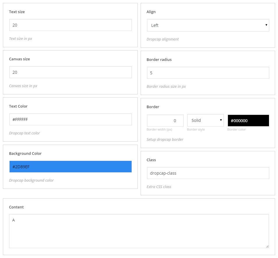
Dropcap
Displays dropcap in the text block
- Text size: – text size
- text color: – text color
- background Color: – text font color
- align: – align settings
- shape: – shape settings
- border: – set of options (width, style and color) to create a border
- class: – shortcode custom class
[cherry_dropcap font_size="20" canvas_size="20" color="#FFFFFF" background="#2D89EF" align="left" radius="5" border="none" class="dropcap-class"]A[/cherry_dropcap]
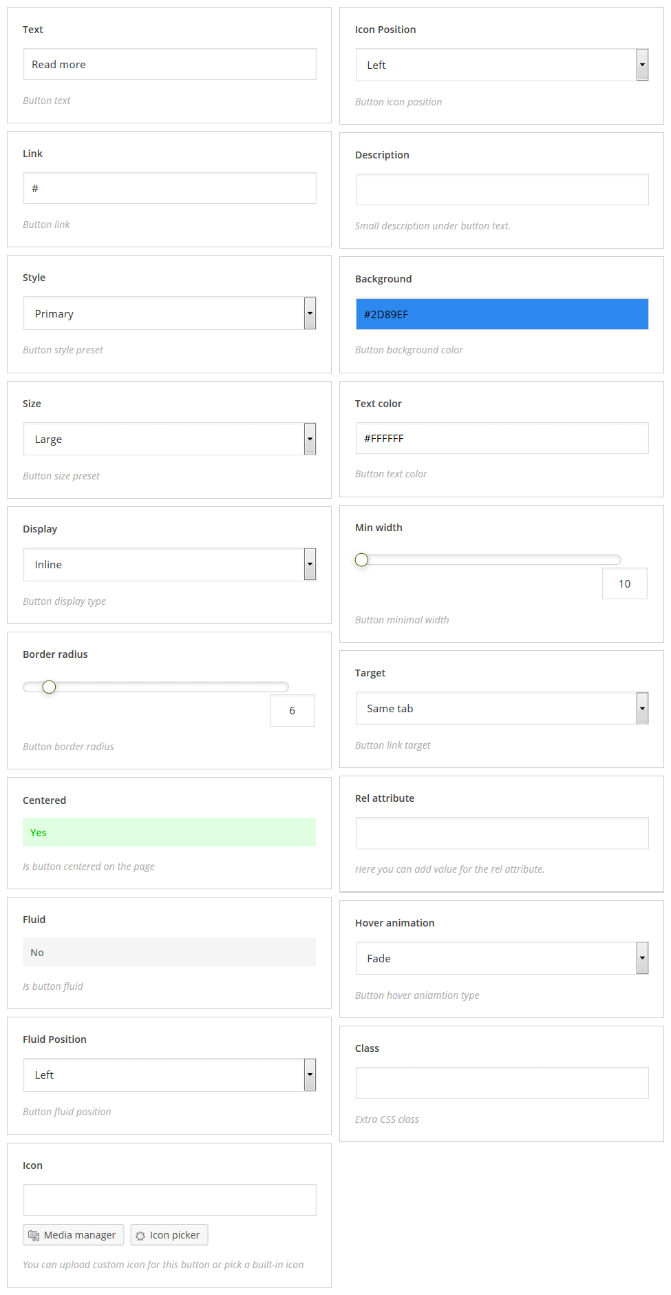
Button
- text: – button text
- link: – button link
- style: – button color
- size: – button size
- display: – button display style
- border radius: – radius of button rounded corners
- centered: – button alignment
- fluid: – responsive setting
- fluid Position: – button alignment in responsive layouts
- icon: – filled to add an icon, icon can be added through media manager and icon picker
- icon Position: – position of icon relative to button
- description: – short text description under the button
- background: – button background color
- text color: – button text color
- min width: – minimum button width
- target: – defines whether button link will open in the new or in the parent window (tab)
- rel attribute: – rel attribute defines connection between current document and linked document defined by the href attribute
- hover animation: – hover animation type
- class: – shortcode custom class
[cherry_button text="Read more" url="#" style="primary" size="medium" display="inline" radius="0" centered="no" fluid="no" fluid_position="left" icon_position="left" bg_color="#2D89EF" color="#FFFFFF" min_width="0" target="self" hover_animation="fad
Content
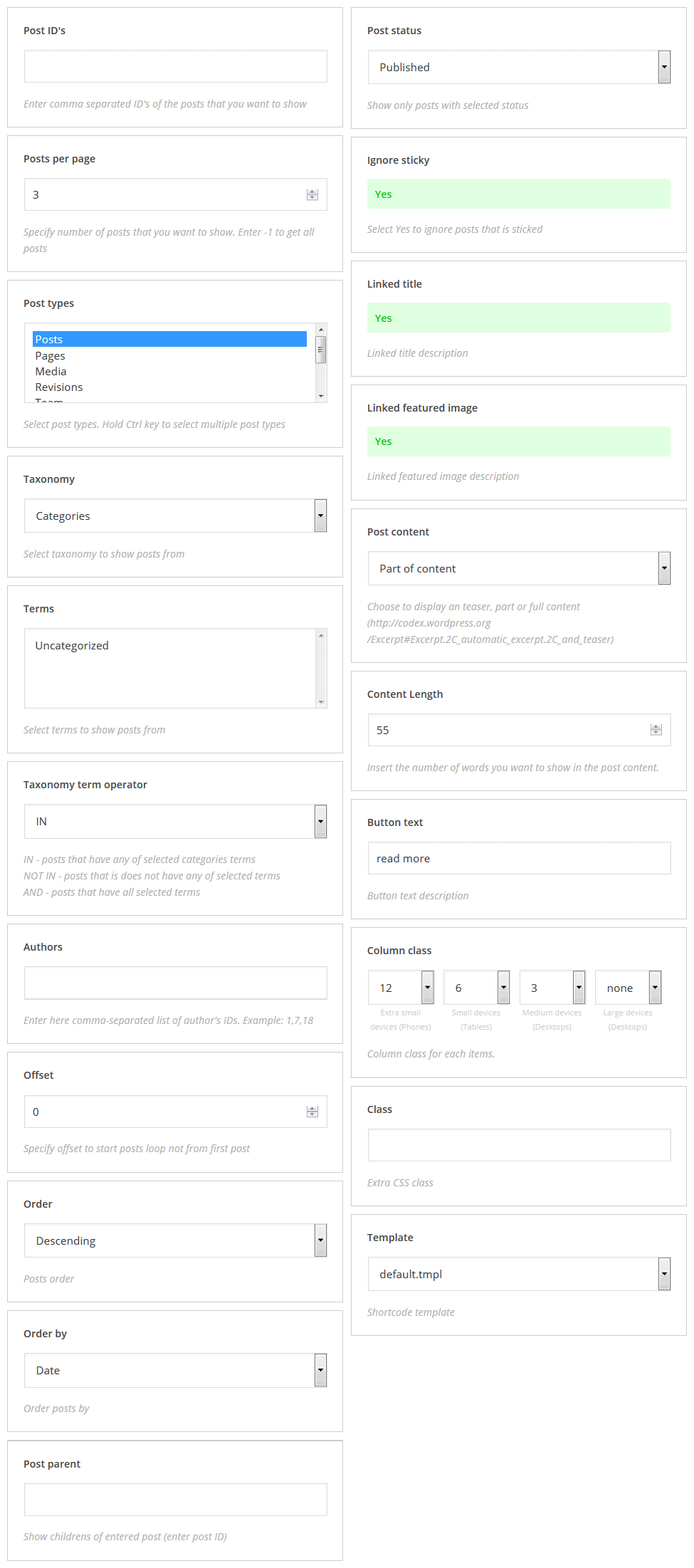
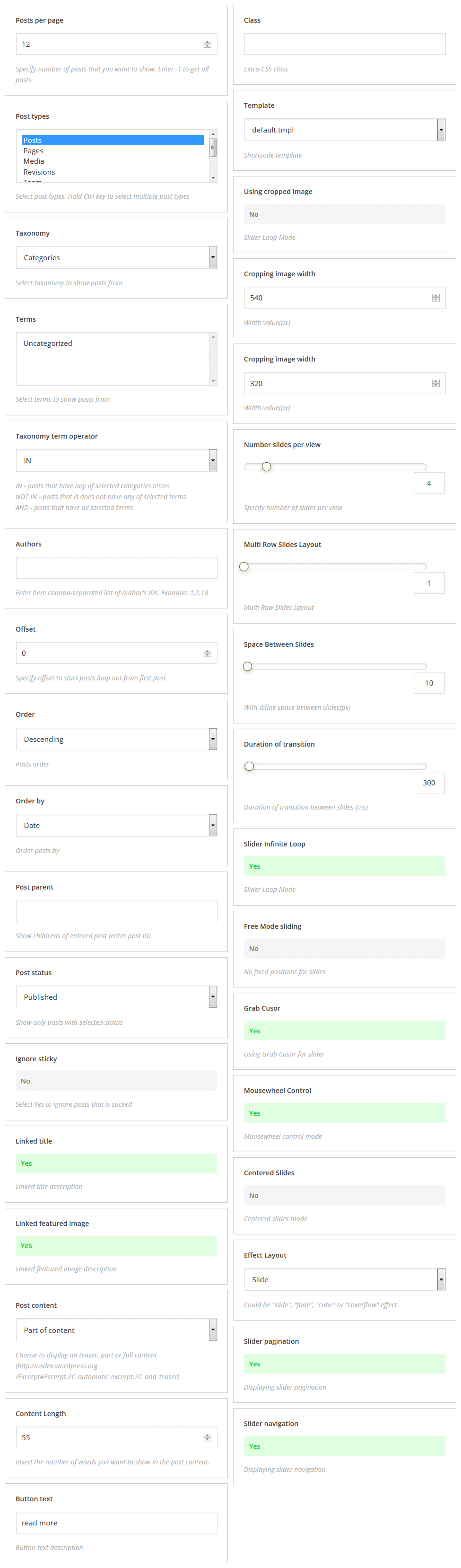
Posts
Displays posts content with possibility of sorting and additional settings.
- Post ID's: – field for IDs of posts to display
- Posts per page: – number of posts per page
- Post types: – type of displayed posts (multiple choice)
- Taxonomy: – taxonomy
- Terms: – terms to show posts from
- Taxonomy term operator: – taxonomy term operator has 3 values NOT, NOT IN, AND
- Authors: – coma-separated list of authors
- Offset: – indent value
- Order: – ascending/descending order
- Order by: – order by one of parameters
- Post parent: – parent container can be set in this field
- Post status: – display posts with specific status only
- Ignore sticky: – defines whether ignore sticky posts or not
- Linked title: – linked title description
- Linked featured image: – linked featured image description
- Post content: – post content value
- Content Length: – number of words per displayed posts
- Button text: – button text
- Column class: – container size settings with possibility to set size for different resolutions
- Class: – shortcode custom class
- Template: – shortcode template to display shortcode content, for more information, please visit our tutorial
[cherry_posts posts_per_page="10" post_type="post" taxonomy="category" tax_operator="0" offset="0" order="desc" orderby="date" post_status="publish" ignore_sticky_posts="yes" linked_title="yes" linked_image="yes" image_size="thumbnail" content_type="part" content_length="55" button_text="read more" col_xs="12" col_sm="6" col_md="3" col_lg="3" template="default.tmpl"]
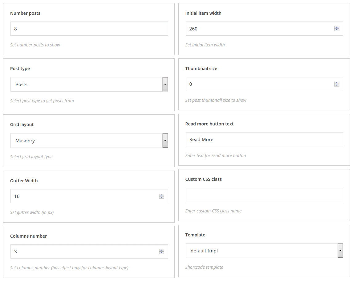
Grid
Displays content in a chosen grid style
- Number posts: – number of displayed posts
- Post type: – posts type
- Grid layout: – grid layout type
- Gutter width: – items indent
- Columns number: – number of columns (has effect only for columns layout type)
- Initial item width: – initial grid item width
- Thumbnail size: – post thumbnail size
- Read more button text: – "Read More" button text
- Class: – shortcode custom class
- Template: – shortcode template to display shortcode content, for more information, please visit our tutorial
[cherry_grid num="8" post_type="post" type="flex" gutter="0" columns="3" initial_size="0" thumbnail_size="0" button_text="Read More" template="default.tmpl"]
Portfolio
Displays portfolio posts
- Portfolio listing layout: – portfolio grid layout
- Portfolio pagination type: – portfolio navigation type
- Portfolio animation type: – grid type
- Filter: – filter layout
- Post per page: – number of displayed posts
- Columns number: – number of columns (has effect only for columns layout type)
- Gutter width: – items indent
- Class: – shortcode custom class
- Template: – shortcode template to display shortcode content, for more information, please visit our tutorial
[cherry_portfolio listing_layout="masonry-layout" loading_mode="portfolio-ajax-pagination-mode" loading_animation="loading-animation-move-up" filter_visible="yes" posts_per_page="9" grid_col="3" item_margin="9"]
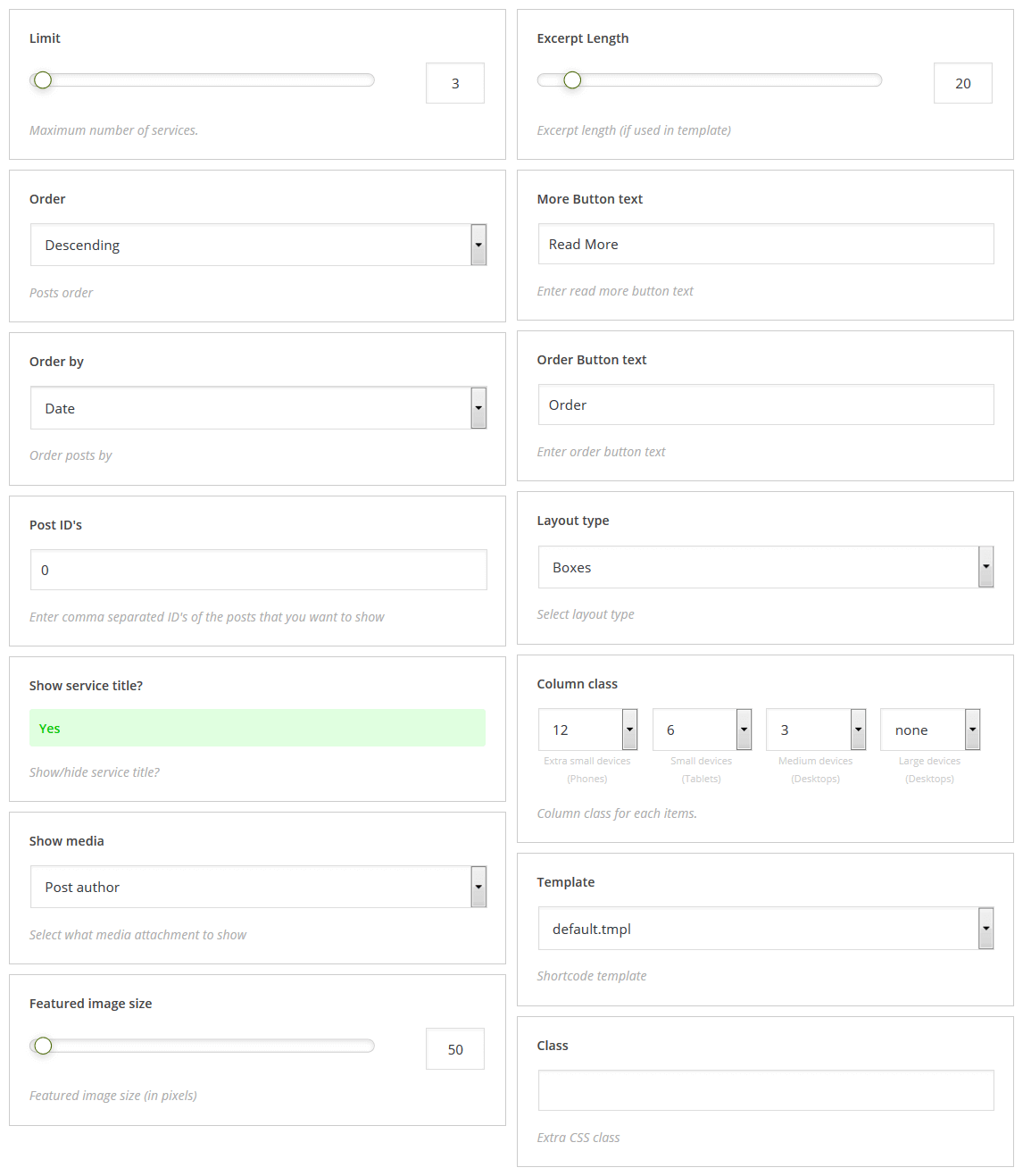
Services
Besides, there is a possibility to display content as pricing table and service box
- Limit: – minimum number of displayed services
- Order: – ascending/descending order
- Order by: – order by one of parameters
- Post ID's: – field for IDs of posts to display
- Show service title?: – display/hide the service title
- Show media: – additional media content type to be displayed
- Featured image size: – post featured image size
- Excerpt length: – excerpt length (if used in the post)
- Read more button text: – "Read More" button text
- Order button text: – order button text
- Layout type: – shortcode layout type
- Column class: – container size settings with possibility to set size for different resolutions
- Template: – shortcode template to display shortcode content, for more information, please visit our tutorial
- Class: – shortcode custom class
[cherry_services limit="3" order="desc" orderby="date" id="0" show_title="yes" show_media="icon" size="thumbnail" excerpt_length="20" button_text="Read More" order_button_text="Order" layout="boxes" col_xs="12" col_sm="6" col_md="3" col_lg="none" template="default.tmpl"]
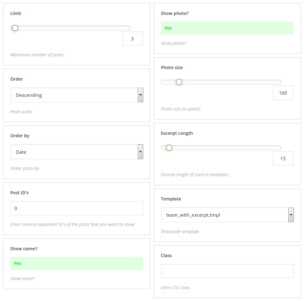
Team
Displays "Our team" posts
- Limit: – minimum number of displayed services
- Order: – ascending/descending order
- Order by: – order by one of parameters
- Post ID's: – field for IDs of posts to display
- Show name: – display/hide team members names
- Show photo: – display/hide team members photo
- Photo size: – photo size
- Excerpt length: – excerpt length
- Column class: – container size settings with possibility to set size for different resolutions
- Template: – shortcode template to display shortcode content, for more information, please visit our tutorial
- Class: – shortcode custom class
[cherry_team limit="3" order="desc" orderby="date" id="0" show_name="yes" show_photo="yes" size="thumbnail" excerpt_length="20" col_xs="12" col_sm="6" col_md="3" col_lg="none" template="default.tmpl"]
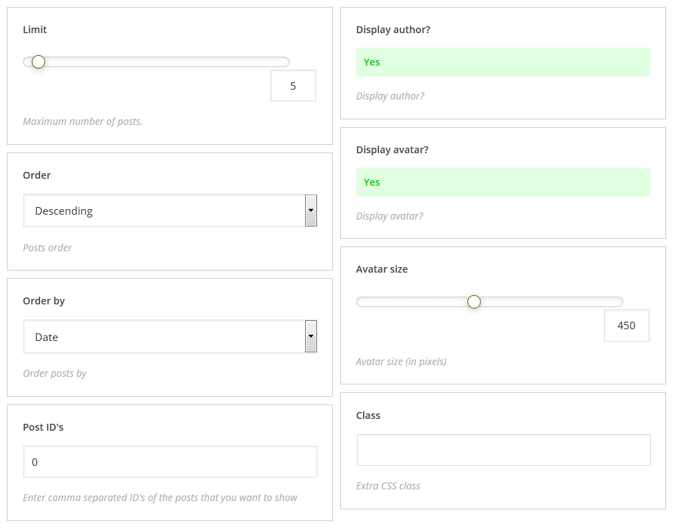
Testimonials
Displays testimonials posts
- Limit: – minimum number of displayed services
- Order: – ascending/descending order
- Order by: – order by one of parameters
- Post ID's: – field for IDs of posts to display
- Display author?: – display/hide author
- Display avatar?: – display/hide author avatar
- Avatar size: – avatar size
- Template: – shortcode template to display shortcode content, for more information, please visit our tutorial
- Class: – shortcode custom class
[cherry_testimonials limit="3" order="desc" orderby="date" display_author="yes" display_avatar="yes" size="50" content_type="full" content_length="55" template="default.tmpl"]
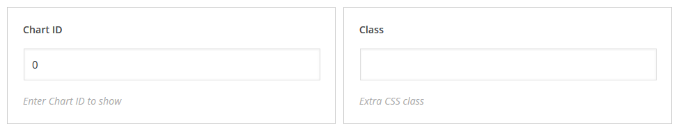
Charts
Displays chart according to pre-set and set up element identification.
- Chart id: – chart ID
- Class: – shortcode custom class
[cherry_charts id="21" custom_class="chart-class"]
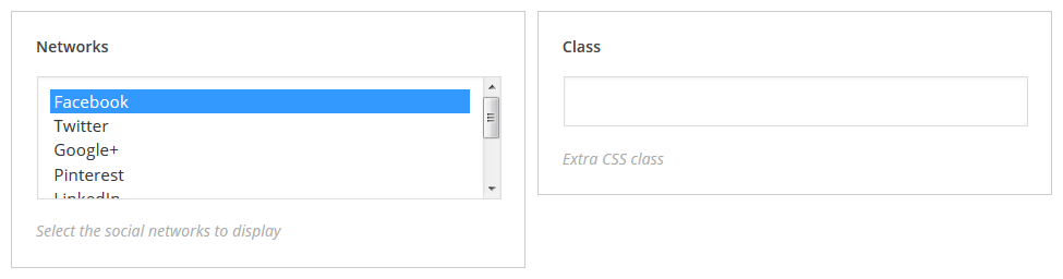
Sharing
Renders social networks sharing block. Available only if Social plugin is active.
- Networks: – select social networks
- Class: – add user custom css class
[cherry_sharing networks="facebook,twitter,pinterest" custom_class="sharing-class"]
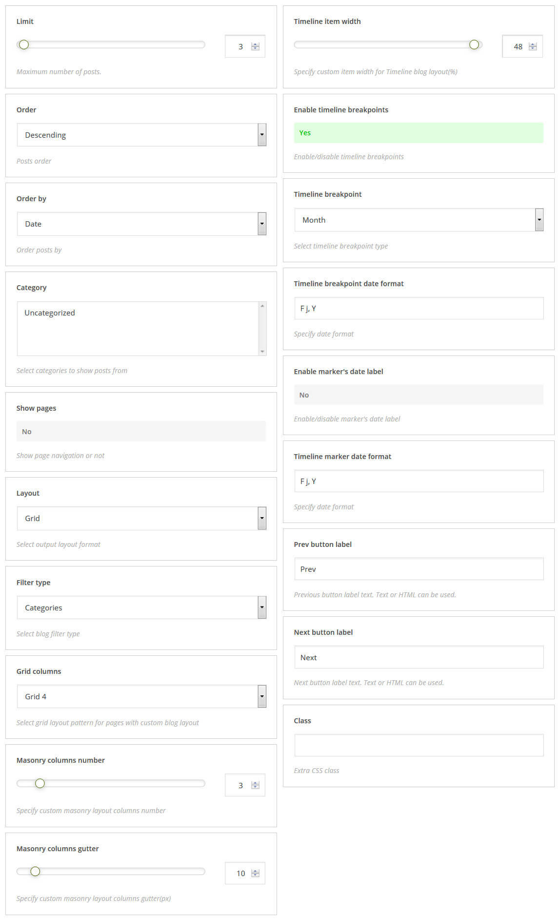
Blog Layout
Shortcode for outputting blog posts, with enhanced customization.
- Limit – maximum number of posts
- Order – posts order
- Order by – order posts by
- Category – select categories to show posts from
- Show pages – show page navigation or not
- Layout – select output layout format
- Filter type – select blog filter type
- Grid columns – select grid layout pattern for pages with custom blog layout
- Masonry columns number – specify custom masonry layout columns number
- Masonry columns gutter – specify custom masonry layout columns gutter(px)
- Timeline item width – specify custom item width for Timeline blog layout(%)
- Enable timeline breakpoints – enable/disable timeline breakpoints
- Timeline breakpoint – select timeline breakpoint type
- Timeline breakpoint date format – timeline breakpoint date format
- Enable marker's date label – enable/disable marker's date label
- Prev button label – previous button label text. Text or HTML can be used
- Next button label – next button label text. Text or HTML can be used
- Class – extra CSS class
- Template: – shortcode template to display shortcode content, for more information, please visit our tutorial
[cherry_blog posts_per_page="6" order="asc" orderby="id" category="uncategorized" paged="yes" layout_type="masonry" filter_type="tags" grid_column="grid-3" columns="4" columns_gutter="20" timeline_item_width="50" use_timeline_breakpoint="no" timeline_breakpoint="year" timeline_breakpoint_date_format="Y, j, F" show_marker_date="yes" timeline_marker_date_format=" Y, j, F" pagination_previous_label="Previous" class="custom_class"]
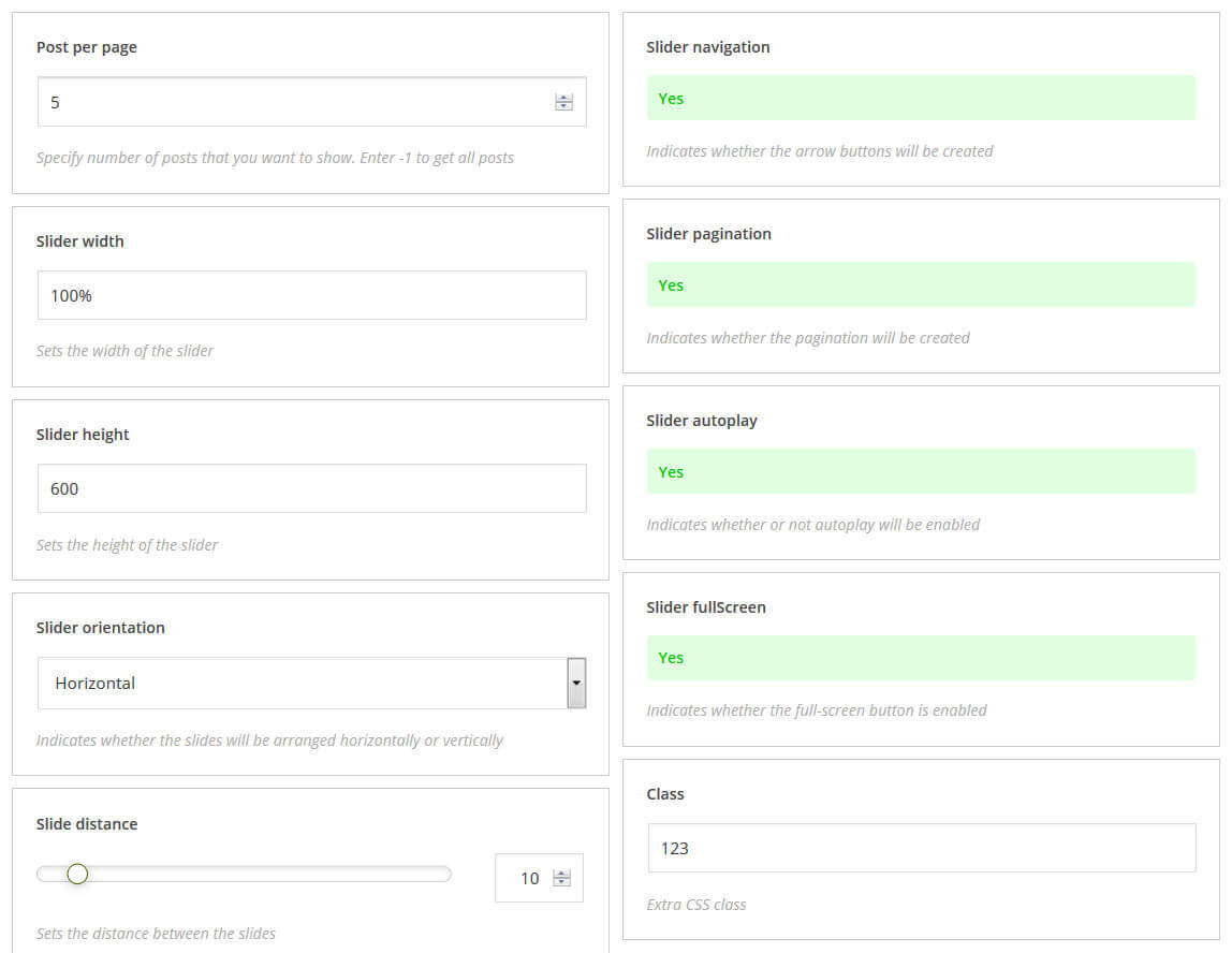
Simple Slider
Shortcode for outputting slider (posts format "slides list").
- Post per page – specify number of posts that you want to show. Enter -1 to get all posts
- Slider width – sets the width of the slider
- Slider height – sets the height of the slider
- Slider orientation – indicates whether the slides will be arranged horizontally or vertically
- Slide distance – sets the distance between the slides
- Slider navigation – indicates whether the arrow buttons will be created
- Slider pagination – indicates whether the pagination will be created
- Slider autoplay – indicates whether or not autoplay will be enabled
- Slider fullScreen – indicates whether the full-screen button is enabled
- Class – extra CSS class
[cherry_slider posts_per_page="4" slider_width="90%" slider_height="560" slider_orientation="vertical" slider_slide_distance="15" slider_navigation="no" slider_pagination="no" slider_autoplay="no" slider_fullScreen="no" custom_class="custom_class"]
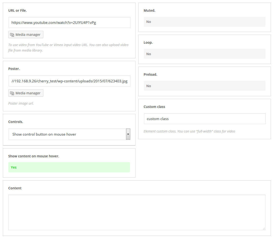
Video Preview
Shortcode for outputting video in the content. You can configure the playback mode, set the poster, and more.
- URL or File – to use video from YouTube or Vimeo input video URL. You can also upload video file from media library.
- Poster – poster image url
- Controls – select how to display controls
- Show content on mouse hover – select, show or hide content on mouse hover
- Muted – set enable or disable mute mode
- Loop – enable or disable loop paying mode
- Preload
- Custom class – extra CSS class
[cherry_slider posts_per_page="4" slider_width="90%" slider_height="560" slider_orientation="vertical" slider_slide_distance="15" slider_navigation="no" slider_pagination="no" slider_autoplay="no" slider_fullScreen="no" custom_class="custom_class"]
Media
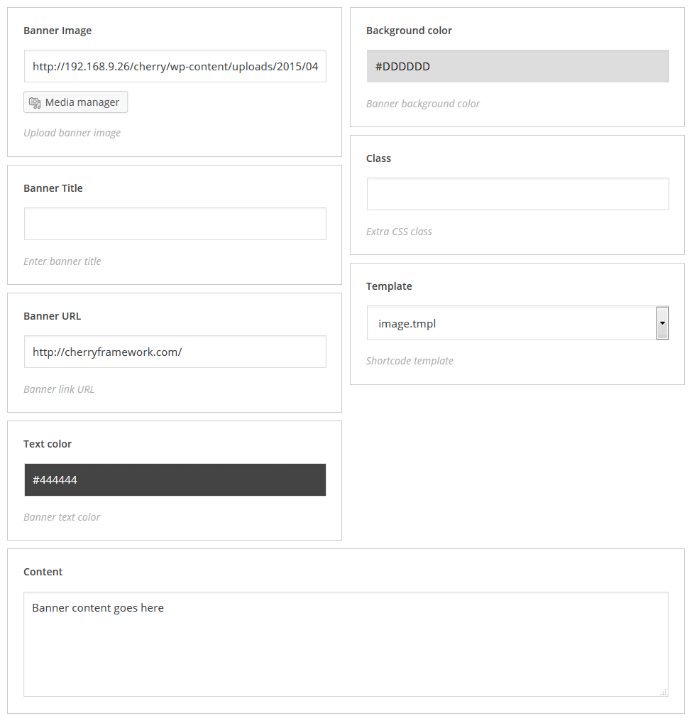
Banner
Displays banner
- Banner image: – banner image
- Banner title: – banner title
- Banner url: – banner URL
- Text color: – banner color
- Background color: – banner background color
- Template: – shortcode template to display shortcode content, for more information, please visit our tutorial
- Class: – extra CSS class
[cherry_banner image="path_to_image" url="/" color="#444444" bg_color="#DDDDDD" template="default.tmpl"]Banner content goes here[/cherry_banner]
Swiper carousel
Displays carousel with chosen posts
- Posts per page: – number of posts displayed per page
- Post types: – post types (multiple choice)
- Taxonomy: – taxonomy
- Terms: – terms to show post from
- Taxonomy term operator: – taxonomy term has 3 values, they are NOT, NOT IN, AND
- Authors: – coma-separated list of authors
- Offset: – indent value
- Order: – ascending/descending order
- Order by: – order by one of parameters
- Post parent: – parent container can be set in this field
- Post status: – display posts with specific status only
- Ignore sticky: – defines whether ignore sticky posts or not
- Linked title: – linked title description
- Linked featured image: – linked featured image description
- Post content: – post content value
- Content Length: – number of words per displayed posts
- Button text: – button text
- Using cropped image: – to use/not to use cropped images
- Cropping image width: – cropped image width
- Cropping image height: – cropped image height
- Number slides per view: – number of slides displayed per view
- Multi Row Slides Layout: – number of rows
- Space Between Slides: – slides indent value
- Duration of transition: – slides transition duration value
- Slider Infinite Loop: – enable/disable infinite loop
- Free Mode sliding: – enable/disable slides fixed position
- Grab Cursor: – enable/disable grab cursor for slider
- Mousewheel Control: – enable/disable mousewheel control mode
- Centered Slides: – enable/disable slides alignment
- Effect Layout: – slides transition effect
- Slider pagination: – display/hide slider pagination
- Slider navigation: – display/hide slider navigation
- Class: – extra CSS class
- Template: – shortcode template to display shortcode content, for more information, please visit our tutorial
[cherry_swiper_carousel posts_per_page="10" post_type="post" taxonomy="category" tax_operator="0" offset="0" order="desc" orderby="date" post_status="publish" ignore_sticky_posts="no" linked_title="yes" linked_image="yes" content_type="part" content_length="55" button_text="read more" template="default.tmpl" crop_image="no" crop_width="540" crop_height="320" slides_per_view="3" slides_per_column="1" space_between_slides="10" swiper_duration_speed="300" swiper_loop="yes" swiper_free_mode="no" swiper_grab_cursor="no" swiper_mouse_wheel="no" swiper_centered_slide="no" swiper_effect="slide" swiper_pagination="yes" swiper_navigation="yes" swiper_navigation_position="inner"]
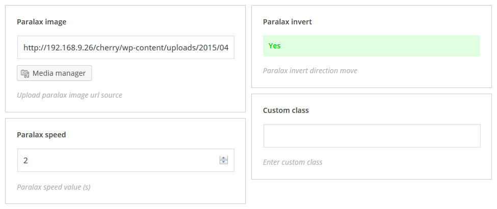
Parallax image
Displays image with parallax effect
- Parallax image: – parallax image
- Parallax speed: – parallax speed
- Banner url: – image URL
- Parallax invert: – enable/disable parallax inversion
- Class: – extra CSS class
[cherry_paralax_image speed="1.5" invert="no" min_height="300"]Your content goes here[/cherry_paralax_image]
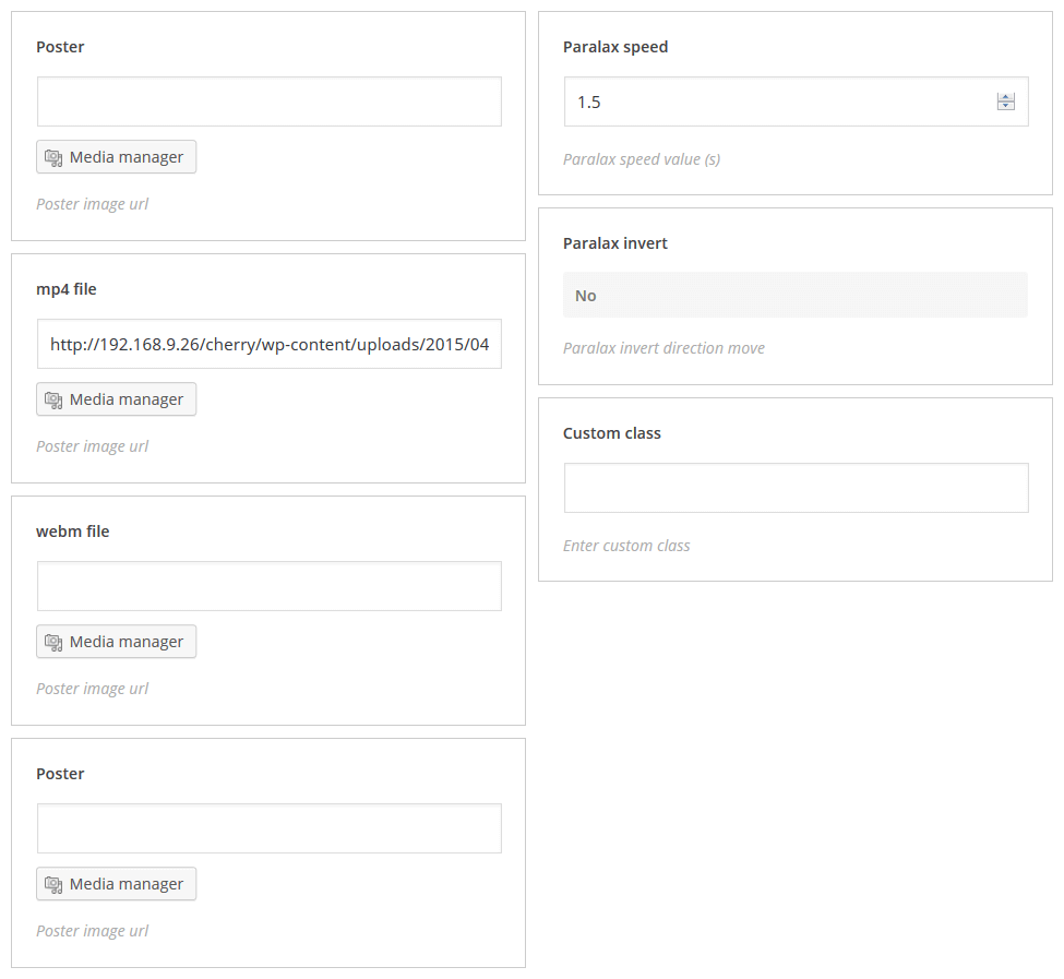
Parallax html video
Displays video with parallax effect
- Poster: – poster image (use media manager to add image)
- MP4 file: – mp4 file (use media manager to add mp4 file)
- Webm file: – webm file (use media manager to add webm file)
- Ogv file: – ogv file (use media manager to add ogv file)
- Parallax speed: – parallax speed
- Parallax invert: – enable/disable parallax inversion
- Class: – extra CSS class
[cherry_paralax_html_video poster=".../wp-content/uploads/2015/06/Albinus_t08.jpg" mp4=".../wp-content/uploads/2015/06/Albinus_t08.mp4" webm=".../wp-content/uploads/2015/06/Albinus_t08.webm" ogv=".../wp-content/uploads/2015/06/Albinus_t08.ogv" custom_class="parallax-class"]Your content goes here[/cherry_paralax_html_video]
Components
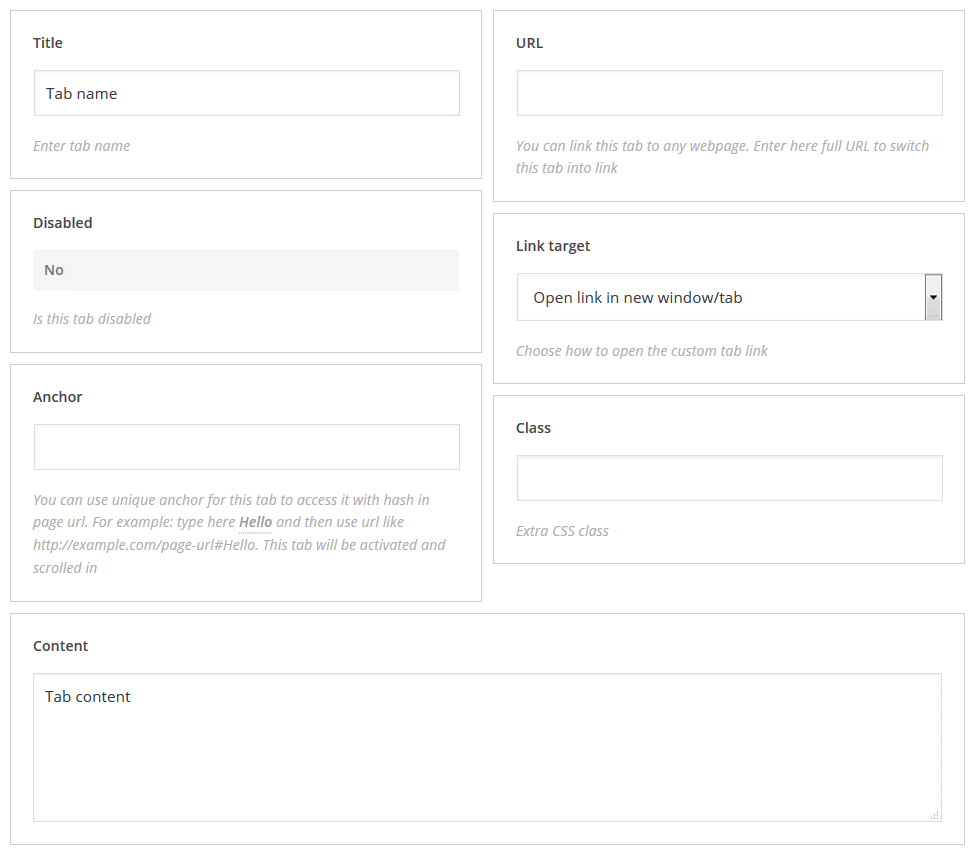
Tab
Displays tab
- title: – tab title
- disabled: – enable/disable tab
- anchor: – unique tab anchor
- url: – tab URL
- link target: – defines whether the link will open in the new or in the parent window (tab)
- class: – shortcode custom class
[cherry_tabs style="default" active="1" vertical="no"][cherry_tab title="Title 1"]Content 1[/cherry_tab] [cherry_tab title="Title 2"]Content 2[/cherry_tab] [cherry_tab title="Title 3"]Content 3[/cherry_tab][/cherry_tabs]
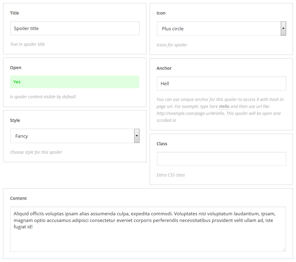
Spoiler
Displays spoiler
- title: – spoiler title
- open: – spoiler content is visible/hidden by default
- style: – spoiler style
- icon: – spoiler icon
- anchor: – unique tab anchor
- class: – shortcode custom class
[cherry_spoiler open="yes" class="spoiler-class"]Hidden content[/cherry_spoiler]
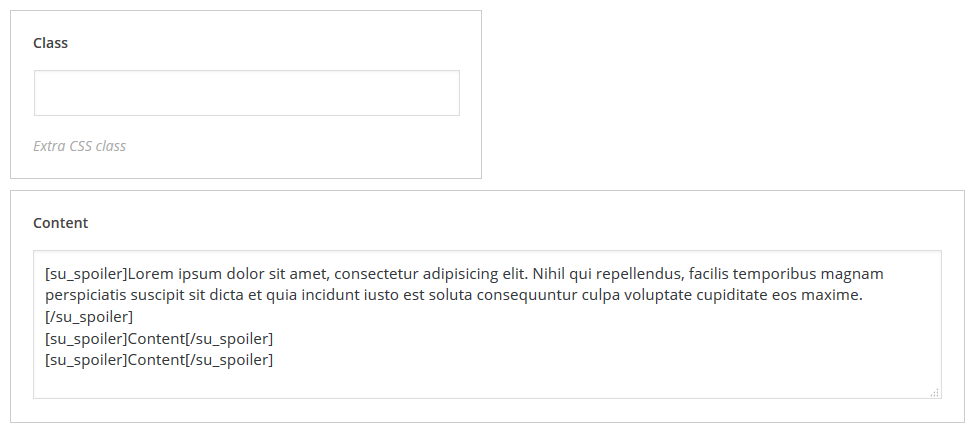
Accordion
Displays spoiler container
- class: – shortcode custom class
[cherry_accordion class="accordion-class"][cherry_spoiler title="Spoiler Title"]Content[/cherry_spoiler] [cherry_spoiler title="Spoiler Title"]Content[/cherry_spoiler] [cherry_spoiler title="Spoiler Title"]Content[/cherry_spoiler][/cherry_accordion]
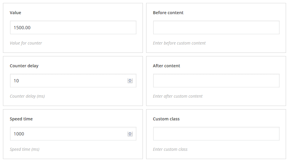
Counter
Displays animated counter
- value: – counter value
- counter delay: – counter delay value
- speed time: – counter animation speed
- before content: – content displayed before counter
- after content: – content displayed after counter
- class: – shortcode custom class
[cherry_counter counter_value="100.00" delay="10" time="1000" custom_class="counter-class"]
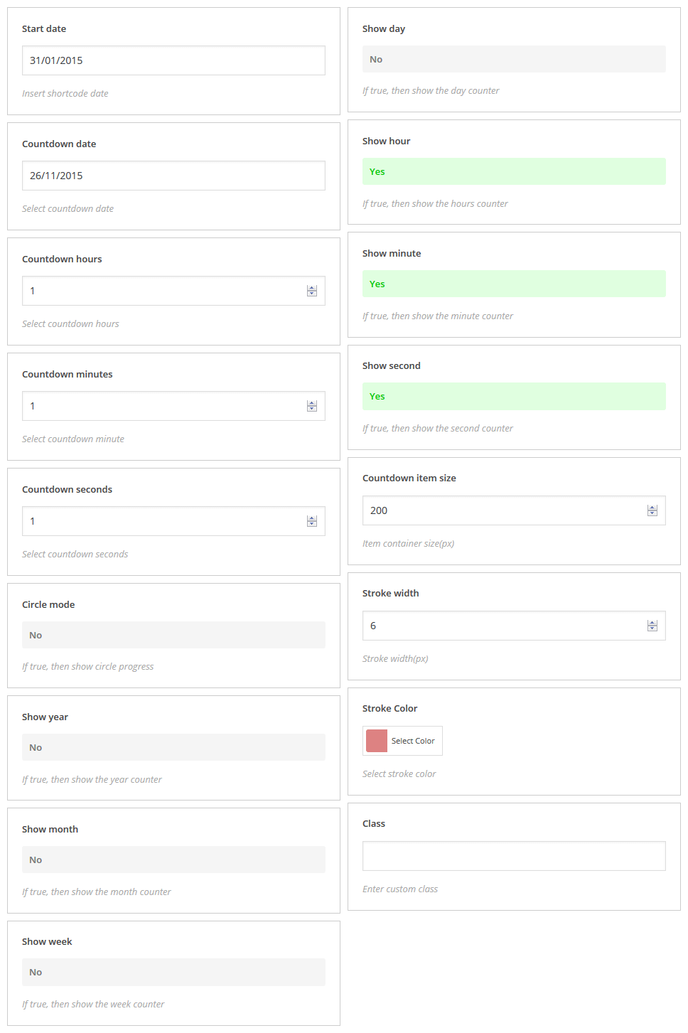
Countdown
Displays animated countdown counters
- start date: – to insert shortcode date
- countdown date: – to select countdown date
- countdown hours: – to select countdown hours
- countdown minutes: – to select countdown minutes
- countdown seconds: – to select countdown seconds
- circle mode: – if true, then show circle progress
- show year: – if true, then show the year counter
- show month: – if true, then show the month counter
- show week: – if true, then show the week counter
- show day: – if true, then show the day counter
- show hour: – if true, then show the hours counter
- show minute: – if true, then show the minute counter
- show second: – if true, then show the second counter
- countdown item size: – item container size(px)
- stroke width: – stroke width(px)
- stroke color: – select stroke color
- class: – shortcode custom class
[cherry_countdown countdown_date="26/11/2015" countdown_hour="1" countdown_minutes="1" countdown_seconds="1" circle_mode="no" show_year="no" show_month="no" show_week="no" show_day="no" item_size="200" stroke_width="6" stroke_color="#dd8282"]
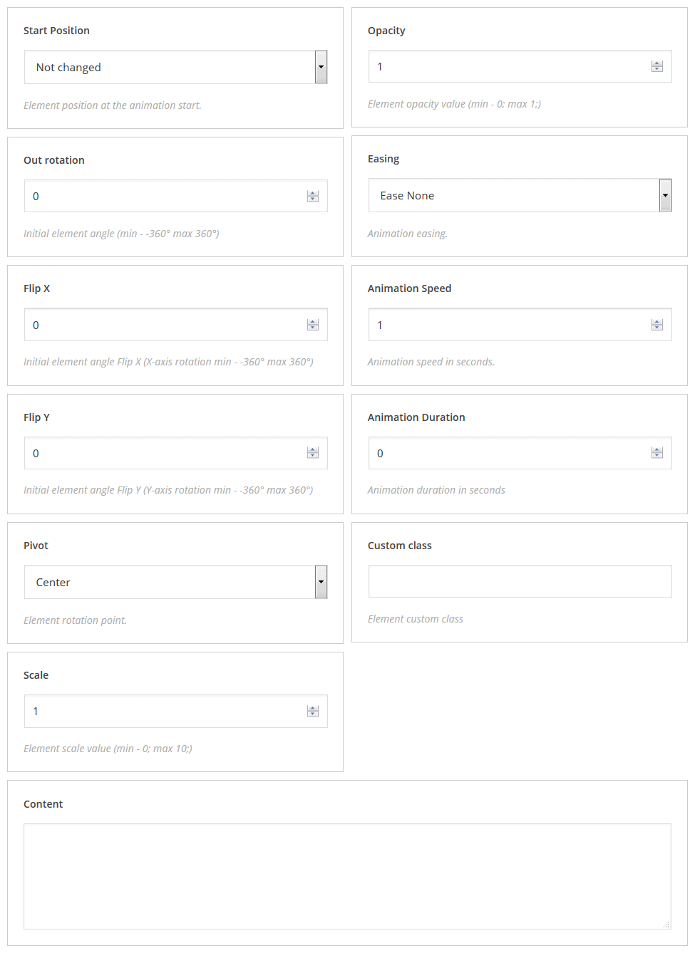
Lazy Load Effect
Description: This shortcode allows you to display the appearance of content items smoothly when scrolling the page.
- start position: – position of element at the beginning of animation
- out rotation: – initial element angle at the beginning of animation (min -360° max 360°)
- flip X: – initial element angle flip at the beginning of animation (X-axis rotation min -360° max 360°)
- flip Y: – initial element angle flip at the beginning of animation (Y-axis rotation min -360° max 360°)
- pivot: – element rotation pivot
- scale: – element scale value (min: 0; max: 10;)
- opacity: – element opacity value (min: 0; max: 1;)
- easing: – animation easing effect
- animation speed: – animation speed in seconds
- animation delay: – delay before next element appears (can be used in case you have two or more elements in a row and you want to animate them one by one)
- custom_class: – shortcode custom class
[cherry_lazy_load_effect start_position="not_changed" rotation="0" flip_x="0" flip_y="0" pivot="center" scale="1" opacity="1" easing="none" speed="1" delay="0" custom_class="lazy-class"][/cherry_lazy_load_effect]
Other
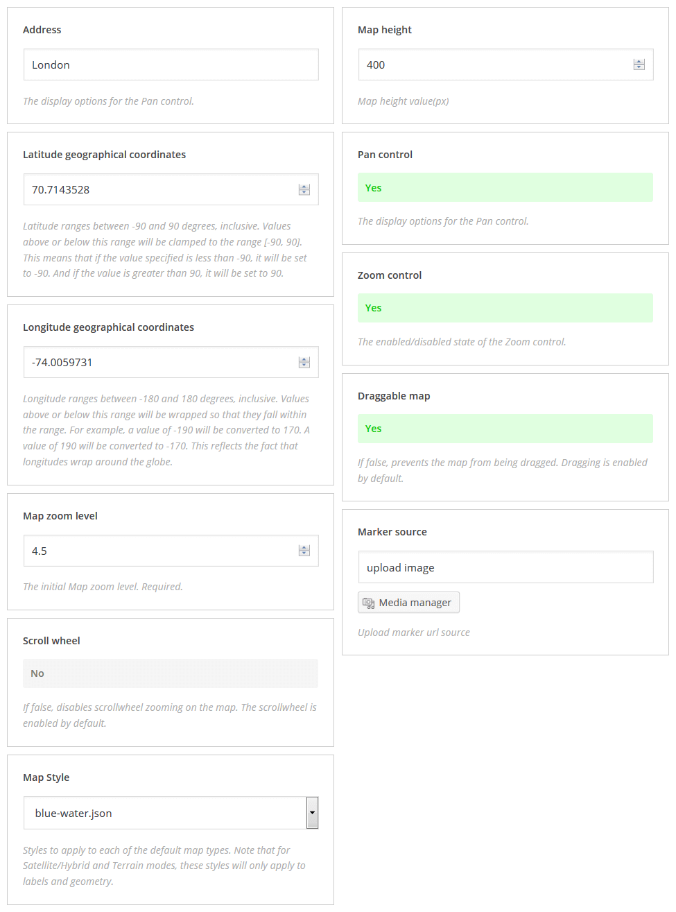
Google map
Displays animated counter
- address: – city
- latitude geographical coordinates: – latitude value
- longitude geographical coordinates: – longitude value
- map zoom level: – initial map zoom level (required value)
- scroll wheel: – enable/disable srollwheel zooming on the map
- map Style: – map style
- map height: – map height
- pan control: – enable/disable map navigation
- zoom control: – enable/disable map zooming
- draggable map: – enable/disable dragging map
- marker source: – marker image (use media manager to add image)
- class: – shortcode custom class
[cherry_google_map geo_address="London" lat_value="40.7143528" lng_value="-74.0059731" zoom_value="4" scroll_wheel="no" map_style="apple-maps-esque" map_height="400" pan_control="yes" zoom_control="yes" map_draggable="yes"][/cherry_google_map]