- Documentation
- Cherry Customizer
- Cherry Handler
- Cherry Dynamic CSS
- Cherry JS Core
- Cherry Template Manager
- Cherry Widget Factory
- Cherry Interface Builder
- Cherry Utility
- Cherry UI-elements
- Cherry Toolkit
Documentation
Cherry Customizer
Cherry Customizer - module that simplifies the working procedure with native WordPress Customizer API functionality.
Native Customizer API operates 4 major entities - panel, section, settings, control. The module leaves 3 - panel, section, control.
Module arguments
prefix- unique prefix to prevent issues during adding sections, controls (theme slug or plugin slug)capability- user capabilities required for proper module work (default,edit_theme_options)type-theme_modoroption(default,theme_mod). This parameter defines how the settings will be stored in wp_options table:- option - settings will be available all the time, independently from the active theme (used for plugin settings)
- theme_mod - settings are available only when the current theme is active (used for theme settings)
options- (controls) grouped by panels and/or sections.
Initialization example:
your_prefix_get_core()->init_module( 'cherry-customizer', array(
    'prefix'     => 'your_prefix',
    'capability' => 'edit_theme_options',
    'type'       => 'theme_mod',
    'options'    => array(),
) );
See in comments for the module.
Call initialization on hook
after_setup_themewith priority not lower than 2 (10 recommended).
Panels
Top hierrarchy level. Registration:
'unique_panel_ID' => array(
    'title'           => esc_html__( 'Panel Title', 'text-domain' ),
    'description'     => esc_html__( 'Panel Description', 'text-domain' ),
    'priority'        => 140,
    'capability'      => '', (optional)
    'theme_supports'  => '', (optional)
    'active_callback' => '', // (optional: is_front_page, is_single)
    'type'            => 'panel', // panel, section or control (*).
),
unique_panel_IDtitledescriptionpriority- priority affects on order. Default sections priority added from the core - https://developer.wordpress.org/themes/advanced-topics/customizer-api/#sectionscapability- if other capabilities are requiredactive_callback- callback-function, defines when to display the panel
Panel can contain sections only.
Sections
Can be both top and intermedate level between panels and controls. Registration:
'unique_section_ID' => array(
    'title'       => esc_html__( 'Section Title', 'text-domain' ),
    'description' => esc_html__( 'Section Description', 'text-domain' ),
    'priority'    => 10, (10, 20, 30, ...)
    'panel'       => 'unique_panel_ID', (*)
),
unique_section_IDtitledescriptionpriority- priority (depands on order)panel- parent Panel ID
Panels and sections can be registered on the same level. Section contains controls only.
Controls
Entity that is an option. Registration:
'unique_control_ID' => array(
'title' => esc_html__( 'Control Title', 'text-domain' ),
'description' => esc_html__( 'Control Description', 'text-domain' ),
'section' => 'unique_section_ID', (*)
'default' => '',
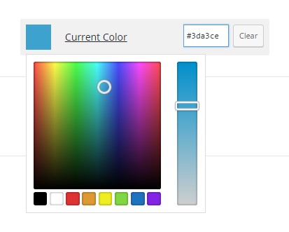
'field' => 'text', // text, textarea, checkbox, radio, select, iconpicker, fonts, hex_color, image, file.
'choices' => array(), // for `select` and `radio` field.
'type' => 'control', (*)
'active_callback' => '', (optional: is_front_page, is_single)
'transport' => 'refresh', // refresh or postMessage (default: refresh)
'sanitize_callback' => '', (optional) Maybe need to use a custom function or sanitization.
),
unique_control_IDtitledescriptionsection- parent Section IDdefault- default valuefield- control typechoise- select, radio controls value variantsactive_callback- callback-function, defines when to show the controltransport- refresh or postMessage (value process type)sanitize_callback- custom function for value validation before saving to the database
Control can locate in section only.
Control Types
- text
- textarea
- url
- password
- checkbox
- range
- number
- select
- fonts - fonts list (system and Google Web fonts)
- radio
- hex_color
- image
- file
- iconpicker - for icon picking
Cherry Handler
Description
Cherry-handler is designed for AJAX queries creation and managing. Automates process with nonce check, user role (capability), public AJAX. Also allows to send data for server processing and receive them back.
Sample creation
Every module initialization call creates its query with preset parameters. Operation procedure can be divided into 2 parts:
- query initialization (registration). This part is carried out on the back-end
- instance initialization in public front-end or admin front-end js scripts
Back-end initialization
Handler parameters:
id- unique handler ID (AJAX query). To avoid problems use various prefixes and numbers during generating the IDs. ID is used for binding back-end and front-end handlersaction- wp-action name, handler creates an action by addingwp_ajax_andwp_ajax_nopriv_for the set name. Action name can be the same with ID. Action value is used for generating unique noncecapability- user role wrapper for current_user_can() wp functionis_public- defines whether to create an action withwp_ajax_nopriv_prefix for public front-end (false by default)callback- function that can be done after all checks. The callback can return void result. It can be done via echo or return, but the answer will be generated in json format. The result is located in Data property.type- query type (post by default)sys_messages- system messages arrayinvalid_base_data- server error or nonce field is emptyno_right- no user rightinvalid_nonce- nonce validation erroraccess_is_allowed- access is allowedwait_processing- previous query processing message
Initialization example:
$sys_messages = array(
    'invalid_base_data' => esc_html__( 'Unable to process the request without nonche or server error', 'text-domain' ),
    'no_right'          => esc_html__( 'No right for this action', 'text-domain' ),
    'invalid_nonce'     => esc_html__( 'Stop CHEATING!!!', 'text-domain' ),
    'access_is_allowed' => esc_html__( 'Access is allowed','text-domain' ),
    'wait_processing'   => esc_html__( 'Please wait, processing the previous request', 'text-domain' ),
);

$options_ajax_handler = get_core()->init_module(
    'cherry-handler', array(
        'id'           => 'cherry_save_options_ajax',
        'action'       => 'cherry_save_options_ajax',
        'capability'   => 'manage_options',
        'callback'     => array( $this , 'cherry_save_options' ),
        'sys_messages' => $sys_messages,
        )
);
Note: If you set an empty line in a message, the notice will not be displayed. For example: If you don’t need an "Access is allowed" message, leave this field empty during handler initialization.
Front-end initialization
Initialization example:
saveOptionsInstance = new CherryJsCore.CherryAjaxHandler( /* object with parameters */ );
If CherryAjaxHandler is unavailable, handler can be initialized with CherryHandlerInit event:
$( document ).on( 'CherryHandlerInit', this.init );
Or add cherry-handler-js when adding your script in dependencies:
wp_enqueue_script(
    'your-script-handle',
    get_template_directory_uri() . '/assets/admin/js/script.js',
    array( 'cherry-js-core, cherry-handler-js' ),
    1.0.0,
    true
);
Handler js parameters:
handlerId- when checking the global area of js variables, you will see a variable with the name you’ve set during initializing the handler to a back-end.cache- if set to false the browser will not cache the query. It will also add the line_=[TIMESTAMP]в URL. (false by default)processData- by default all send to server data will be transformed into line in url-format (fName1=value1&fName2=value2&...) relevant toapplication/x-www-form-urlencoded. If you need to send data that can’t be processed in the mentioned way (for example DOM-document), you should disable processData option. (true by default)url- this parameter automatically defines the module, but you can set it manuallybeforeSendCallback- custom-function on ajax before send requesterrorCallback- custom-function on ajax error eventsuccessCallback- custom-function on ajax success eventcompleteCallback- custom-function on ajax complete event
After js handler initialization the following methods are available:
send- formats AJAX query after all necessary checks. Each query processing stage comes with system messages. Launch method in any event whether it is click or scroll, for instance:sendData- formats AJAX query and sets data in your custom callback. Wrapping-function for send methodsdata- data for sending
sendFormData- signs the form and sends to your custom callbackformId- unique form ID (form tag attribute)
Example:
( function( $, CherryJsCore ) {
    'use strict';
    CherryJsCore.utilites.namespace('cherryPopupsBackScripts');
    CherryJsCore.cherryPopupsBackScripts = {
        saveHandlerId: 'cherry_save_options_ajax',
        setAsDefaultHandlerId: 'cherry_set_as_default_options_ajax',
        resetHandlerId: 'cherry_restore_options_ajax',
        saveButtonId: '#cherry-popups-save-options',
        resetButtonId: '#cherry-popups-restore-options',
        formId: '#cherry-popups-options-form',
        saveOptionsInstance: null,
        resetOptionsInstance: null,
        cherryHadlerInit: function () {
            // Add function to the event CherryHandlerInit
            $( document ).on( 'CherryHandlerInit', this.init.bind( this ) );
        },
        init: function () {
            // Initialize handlers here, set unique id and necessary callbacks
            this.saveOptionsInstance = new CherryJsCore.CherryAjaxHandler({
                handlerId: this.saveHandlerId,
                successCallback: this.saveSuccessCallback.bind( this )
            });
            this.resetOptionsInstance = new CherryJsCore.CherryAjaxHandler({
                handlerId: this.resetHandlerId,
                successCallback: this.restoreSuccessCallback.bind( this )
            });
            this.addEvents();
        },
        addEvents: function () {
            $( 'body' )
                .on( 'click', this.saveButtonId, this.saveOptionsHandler.bind( this ) )
                .on( 'click', this.resetButtonId, this.resetOptionsHandler.bind( this ) );
        },
        saveOptionsHandler: function( event ) {
            // Call method  sendFormData of the sample saveOptionsInstance, initialized above
            this.saveOptionsInstance.sendFormData( this.formId );
        },
        resetOptionsHandler: function( event ) {
            // Call method send of the sample resetOptionsInstance, initialized above
            this.resetOptionsInstance.send();
        },
        saveSuccessCallback: function() {
            CherryJsCore.cherryHandlerUtils.noticeCreate( 'success-notice', cherryPopupnSettings.save_message );
        },
        restoreSuccessCallback: function() {
            CherryJsCore.cherryHandlerUtils.noticeCreate( 'success-notice', cherryPopupnSettings.restore_message );
                setTimeout( function() {
                window.location.href = cherryPopupnSettings.redirect_url;
            }, 500 );
        }
    }

    CherryJsCore.cherryPopupsBackScripts.cherryHadlerInit();

} ( jQuery, window.CherryJsCore ) );
Data sent to the custom callback are available in the global array with "data" clue.
if ( ! empty( $_REQUEST['data'] ) ) {
    $data = $_REQUEST['data'];
}
Display system messages
The module allows to display system messages on the admin front-end, for that you need to call js method:
CherryJsCore.cherryHandlerUtils.noticeCreate( 'success-notice', 'Save options' );
noticeCreate method takes parameters:
type- message type (success-notice, info-notice, error-notice) success-notice by defaultmessage- message text
Example:
Cherry Dynamic CSS
General Description
Parses transferred CSS files and changes fond dynamic variables and functions to the proper values. Parsed CSS is added to the style tag in the site head.
Variables set in $name-variable format. Variable can be an array. In this case value of any of the elements of this array can be received by a key on the same method as in PHP - $variable_name[key]. If it is necessary to add measurement units, they should be wrapped into the curly brackets - $variable{px} - in this way the parser won't see the units as a part of variable.
Functions are set in @function_name() format. Full functions list and adding new functions algorithm is the following.
Module Arguments
The module can take arguments array with the following keys:
prefix- string - theme name. If we use the module in the theme and a prefix for plugin options or a name of an option in which all available plugin options are stored.type- string - type of usable options (theme_mod or option)single- boolean - options storage type. If true - all options are stored as an array in a single database slot. In other case, each option is stored in a single slot.css_files- array - path array to CSS files which should be parsedoptions- array - options array, options names are used as variables names. Options values are taken from the database automatically and substitute the corresponding variables
Functions
Available functions
darken( color, percent)- make the passed color darker on a passed percent.lighten( color, percent )- make the passed color lighter on a passed percent.contrast( base color, light, dark )- choose contrast color for the base color from two passed colors. If the base color is dark - the first passed color (light) will be returned . If the base color is dark - the second passed color (dark) will be returnedalpha( color, transparency )- adds transparency to the passed color.background( selector, array_with_background_data )- not used yet as it works with data format on Cherry4typography- not used yet as it works with data format on Cherry4box- not used yet as it works with data format on Cherry4emph( selector, color, property)- adds passed color to the passed property and generates a selector with hover which is 10% darkerfont_size( size, operation, rounding, percent)- changes passed size on a passed percent with the help of passed operation (multiple addition). The result is rounded with the help of passed function (floor, ceil, round, abs)container_compare( container_width, element_width )- compares container width value with the element value. If the element width is less it remains unchanged. If more, container width is returned.sum( value1, value2 )- sums up value1 and value2diff( value1, value2 )- subtracts value2 from value1menu_toogle_endpoint- not used yet as it works with data format on Cherry4
User function addition
User functions can be added to the module. cherry_css_func_list filter is used for that. Filter takes array of available function names, and callbacks for their processing, as an argument. To add a new function, you need to add a new key-value pair to this array with the help of the filter. Key is a new function name and value - callback name for this function.
Available hooks
Actions
cherry_dynamic_css_include_custom_files
Arguments:
$this->args- global module arguments$this->core- core sample for the given module.
Called in print_inline_css() method. With the help of this hook you can pass your CSS for processing by the given module sample. The given CSS will be added after the main one.
Filters
cherry_css_var_list
Arguments:
$var_list- indexed array with the list of available variables of the given module sample (taken from the arguments)$this->args- global module arguments. With the help of this filter you can change an array of variables available for processing in the given module sample. Changes the list of available variables list only.
cherry_css_variables
Arguments:
$variables- associative array (variable_name => variable_value)$this->args- global module arguments. This filter allows to change the list of available module variables and their value.
cherry_css_func_list
Arguments:
$func_list- associative array with the list of available functions (function_name => callbacks)$this->args- global module arguments. This filter allows to change the effect of current function on parser or add new functions.
cherry_dynamic_css_parsed_styles
Arguments:
$parsed_css- string with processed CSS (without wrapping style tags)$this->args- global module arguments. The filter allows change/add processed CSS before displaying it on the page.
Adding inline styles
The module allows to generate inline styles and add them to the <head>. In this way, multiple <style> tags are deleted from DOM.
First of all, initialize the module and place instance into the variable:
$this->dynamic_css = $this->get_core()->init_module( 'cherry-dynamic-css', array() );
after that add_style method is available. The method takes 3 parameters:
selector- css selectorstyle- styles array, where key is css attribute and value - css value.media- array which consists of 2 keys,min => min-width,max => max-width, in this way you can set css media breakpoints
Example:
$this->dynamic_css->add_style(
    '#your-selector',
    array(
        'width'  => '100%',
        'height' => 'auto',
    ),
    array(
        'min' => '320px',
        'max' => '989px',
    )
);
Cherry JS Core
General description
The module is used for:
- General organization of JS-scripts structure
- JS-utilities realization
- Formation of the general
CherryJsCoreobject for JS-project. The object is located in the global scope and contains data about project scripts and other issues - For PHP and JS interaction realization
The module is divided to PHP and JS parts. PHP-file is singletone-calss which creates a single instance per project. PHP is mainly used for PHP and JS interaction realization via data localization (wp_localize_script) from wp-admin. In the main PHP file, you also need to add necessary assets. JS processes received from wp-admin data and contains abstract utilities and expressions general for the entire project.
Main JS object structure description
name : 'Cherry Js Core', // module name
version : '1.0.0', // module version
author : 'Cherry Team', // module author
variable : { // general module variables
    $document : $( document ), // variable with link on document object, which returned jq-selector
    $window : $( window ), // variable with link on window object, which returned jq-selector
    browser : $.browser, // browser data
    browser_supported : true, // browser support
    security : cherry_ajax, // unique security key
    loaded_assets : { // list of loaded assets
        script : wp_load_script, // scripts list
        style : wp_load_style // styles list
    },
    ui_auto_init: ( 'true' == ui_init_object.auto_init ) ? true : false, //  ui-elements auto initialization
    ui_auto_target: ui_init_object.targets // target selectors where you need to carry out ui-elements auto-initialization
},
status : { // current sessions status
    on_load : false, // window load status
    is_ready : false // document readiness status
}
Expressions
ui_init- ui-elements initialization by target-selector. Selectors can be set viacherry_core_js_ui_init_settingsfilter in the array format. You can also state auto initialization status (default false)widget_added_ui_init- widget-added event initialization (add widget to the widget area event). At the moment there is a ui-elements initialization triggerwidget_updated_ui_init- widget-added event initialization (after save widget update event). At the moment there is a ui-elements initialization trigger
Utilities
namespace- utility for creating name space inside the defaultCherryJsCoreget_compress_assets
Cherry Template Manager
General Description
The module allows to load and process template files (tmpl). In its turn, tmpl files contain html markup and macros which are replaced by content during files parsing.
tmpl-files load order is the following:
- folder - wp-content / uploads / theme_name (plugin_name) / template-name.tmpl
- folder in the theme - wp-content / themes / theme_name / templates / theme_name (plugin_name) / template_name.tmpl
- folder in the plugin - wp-content / plugins / plugin_name / templates / theme_name (plugin_name) / template_name.tmpl
Files structure
tmpl-file can include any HTML markup and macros of two types.
PHP code in tmpl-files will not work.
Macros types:
%%MACRO_NAME%%- macro which calls the callback for processing$$MACRO_NAME$$- macro which receives variable value from variable attribute of the callbacks class.
Example:
<button type="submit" class="search-submit btn btn-primary">
    %%ICON%%
    %%SUBMIT_TEXT%%
</button>

<span class="screen-reader-text">$$READER_TEXT$$</span>
<input type="search" class="search-field" placeholder="$$PLACEHOLDER$$" value="" name="s">
Module arguments
template_dir- string - path to template format. By default:templates/%1$s/%2$s.tmplslug- string - product slug (set automatically). By default:''upload_dir- string - path to directory with uploads (set automatically). By default:''macros_callback- string - regular expression for callback macro which is passed in the callbacks class. By default:/%%.+?%%/macros_variable- string - variable macro regular expression which is passed in the callbacks class. By default:/\$\$.+?\$\$/
Module methods
parsed_template
The method loads tmpl-files and parses callbacks and variables macros, replacing them with their results. The method returns HTML.
template_name- string - name of the loaded template (without *.tmpl extension). Example: search-form. By default: falseclass- string | stdClass - class name or sample. If class name is passed as string, method parsed_template tries to get its sample. If sample is passed, methods starts to work with it right away. All methods for callback macros should be public. Data for variables macro should be stored as an array inside $variables array of the passed class. The property should also be public. By default: falsemacros_callback- string - regular expression for callback macro, which is passed in callback class. the given argument is set individually and will be of the top priority, compared to the module macros_callback argument. By default: falsemacros_variable- string - regular expression for variable macros, which is passed in callback class. The given argument is set individually and will be of the top priority, compared to the module macros_variable argument. By default: false
Example:
$template_manager = Cherry_Template_Manager::get_instance();

$template_manager->parser->parsed_template(
    'your-template-name',
    your_callback()
);
Callback & variables filters
You can rewrite or add new Callbacks and variables values. For that you can use 2 filters, one for variables and the second for callbacks.
They have the following formats:
- Variable -
{$product_slug}_set_variable_{$macro_name}. In lower case. Example: cherry-search_set_variable_placeholder. The macro in tmpl-file looks like that -$$PLACEHOLDER$$ - Callback -
{product_slug}_set_callback_{$macro_name}. In lower case. Example: cherry-search_set_callback_submit_text. The macro in tmpl-file looks like that -%%SUBMIT_TEXT%%
get_template_by_name
The method loads tmpl-file content. Search result is returned with a string. If the template is not found, returns false value.
name- string - name of the loaded template (without *.tmpl extension). Example: search-form-input. By default:false
Example:
$template_manager = Cherry_Template_Manager::get_instance();

$template_manager->loader->get_template_by_name( 'your-template-name' );
Cherry Widget Factory
General Description
The module adds Cherry_Abstract_Widget class which allows you to create custom widgets. Besides adding an abstract widget, the base module class passes the current core sample to the widgets built on its base and calls automatic UI elements and widgets initialization.
Cherry_Abstract_Widget
__construct()
Creating your widget based on Cherry_Abstract_Widget in constructor, you should claim several compulsory attributes.
$this->widget_cssclass- CSS class, which wll be added to the widget on the frontend. It is recommended to avoid underscores in titles as they will be cut.$this->widget_description- widget description that will be displayed in the admin panel.$this->widget_id- base widget ID$this->widget_name- widget name that will be displayed in the admin panel.$this->settings- associative array with widget fields.
Widget fileds example:
'title'  => array(
    'type'  => 'text', // one of available UI element types
    'value' => default value,
    'label' => label for the field in the admin panel
Other fields that can be added to the array depend on the type of the element.
If it is necessary to pass a set of dynamically generated data (list of categories, posts, tags, etc.) as an options array for any of the fields, it is better to use an
options_callbackattribute. In this attribute you need to pass a function that will return a necessary options array. It is done to make the dynamically generated options list work only during widget controlls form generating procedure.
widget_start
widget_start( $args, $instance );
Method that displays widget header.
Arguments:
$args- widget common arguments array$instance- data array for the current widget sample
widget_end
widget_end( $args );
Method that displays widget footer.
Arguments:
$args- array of widget general arguments
setup_widget_data
setup_widget_data( $args, $instance );
Method that should be preferably called at the beginning of widget()-method. It sets $this->args and $this-instance properties for using in any service methods.
reset_widget_data
reset_widget_data();
Method which resets $this->args and $this-instance.
Module arguments
The module doesn't take any custom arguments, except for current core sample.
Available Hooks
Actions
cherry_widget_after_update- $instance argument - data for the current widget sample. Hook that triggers after update of current widget samplecherry_widget_factory_control- $args argument - control arguments array. Hook that allows to add custom controls to the widget settings editing formcherry_widget_reset_data- hook which allows to perform additional operations while removing the current widget data from the object cash
Filters
none
Cherry Interface Builder
Module Description
The module allows to create page elements like sections, settings, components.
There are 4 types of components:
- vertical tabulation
- horizontal tabulation
- accordion
- switcher

Module initialization
To initiate the module you need to call init_module( $name, $args ) core method.
The method can take the following parameters:
$name- string - module name$args- array - module argumentsviews- array - the array contains relative path to the templates of all interface builder elementssection- string - path to section template. By default: inc/views/section.phpcomponent-tab-vertical- string - path to the component tab vertical template. By default: inc/views/component-tab-vertical.phpcomponent-tab-horizontal- string - path to the component tab horizontal template. By default: inc/views/component-tab-horizontal.phpcomponent-toggle- string - path to the component toggle template. By default: inc/views/component-toggle.phpcomponent-accordion- string - path to the component accordion template. By default: inc/views/component-accordion.phpcomponent-repeater- string - path to the component repeater template. By default: inc/views/component-repeater.phpsettings- string - path to the settings template. By default: inc/views/settings.phpcontrol- string - path to the sections template. By default: inc/views/control.phpsettings-children-title- string - path to the sections template. By default: inc/views/settings-children-title.phptab-children-title- string - path to the sections template. By default: inc/views/tab-children-title.phptoggle-children-title- string - path to the sections template. By default: inc/views/toggle-children-title.phphtml- string - path to the sections template. By default: inc/views/html.php
Example:
$this->core->init_module( 'cherry-interface-builder', array() );
Save module sample into the variable:
$builder = $this->core->modules['cherry-interface-builder'];
Create interface builder elements
Section element
Section element allows to create a wrapper around interface elements. For "section" element registration you need to use register_section( $args = array() ) method. Method register_section takes the following parameters:
$args- array - array with registrable sections- Section settings:
id- string - optional parameter, if$argsparameter is passed as a set of elements with keys. If$argsis passed as in one dimensional array, this parameter is a must. By default: ""parent- string - parent element ID. By default: ""scroll- boolean - limits element height to 750px and adds scrollbar. By default: falsetitle- string - element title. By default: ""description- string - element description. By default: ""class- string - element class. By default: ""view- string - path to new element template. By default: ""master- string - additional class for master / slave system. By default: ""
Example:
$builder->register_section(
    array(
        'option_section' => array(
        'type'           => 'section',
        'scroll'         => true,
        'title'          => esc_html__( 'Title', 'text-domain' ),
        'description'    => esc_html__( 'Description', 'text-domain' ),
    ) )
);
Form element
Creates wrap around interface element with the help of form tag.
For "form" element registration you need to use register_form( $args = array() )-method
Parameters:
$args- array - array with registrable sections- Sections settings:
id- string - optional parameter, if parameter$argsis passed as a set of elements with keys. If$argsis passed as in one dimensional array, this parameter is a must. By default: ""type- string - element type (optional parameter for register_form method). By default: sectionparent- string - parent element ID. By default: ""view- string - path to new element template. By default: ""class- string - element class. By default: ""accept-charset- string - sets encoding where server can take an process data. By default: "utf-8"action- string - address of the program or document which processes form data. By default: ""autocomplete- string - enables form fields autosuggestion. By default: "on"enctype- string - form data encoding method. By default: "application/x-www-form-urlencoded"method- string - HTTP-protocol method. By default: "post"novalidate- boolean - cancels internal form data input correctness check. By default: ""target- string - window or frame name, where the developer will upload the returned result. By default: ""
Example:
$builder->register_form(
    array(
        'option_form' => array(
        'type'        => 'form',
        'parent'      => 'option_section',
        'action'      => 'my_action.php',
    ) )
);
Settings element
Settings element allows to group interface elements.
For "settings" element registration you need to use register_settings( $args = array() )
Parameters:
$args- array - array with registrable settings- settings:
id- string - optional parameter, if parameter$argsis passed as a set of elements with keys. If$argsis passed as in one dimensional array, this parameter is a must. By default: ""type- string - element type (optional parameter forregister_settings). By default: sectionparent- string - parent element id. By default: ""scroll- boolean - limits element height to 750px and adds scrollbar. By default: falsetitle- string - element title. By default: ""description- string - element description. By default: ""class- string - element class. By default: ""view- string - path to new element template. By default: ""master- string - additional class for master / slave system. By default: ""
Example:
$builder->register_settings(
    array(
        'ui_elements' => array(
            'type'              => 'settings',
            'parent'            => 'option_section',
            'title'             => esc_html__( 'Title', 'text-domain' ),
            'description'       => esc_html__( 'Description', 'text-domain' ),
        ),
        'bi_elements' => array(
            'type'              => 'settings',
            'parent'            => 'option_section',
            'title'             => esc_html__( 'Title', 'text-domain' ),
            'description'       => esc_html__( 'Description', 'text-domain' ),
        ),
    )
);
Components element
Component element allows to add one of the components.
For "settings" element registration you need to use register_component( $args = array() ) method.
Parameters:
$args- array - array with registered component- settings:
id- string - optional parameter, if parameter$argsis passed as a set of elements with keys. If$argsis passed as in one dimensional array, this parameter is a must. By default: ""type- string - component type (by default -component-tab-horizontal):component-accordion- string - accordioncomponent-toggle- string - switchercomponent-tab-vertical- string - vertical tabcomponent-tab-horizontal- string - horizontal tab
parent- string - parent element id. By default: ""scroll- boolean - limits element height to 750px and adds scrollbar. By default: falsetitle- string - element title. By default: ""description- string - element description. By default: ""class- string - element class. By default: ""view- string - path to new element template. By default: ""view_wrapping- boolean - add view wrapping. By default: truemaster- string - additional class for master / slave system. By default: ""
Example:
$builder->register_component(
    array(
        'accordion' => array(
            'type'        => 'component-accordion',
            'parent'      => 'bi_elements',
            'title'       => esc_html__( 'Title', 'text-domain' ),
            'description' => esc_html__( 'Description', 'text-domain' ),
        ),
        'toggle' => array(
            'type'        => 'component-toggle',
            'parent'      => 'bi_elements',
            'title'       => esc_html__( 'Title', 'text-domain' ),
            'description' => esc_html__( 'Description', 'text-domain' ),
        ),
        'tab_vertical' => array(
            'type'        => 'component-tab-vertical',
            'parent'      => 'bi_elements',
            'title'       => esc_html__( 'Title', 'text-domain' ),
            'description' => esc_html__( 'Description', 'text-domain' ),
        ),
        'tab_horizontal' => array(
            'type'        => 'component-tab-horizontal',
            'parent'      => 'bi_elements',
            'title'       => esc_html__( 'Title', 'text-domain' ),
            'description' => esc_html__( 'Description', 'text-domain' ),
        ),
    )
);
component-tab-vertical
The component adds vertical tabulation. Find more details in Components elements section.
component-tab-horizontal
The component adds horizontal tabulation. Find more details in Components elements section.
component-toggle
The component adds a toggle that allows to show and hide interface element. Find more details in Components elements section.
component-accordion
The component adds accordion with show/hide interface elements function Find more details in Components elements section.
Control element
Adds interface elements from Cherry UI-elements module, but in wrapper.
For settings element registration you need to use register_control( $args = array() ) method register_control method takes the following parameters:
- $args - array - array with interface elements
- $child_class - string - argument allows to pass CSS class for UI element
Example:
$builder->register_control(
array(
'checkbox' => array(
'type' => 'checkbox',
'parent' => 'ui_elements',
'title' => esc_html__( 'Title', 'text-domain' ),
'description' => esc_html__( 'Description', 'text-domain' ),
'class' => '',
'value' => array(
'checkbox' => 'true',
),
'options' => array(
'checkbox' => esc_html__( 'Check Me', 'text-domain' ),
),
),
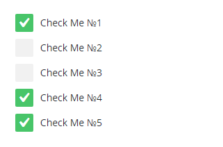
'checkbox_multi' => array(
'type' => 'checkbox',
'parent' => 'ui_elements',
'title' => esc_html__( 'Title', 'text-domain' ),
'description' => esc_html__( 'Description', 'text-domain' ),
'class' => '',
'value' => array(
'checkbox-0' => 'false',
'checkbox-1' => 'false',
'checkbox-2' => 'false',
'checkbox-3' => 'true',
'checkbox-4' => 'true',
),
'options' => array(
'checkbox-0' => array(
'label' => esc_html__( 'Check Me #1', 'text-domain' ),
),
'checkbox-1' => esc_html__( 'Check Me #2', 'text-domain' ),
'checkbox-2' => esc_html__( 'Check Me #3', 'text-domain' ),
'checkbox-3' => esc_html__( 'Check Me #4', 'text-domain' ),
'checkbox-4' => esc_html__( 'Check Me #5', 'text-domain' ),
),
),
....
HTML element
register_html method allows to register custom HTML-markup.
The method takes the following parameters:
$args- array - array with registrable custom HTML-markup- Custom HTML-markup settings:
id- string - optional parameter, if parameter$argsis passed as a set of elements with keys. If$argsis passed as in one dimensional array, this parameter is a must. By default: ""type- string - element type (optional parameter forregister_html-method). By default: htmlparent- string - parent element id. By default: ""class- string - element class. By default: ""master- string - additional class for master / slave system. By default: ""html- string - HTML content displayed on the page. By default: ""
Render method
Render method allows to display interface elements on the page in two ways.
1-st way - use functions for elements registration like register_section, register_component etc. After that you should call the render method without parameters.
Render example:
$this->builder->render();
2-nd way - allows to pass the entire elements structure with the help of an array right to the render method.
Render example:
$builder->render( true, array(
    'ui_elements' => array(
        'type'        => 'settings',
        'parent'      => 'option_section',
        'title'       => esc_html__( 'Title', 'text-domain' ),
        'description' => esc_html__( 'Description', 'text-domain' ),
    ),
    'bi_elements' => array(
        'type'        => 'settings',
        'parent'      => 'option_section',
        'title'       => esc_html__( 'Title', 'text-domain' ),
        'description' => esc_html__( 'Description', 'text-domain' ),
    ),
....
render-method takes the following parameters:
$echo- boolean - data display type via echo function or via return value. By default: true$args- array - array with interface elements structure. By default: array()
Cherry Utility
General Description
The module is used for implementing:
- Posts attributes, tags and categories
- Title
- Content
- Excerpt
- More button
- Tags and categories description
- Posts, categories and tags metadata
- Post categories
- Post tags
- Post publish date
- Post author
- Post comments number
- Number of posts in category
- Number of posts in a tag
- Media elements
- Image preview
- Video
- Additional utilities
- Post link
- Link on tag or category
- Text cut
- Thumbnail size
- Get tags or categories array
Module arguments
The module can take arguments array with the following keys:
utility- array - sub modules arraymedia- sub-module that works with medial elements like images and videosattributes- sub-module that works with posts, tags and categories attributes like: title, content, description, read more buttonmeta-data- sub-module that works with posts, categories and tags metadata like: post author, publish date, number of comments, etc.
meta_key- array - meta keys arrayterm_thumb- option where tags and categories thumbnails key should be added. cherry_thumb by default. The given key can be used in cherry-term-meta module. It should be added in arguments infieldsoption.
Example:
'cherry-utility' => array(
    'autoload'  => true,
    'args'      => array(
        'utility' => array(
            'media',
            'attributes',
            'meta-data',
        ),
        'meta_key'  => array(
            'term_thumb' => 'cherry_thumb',
        ),
    ),
);
Sub-modules
If autoload argument value of the module is true, it is enough to get it from the $core->modules['cherry-utility'] to start working with modules.
Example:
$utility = $core->modules['cherry-utility']->utility;
where $core - Cherry_Core instance.
In case autoload argument value is false, the module should be initialized via init_module() core method. After that you can receive the module from $core->modules['cherry-utility'] core.
In the theme you can receive the module toolkit through theme_name_utility() function.
Example:
$utility = your_prefix_utility();
Сherry_Attributes_Utilit
path - cherry-framework\modules\cherry-utility\inc\cherry-attributes-utilit.php
The following methods are stored in the class:
get_title
The method returns post title, tag or category. The method has the following parameters:
$args- array - array with arguments for title customization. The array can contain the following keys with valuesvisible- boolean - show/hide title. The key can take two values true/false. If false returns empty string. By default: truelength- int - show/hide title. Returned title length. 0 value returns the entire title. By default: 0trimmed_type- string - title cut method, works with length attribute. Has two values:word- word cut,char- characters cut. By default: wordending- string - character that is displayed after title cut. By default: …html- string - returned HTML-format (the string contains special characters %1$s). By default: <h3 %1$s><a href="%2$s" %3$s rel="bookmark">%4$s</a></h3>- %1$s - Contains class key value, mentioned below. Displayed in - class="class_name" format
- %2$s - Contains post URL
- %3$s - Contains uncut post title, even if length is nonzero. Displayed in - title ="post/ category/ tag title" format
- %4$s - Contains post title
class- string - title CSS-class. By default: ""title- string - HTML-tag title. By default: ""echo- boolean - title display method true/false. If true displays the result immediately. By default: false
$type- string - entity type from which you need to get a title. Has two values post - post and term - categories, tag. By default: post$ID- int - ID of any entity, listed in$typeattribute. No need to indicate if the function is used inside posts loop. By default: 0
Example:
$utility = $core->modules['cherry-utility']->utility;
// Post title display
$utility->attributes->get_title( array(
'visible' => true,
'length' => 0,
'trimmed_type' => 'word',
'ending' => '…',
'html' => '<h1 %1$s><a href="%2$s" title="%3$s" rel="bookmark">%4$s</a></h1>',
'class' => 'post-title',
'echo' => true,
) );
// Category title display
$utility->attributes->get_title(
array(
'visible' => true,
'length' => 5,
'trimmed_type' => 'word',
'ending' => '…',
'html' => '<h2 %1$s><a href="%2$s" title="%3$s" rel="bookmark">%4$s</a></h2>',
'class' => 'term-title',
'echo' => true,
),
'term',
256
);
get_content
The method returns post content or excerpt and tag or category description.
The method has the following parameters get_content( $args = array(), $type = 'post', $ID = 0):
$args- array - content settings arguments array. The array can contain the following keys with valuesvisible- boolean - show/hide content. The key can take two values true/false. If false returns empty string. By default: truecontent_type- string - displayed content type. By default: post_content. Key has three values:- post_content - displays post content
- post_excerpt - displays post description. If this value is set without description, it displays the content or its part depending on length parameter value
- term_description - this value is set automatically if
$typeis term
length- int - returned content length. 0 value returns the entire content. By default: 0trimmed_type- string - content cut method, works with length attribute. Has two values:- word - word cut
- char - characters cut
ending- string - character that is displayed after content cut. By default: …html- string - returned HTML-format (the string contains special characters %1$s). By default: <p %1$s>%2$s</p>- %1$s - contains class key value, mentioned below. Displayed in - class="class_name" format
- %2$s - includes content depending on
content_typeargument value
class- string - content CSS-class. By default: ""echo- boolean - content display method true/false. If true displays the result immediately. false value allows to save the result in a variable. By default: false
$type- string - entity type from which you need to get a content. Has two values post - post and term - categories, tag. By default: post$ID- int - ID any entity, listed in$typeattribute. No need to indicate if the function is used inside posts loop. If$typeis term,$IDattribute is a must. By default: 0
Example:
$utility = $core->modules['cherry-utility']->utility;
// Post content display.
$utility->attributes->get_content( array(
'visible' => true,
'content_type' => 'post_content',
'length' => 0,
'trimmed_type' => 'word',
'ending' => '…',
'html' => '<p %1$s>%2$s</p>',
'class' => 'post-content',
'echo' => true,
) );
// Category description display.
$utility->attributes->get_content(
array(
'visible' => true,
'length' => 55,
'trimmed_type' => 'word',
'ending' => '…',
'html' => '<p %1$s>%2$s</p>',
'class' => 'term-description',
'echo' => true,
),
$type = 'term',
$ID = 348
);
get_button
The method returns post button, tag or category.
The method has the following parameters get_button($args = array(), $type = 'post', $ID = 0):
$args- array - button customization arguments array. The array can contain the following keys with values:visible- boolean - show/hide button. The key can take two values true/false. If false returns empty string. By default: truetext- string- button text. If the argument is empty, the button is not displayed and the function returns empty string. By default: ""icon- string - button icon. By default: ""html- string - returned HTML-format (the string contains special characters %1$s). By default: <a href="%1$s" %2$s %3$s><span class="btn__text">%4$s</span>%5$s</a>:- %1$s - contains post, category or tag link, depending on the
$typeattribute value - %2$s - contains post/category/tag title. Displayed in - title="post/ category/ tag" format
- %3$s - contains class key value, mentioned below. Displayed in - class="class_name" format
- %4$s - contains text attribute value
- %5$s - contains image attribute value
- %1$s - contains post, category or tag link, depending on the
class- string - button CSS-classclass- string - button CSS-class. By default: btntitle- string - HTML-tag title <a>. By default: ""echo- boolean - button display method true/false. If true displays the result immediately. false value allows to save the result in a variable. By default: false
$type- string - entity type from which you need to get a button. Has two values post - post and term - categories, tag. By default: post$ID- int - ID of any entity, listed in$typeattribute. No need to indicate if the function is used inside posts loop. If$typeis term,$IDattribute is a must. By default: 0clear
Example:
// Display post button.
$utility->attributes->get_button( array(
    'visible' => true,
    'text'    => esc_html__( 'Read More', 'text-domain' ),
    'icon'    => '<i class="material-icons">arrow_forward</i>',
    'class'   => 'btn',
    'html'    => '<a href="%1$s" title="%2$s" %3$s><span class="btn__text">%4$s</span>%5$s</a>',
    'echo'    => true,
) );

// Display category button.
$utility->attributes->get_button(
    array(
        'visible' => true,
        'text'    => esc_html__( 'Read More', 'text-domain' ),
        'icon'    => '<i class="material-icons">arrow_forward</i>',
        'class'   => 'btn',
        'html'    => '<a href="%1$s" title="%2$s" %3$s><span class="btn__text">%4$s</span>%5$s</a>',
        'echo'    => true,
    ),
    $type = 'term',
    $ID = 129
);
Cherry_Meta_Data_Utilit
path - cherry-framework\modules\cherry-utility\inc\cherry-meta-data-utilit.php
The following methods are contained in this class:
get_terms
The method returns post tags or categories depending on the listed parameters.
The method has the following parameters get_terms( $args = array() , $ID = 0 ):
$args- array - arguments array. The array can contain the following keys with values:visible- boolean - show/hide. The key can take two values true/false. If false returns empty string. By default: truetype- string - received data type. The key has 2 values (dy default: category):- category - displays category
- post_tag - displays tags
icon- string - icon. By default: ""prefix- string - icon/ category list/ tags prefix. By default: ""delimiter- string - category/tag delimiter. By default: " " (space)before- string - category/tags list HTML-wrapper start. By default: <div class="post-terms">after- string - category/tags list HTML-wrapper end. By default: </div>class- string - CSS-class. By default: post-termecho- boolean - display method true/false. If true displays the result immediately. false value allows to save the result in a variable. By default: false
$ID- int - Post ID. No need to indicate if the function is used inside posts loop. By default: 0
Example:
$utility = $core->modules['cherry-utility']->utility;

// post categories list display
$utility->meta_data->get_terms( array(
    'visible'   => 'true',
    'type'      => 'category',
    'icon'      => '<i class="material-icons">bookmark</i>',
    'delimiter' => ', ',
    'echo'      => false,
) );

// post tags list display
$utility->meta_data->get_terms( array(
    'visible'   => 'true',
    'type'      => 'post_tag',
    'icon'      => '<i class="material-icons">bookmark</i>',
    'delimiter' => ', ',
    'echo'      => true,
) );
get_author
The method returns post author.
The method has the following parameters get_author( $args = array() , $ID = 0 ):
$args- array - arguments. The array can contain the following keys with values:visible- boolean - show/hide. The key can take two values true/false. If false returns empty string. By default: trueicon- string - icon. By default: ""prefix- string - link prefix. By default: ""html- string - returned HTML-format (the string contains special characters %1$s). By default: %1$s<a href="%2$s" %3$s %4$s rel="author">%5$s%6$s</a>- %1$s - prefix key value
- %2$s - author's posts page url
- %3$s - <a> tag title. Displayed in - title="text" format. If title key not listed, the title is not displayed
- %4$s - contains class key value. Displayed in - class="class_name" format
- %5$s - includes icon listed in icon key
- %6$s - contains author name
title- string - <a> HTML-tag title. By default: ""class- string - CSS-class. By default: post-authorecho- boolean - display method true/false. If true displays the result immediately. false value allows to save the result in a variable. By default: false
$ID- int - Post ID. No need to indicate if the function is used inside posts loop. By default: 0
Example:
$utility = $core->modules['cherry-utility']->utility;

// Display post author
$utility->meta_data->get_author( array(
    'icon' => '<i class="material-icons">person</i>',
    'echo' => true,
) );
get_comment_count
The method returns post comments number depending on the listed parameters.
The method has the following parameters get_comment_count( $args = array() , $ID = 0 ):
$args- array - arguments. The array can contain the following keys with valuesvisible- boolean - show/hide. The key can take two values true/false. If false returns empty string. By default: trueicon- string - icon. By default: ""prefix- string - link prefix. By default: ""sufix- string / function - displayed after comments number. Processes the special character %s. Example:_n_noop( '%s comment', '%s comments', 'text-domain' ). By default: %shtml- string - returned HTML-format (the string contains special characters %1$s). By default: %1$s<a href="%2$s" %3$s %4$s>%5$s%6$s</a>- %1$s - prefix key value
- %2$s - post comments url
- %3$s - <a> tag title. Displayed in - title="text" format. If title key not listed, the title is not displayed
- %4$s - contains class key value. Displayed in - class="class_name" format
- %5$s - includes icon listed in icon key
- %6$s - number of comments in the post
title- string - <a> HTML-tag title. By default: ""class- string - CSS-class. By default: post-comments-countecho- boolean - display method true/false. If true displays the result immediately. false value allows to save the result in a variable. By default: false
$ID- int - Post ID. No need to indicate if the function is used inside posts loop. By default: 0
Example:
$utility = $core->modules['cherry-utility']->utility;

// Post comments number display
$utility->meta_data->get_comment_count( array(
    'visible' => 'true',
    'icon'    => '<i class="material-icons">chat_bubble_outline</i>',
    'sufix'   => array( 'single' => '%s comment', 'plural' => '%s comments' ),
    'echo'    => true,
) );
get_date
The method returns post date depending on the listed arguments.
The method has the following attributes get_date( $args = array() , $ID = 0 ):
$args- array - arguments. The array can contain the following keys with valuesvisible- boolean - show/hide. The key can take two values true/false. If false returns empty string. By default: trueicon- string - icon. By default: ""prefix- string - link prefix. By default: ""html- string - returned HTML-format (the string contains special characters %1$s). By default: %1$s<a href="%2$s" %3$s %4$s><time datetime="%5$s">%6$s%7$s</time></a>:- %1$s - prefix key value
- %2$s - blog page url
- %3$s - <a> tag title. Displayed in - title="text" format. If title key not listed, the title is not displayed
- %4$s - contains class key value. Displayed in - class="class_name" format
- %5$s - publish date format in
Y-m-d\TH:i:sPdate format - %6$s - includes icon listed in icon key
- %7$s - post publish date format. The format is listed in the admin panel Settings -> General -> Date Format
title- string - <a> HTML-tag title. By default: ""class- string - CSS-class. By default: post-dateecho- boolean - display method true/false. If true displays the result immediately. false value allows to save the result in a variable. By default: false
$ID- int - Post ID. No need to indicate if the function is used inside posts loop. By default: 0
Example:
$utility = $core->modules['cherry-utility']->utility;

// Publish date display.
$utility->meta_data->get_date( array(
    'icon' => '<i class="material-icons">schedule</i>',
    'echo' => true,
) );
get_post_count_in_term
The method returns category/tag posts number, depending on the listed arguments.
The method has the following attributes get_post_count_in_term( $args = array() , $ID = 0 ).
$args- array - arguments. The array can contain the following keys with valuesvisible- boolean - show/hide. The key can take two values true/false. If false returns empty string. By default: trueicon- string - icon. By default: ""prefix- string - category/tag posts prefix. By default: ""sufix- string / function - displayed after posts number in category/tag. Processes the special character Example:_n_noop( '%s post', '%s posts', 'text-domain' ). By default: %shtml- string - returned HTML-format (the string contains special characters %1$s). By default: %1$s<a href="%2$s" %3$s %4$s rel="bookmark">%5$s%6$s</a>:- %1$s - prefix key value
- %2$s - categories/ tags page url
- %3$s - <a> tag title. Displayed in - title="text" format. If title key not listed, the title is not displayed in <a> tag
- %4$s - includes class argument value. Displayed in class="class_name" format
- %5$s - includes icon listed in icon key
- %6$s - contains categories/tags posts count and suffix attribute value
title- string - <a> HTML-tag title. By default: ""class- string - CSS-class. By default: post-countecho- boolean - display method true/false. If true displays the result immediately. false value allows to save the result in a variable. By default: false
$ID- int - category/tag ID. Compulsory attribute. By default: 0
Example:
$utility = $core->modules['cherry-utility']->utility;

// posts in category/ tag display.
$utility->meta_data->get_post_count_in_term( array(
    'icon'  => '<i class="material-icons">schedule</i>',
    'sufix' => array(
        'singular' => '%s post',
        'plural'   => '%s posts',
        'domain'   => 'text-domain',
        'context'  => false,
    ),
    'echo' => true,
) );
Cherry_Media_Utilit
path - cherry-framework\modules\cherry-utility\inc\cherry-media-utilit.php
The following methods are contained in this class:
get_image
The method returns category/tag/ post HTML thumbnails.
The method has the following attributes get_image( $args = array(), $type = 'post', $ID = 0 ):
$args- array - arguments. The array can contain the following keys with valuesvisible- boolean - show/hide. The key can take two values true/false. If false returns empty string. By default: truesize- string - image size. By default:apply_filters( 'cherry_normal_image_size', 'post-thumbnail' )mobile_size- string - image size on mobile device. By default:apply_filters( 'cherry_mobile_image_size', 'post-thumbnail' )html- string - returned HTML-format (the string contains special characters %1$s). By default: <a href="%1$s" %2$s><img src="%3$s" alt="%4$s" %5$s></a>:- %1$s - post/category/tag page url
- %2$s - includes class argument value. Displayed in class="class_name" format
- %3$s - image src
- %4$s - post/ category/ tag title
- %5$s - width, height attributes for <img> tag, displayed in format width="" height="". Will not be displayed if is false
class- string - CSS-class. By default: wp-imageplaceholder- boolean - show/hide placeholder if thumbnail is absent. By default: trueplaceholder_background- string - placeholder background color. Color value should be set without#. By default: 000placeholder_foreground- string - placeholder text color. Color value should be set without#. By default: fffplaceholder_title- string - placeholder title text color. If value is undefined, image size is displayed. By default: ""html_tag_suze- boolean - show/hide <img> tag. Included in special character %5$s in html key. By default: trueecho- boolean - display method true/false. If true displays the result immediately. false value allows to save the result in a variable. By default: false
$type- string - entity type from which you need to get a button. Has two values post - post and term - categories, tag. By default: post$ID- int -$typeattribute entity ID. No need to indicate if the function is used inside posts loop. If$typeattribute is term,$IDattribute is compulsory. By default: 0
Example:
$utility = $core->modules['cherry-utility']->utility;

// Display number of posts in category/tag.
$utility->media->get_image( array(
    'html'          => '<span style="background-image: url(\'%3$s\');"%4$s %2$s></span>',
    'class'         => 'term-img',
    'size'          => 'medium',
    'mobile_size'   => 'thumbnail',
) );
get_video
The method return post video HTML (it also supports other oembed objects).
The method has the following attributes get_video( $args = array(), $ID = 0 ):
$args- array - arguments. The array can contain the following keys with valuesvisible- boolean - show/hide. The key can take two values true/false. If false returns empty string. By default: truesize- string - oembed object size. By default:apply_filters( 'cherry_normal_video_size', 'post-thumbnail' )mobile_size- string - oembed object size on mobile screen. By default:apply_filters( 'cherry_mobile_video_size', 'post-thumbnail' )class- string - CSS-class. By default: wp-videoecho- boolean - display method true/false. If true displays the result immediately. false value allows to save the result in a variable. By default: false
$ID- int -$typeattribute entity ID. No need to indicate if the function is used inside posts loop. By default: 0
Example:
$utility = $core->modules['cherry-utility']->utility;

// Posts number display in category/tag.
$utility->media->get_video( array(
    'size'        => 'medium',
    'mobile_size' => 'thumbnail',
) );
Cherry_Satellite_Utilit
path - cherry-framework\modules\cherry-utility\inc\cherry-satellite-utilit.php
Class contains the following methods:
get_post_object
The method returns post object.
The method has the following attributes get_post_object( $ID = 0 ):
$ID- int - post ID
get_term_object
The method returns category/tag object depending on the listed $ID.
The method has the following attributes get_term_object( $ID = 0 ):
$ID- int - category/tag ID
get_post_permalink
The method returns post URL.
get_term_permalink
Method url to category/tag depending on the listed $ID.
The method has the following attributes get_term_permalink( $ID = 0 ):
$ID- int - category/tag ID
cut_text
Text cut method.
The method has the following attributes cut_text( $text, $length, $trimmed_type = 'word' , $after ):
text- string - text to cut. By default: ""length- int - words/characters length. By default: nulltrimmed_type- string (by default: word):- word - word cut
- char - characters cut
after- string - character that is displayed after content cut. By default: ""
get_thumbnail_size_array
The method returns an array with image height and width in px.
The method has the following attributes get_thumbnail_size_array( $size ):
size- string - thumbnail registered size slug. By default: ""
get_terms_array
The method returns categories/tags array. Array (id => name) format or in dependency of listed array attributes (slug => name).
The method has the following attributes get_terms_array( $tax = 'category', $key = 'slug' ):
tax- string - taxonomy type (by default: category). Has three values:- category
- post_tag
- post_format
key- string - key in array format (by default: slug). Has two values:- slug
- term_id
Cherry UI-elements
Description
UI-elements module is a set of the most widely used editing elements and controls. It consists of the wrapping file for elements list initialization, and elements set respectively.
Arguments
ui_elements- array and slug UI-elements, which should be added (php, css, js). All UI-elements will be added by default, their assets also will be added. To avoid adding excessive files, control this process by limiting UI-elements which will be used during page rendering.
Example:
your_prefix_get_core()->init_module( 'cherry-ui-elements', array(
    'ui_elements' => array(
        'text',
        'textarea',
        'select',
        'checkbox',
        'radio',
        'colorpicker',
        'media',
    ),
) );
Each module initialization call creates its own set of plugged UI-elements. After initialization for building instance UI-elements (samples) use get_ui_element_instance-method, which contains 2 parameters:
$ui_slug- element slug - identifier. For 1.1.3 version, the following UI-elements are available:- text
- textarea
- select
- checkbox
- radio
- colorpicker
- media
- stepper
- switcher
- slider
- repeater
- iconpicker
$args- UI-elements arguments
Example:
$current_element = ui_builder->get_ui_element_instance(
    'checkbox',
    array(
        'id'    => 'cherry-ui-checkbox-id',
        'name'  => 'cherry-ui-checkbox-name',
        'value' => array(
            'checkbox-1' => 'true',
            'checkbox-2' => 'true',
            'checkbox-3' => 'true',
        ),
        'options' => array(
            'checkbox-1' => 'checkbox 1',
            'checkbox-2' => 'checkbox 2',
            'checkbox-3' => 'checkbox 3',
        ),
        'label'  => '',
        'class'  => '',
        'master' => '',
    )
);
get_ui_element_instance function controls UI-elements calls. If the element was not passed during cherry-ui-elements module initialization, "non initialized UI-elements generation failure" service messages will be displayed.
UI-elements list
- ui-text
- ui-textarea
- ui-switcher
- ui-stepper
- ui-slider
- ui-select
- ui-repeater
- ui-radio
- ui-media
- ui-iconpicker
- ui-colorpicker
- ui-checkbox
ui-text
Render text input field (<input type="text">).

Arguments:
id- element attribute idname- element name attributevalue- valueplaceholder- element placeholder attributelabel- label tag textclass- custom CSS-classmaster- state dependency identifier from slaverequired- required element attribute (false by default)
ui-textarea
Render textarea field (<textarea></textarea>)
Arguments:
id- element attribute idname- element name attributevalue- valueplaceholder- placeholder element attributerows- rows element attribute, rows height in text stringscols- cols element attribute, cols width in characters.label- label tag textclass- custom CSS-classmaster- state dependency identifier from slave
ui-switcher
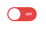
Arguments:
id- element attribute idname- element name attributevalue- valuetoggle- state settings- true_toggle - text for true state (On by default)
- false_toggle - text for false state(Off by default)
- true_slave - true state dependency identifier for master
- false_slave - false state dependency identifier for master
style- style-size for controller (normal by default, normal/small)label- label tag textclass- custom CSS-classmaster- state dependency identifier from slave
ui-stepper
"Stepper" controller render (<input type="number">)

Arguments:
id- element attribute idname- element name attributevalue- valuemax_value- max valuemin_value- min valuestep_value- stepplaceholder- placeholder element attributelabel- label tag textclass- custom CSS-classmaster- state dependency identifier from slave
ui-slider

Arguments:
id- element attribute idname- element name attributevalue- valuemax_value- max valuemin_value- min valuestep_value- stepplaceholder- placeholder element attributelabel- label tag textclass- custom CSS-classmaster- state dependency identifier from slave
In essence, ui-slider is an advanced version of ui-stepper.
ui-select
Select filtered controller render:
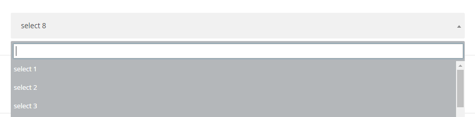
Select multiselect controller render:
Arguments:
id- element attribute idname- element name attributemultiple- multiple element attribute, tag for multiselect render (false by default)filter- tag for select filtered render (false by default)size- size element attribute, number of displayed select optionsinline_style- inline-style, which will be added to selectvalue- valueoptions- options array for select, where array key is option value and select option label is key valueplaceholder- placeholder element attributelabel- label tag textclass- custom CSS-classmaster- state dependency identifier from slave
You can also form group options and name them.
Example:
array(
    'id'           => 'cherry-ui-select-id',
    'name'         => 'cherry-ui-select-name',
    'multiple'     => false,
    'filter'       => false,
    'size'         => 1,
    'inline_style' => 'width: 100%',
    'value'        => 'select-8',
    'options'      => array(
        'select-1'   => 'select 1',
        'select-2'   => 'select 2',
        'select-3'   => 'select 3',
        'select-4'   => 'select 4',
        'select-5'   => 'select 5',
        'optgroup-1' => array(
            'label'         => 'Group 1',
            'group_options' => array(
                'select-6' => 'select 6',
                'select-7' => 'select 7',
                'select-8' => 'select 8',
            ),
        ),
        'optgroup-2' => array(
            'label'         => 'Group 2',
            'group_options' => array(
                'select-9'  => 'select 9',
                'select-10' => 'select 10',
                'select-11' => 'select 11',
            ),
        ),
    ),
    'placeholder' => 'Select',
    'label'       => '',
    'class'       => '',
    'master'      => '',
);
ui-repeater
Controller render, which is used for duplicating a certain controllers set.
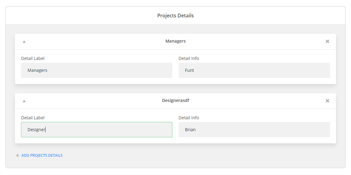
Arguments:
id- element attribute idname- element name attributefields- arguments array for controller setvalue- valuelabel- controller labeladd_label- text for adding new setlabel- label tag textclass- custom classmaster- state dependency identifier from slavetitle_field- identifier from fields set, value of which will be passed as a title for set
ui-radio

Arguments:
id- element attribute idname- element name attributevalue- valueoptions- option array for radio, where option value stands for an array key and settings array stands for key valuelabel- label for variantimg_src- variant image linkslave- dependency identifier for master
label- controllerclass- custom classmaster- state dependency identifier from slave
Example:
'options' => array( 'radio-1' => array( 'label' => 'Radio 1', 'img_src' => '', 'slave' => '', ), 'radio-2' => array( 'label' => 'Radio 2', 'img_src' => '', 'slave' => '', ), 'radio-3' => array( 'label' => 'Radio 3', 'img_src' => '', 'slave' => '', ), );
ui-media
Arguments:
id- element attribute idname- element name attributevalue- valuemulti_upload- multi upload modelibrary_type- filter by a certain type (all types by default, filter by image, video, audio)upload_button_text- upload button textlabel- controller labelclass- custom CSS-classmaster- state dependency identifier from slave
ui-iconpicker

Arguments:
id- element attribute idname- element name attributevalue- valueicon_data- icons arrayauto_parse- css with icons parse (if possible)label- controller labelclass- custom CSS-classmaster- state dependency identifier from slave
ui-colorpicker
Arguments:
id- element attribute idname- element name attributevalue- valuelabel- controller labelclass- custom CSS-classmaster- state dependency identifier from slave
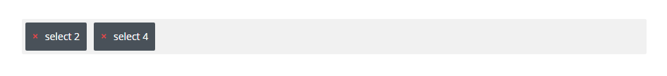
ui-checkbox
Arguments:
id- element attribute idname- element name attributevalue- value (passed in array format)label- controller labelclass- custom CSS-classmaster- state dependency identifier from slave
Example:
array(
    'id'    => 'cherry-ui-checkbox-id',
    'name'  => 'cherry-ui-checkbox-name',
    'value' => array(
        'checkbox-1' => 'true',
        'checkbox-2' => 'true',
        'checkbox-3' => 'true',
    ),
    'options' => array(
        'checkbox-1' => 'checkbox 1',
        'checkbox-2' => 'checkbox 2',
        'checkbox-3' => 'checkbox 3',
    ),
    'label'  => '',
    'class'  => '',
    'master' => '',
);
How to implement "master-slave"
To implement the function, you need to use slave and master settings attributes. The algorithm is the following: add unique id to the slave state add this id to master controller argument and its container
Slave states are available in ui-switcher, ui-checkbox, ui-radio.
Example:
'listing-layout' => array(
    'type'          => 'radio',
    'title'         => esc_html__( 'Projects listing layout', 'cherry-projects' ),
    'description'   => esc_html__( 'Choose projects listing view layout.', 'cherry-projects' ),
    'value'         => 'grid-layout',
    'options'       => array(
        'grid-layout' => array(
            'label'   => esc_html__( 'Grid', 'cherry-projects' ),
            'img_src' => CHERRY_PROJECTS_URI . 'public/assets/images/svg/list-layout-grid.svg',
            'slave'   => 'projects-listing-layout-grid-layout',
        ),
        'masonry-layout' => array(
            'label'   => esc_html__( 'Masonry', 'cherry-projects' ),
            'img_src' => CHERRY_PROJECTS_URI . 'public/assets/images/svg/list-layout-masonry.svg',
            'slave'   => 'projects-listing-layout-masonry-layout',
        ),
        'justified-layout' => array(
            'label'   => esc_html__( 'Justified', 'cherry-projects' ),
            'img_src' => CHERRY_PROJECTS_URI . 'public/assets/images/svg/list-layout-justified.svg',
            'slave'   => 'projects-listing-layout-justified-layout',
        ),
        'cascading-grid-layout' => array(
            'label'   => esc_html__( 'Cascading grid', 'cherry-projects' ),
            'img_src' => CHERRY_PROJECTS_URI . 'public/assets/images/svg/list-layout-cascading-grid.svg',
            'slave'   => 'projects-listing-layout-cascading-grid-layout',
        ),
        'list-layout' => array(
            'label'   => esc_html__( 'List', 'cherry-projects' ),
            'img_src' => CHERRY_PROJECTS_URI . 'public/assets/images/svg/list-layout-listing.svg',
            'slave'   => 'projects-listing-layout-list-layout',
        ),
    ),
),
'grid-template' => array(
    'type'        => 'text',
    'title'       => esc_html__( 'Grid template', 'cherry-projects' ),
    'description' => esc_html__( 'Grid content template', 'cherry-projects' ),
    'value'       => 'grid-default.tmpl',
    'master'      => 'projects-listing-layout-grid-layout',
),
Cherry Toolkit
Cherry Toolkit module is designed for working inside the framework and contains (assistance) functions.
The module should be installed by default
Methods
This module should include static methods only
get_arg
get_arg( $field, $arg, $default = '' );
Get argument from the array. In case the argument was not found, the $default parameter argument is used.
$field- array - Arguments array$arg- string | int | float - Arguments array key$default- mixed - Returned default argument, if an argument was not found in the array by transferred key$arg
get_class_instance
get_class_instance( $class_name = '', $core, $args );
Get new class entity. $core and $args are transferred to the class constructor as arguments.
$class_name- string - Class name$core- Cherry_Core - Cherry_Core entity$args- array - Additional constructor arguments
render_view
render_view( $path, array $data = array() );
Data transition to the loaded template file. Execution result - HTML code.
$path- string - Path to the template file$data- array - Array with variables and their arguments. Variables will be available in the template
remove_empty
remove_empty( $arr );
Empty elements remove.
$arr- array - Elements array
remove_empty_check
remove_empty_check( $var );
Function for variable empty value check.
$var-mixed - variable
join
join( $arr = array() );
Function which unites array elements into the attributes string.
$arr- array - Elements array
leave_right_keys, remove_right_keys
leave_right_keys( $right_keys, $array );
remove_right_keys( $right_keys, $array );
Function for working with arrays. Both functions check if the array elements are on the "blacklist" and delete them.